I feel that I seem to only be popping up nowadays to be a critic, but I will
give my 2 cents anyway.
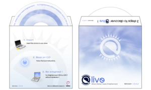
The first thing I noticed was it was blue on blue on blue, it seems very
bland. I personally prefer the old box, not necessarily the 3 boxes with the
ribbons, but the clearer image, a more defined box, the shadow, a 'flashier'
(I couldn't think of the word here that I wanted so will go with 'flashy')
name of white on black below the blue (making it stand out more, so that is
what you look at). There isn't much there (I like that) but someone taking a
very quick glance at the box (as they probably wont be looking directly at
it at all) should notice first of all (and if nothing else) the name. The
way it is now, I feel anyone looking at it will look a little bit longer to
figure out what that outline image is - its not as clear as the old 1.

PS This made me think of the Microsoft bashing I was shown on google videos
(for anyone with a spare few minutes that wants a bit of a laugh):
http://video.google.com/videoplay?docid=36099539665548298&q=microsoft+ipod

Thanks for the effort, its always appreciated.

Lio.

----- Original Message From: "Youness Alaoui" -----
> I feel like I always have to say a critic.. sorry about that :p
> anyways, the image looks nice, I like the idea, but here are a few
suggestions, you can either take them or reject them, as I think it
> is already good! :)
> 1 - How about removing the blue background, I do like it, but I think it
kind of feels awkward the blue background on the image on a
> white background website.. no ?
> 2 - maybe write something on the side of the box ?
> 3 - how about making the image bigger instead of just a little 'icon', and
have a few more details in it, like for example...
>   a) informational stuff, like "windows/linux/mac/bsd certified"
>   b) funny stuff like "aMSN inside(tm)"
>   c) other stuff ?
> 4 - we could add more text/image and have a few different colors than
blue/white, no ? look at the elivecd.org website, and look at
> the images they have for their cd :
http://elivecd.org/img/_images/elive-package-open.png (.tgz svg :
> http://elivecd.org/files/_files/elive-cddover.tar.bz2 ) it's nice, no ? so
small important, 'ad'-like information would be nice..
> 5 - I shut up with my extravagant requests..
>
> Thanks Lee!
>
> KKRT
>
> On Wed, Nov 08, 2006 at 12:24:23AM +0100, Karel Demeyer wrote:
> > OK, discard my message :)
> >
> >
> > Karel.
> >
> >
> > Op dinsdag 07-11-2006 om 23:38 uur [tijdzone +0100], schreef Boris Faure
> > (aka billiob):
> > > they're not. like OIMs.
> > > and why nudges ??
> > >
> > > On 11/7/06, Tom Hennigan <[EMAIL PROTECTED]> wrote:
> > > > Sound clips aren't in 0.96 are they??
> > > >
> > > > On 7 Nov 2006, at 22:30, Karel Demeyer wrote:
> > > >
> > > > > Maybe Nudges and Sound Clips should be added as eye-catcher of the
> > > > > short
> > > > > features list ?  I like the image you propose.
> > >
> > > The image is nice and fits very well.
> > >


-------------------------------------------------------------------------
Using Tomcat but need to do more? Need to support web services, security?
Get stuff done quickly with pre-integrated technology to make your job easier
Download IBM WebSphere Application Server v.1.0.1 based on Apache Geronimo
http://sel.as-us.falkag.net/sel?cmd=lnk&kid=120709&bid=263057&dat=121642
_______________________________________________
Amsn-devel mailing list
[email protected]
https://lists.sourceforge.net/lists/listinfo/amsn-devel