On 08/06/2010 07:10 AM, F. Gr. wrote:
Hi,
in your opinion, what is the best combination of text and background
colour so as not to tire our eyes? I think we spend many hours in
front of a monitor.
I've been using the following one:
text       ->  #000000
background ->  #F6F6FF (in the past also #F8F4FF, #EDE9E3, and others)
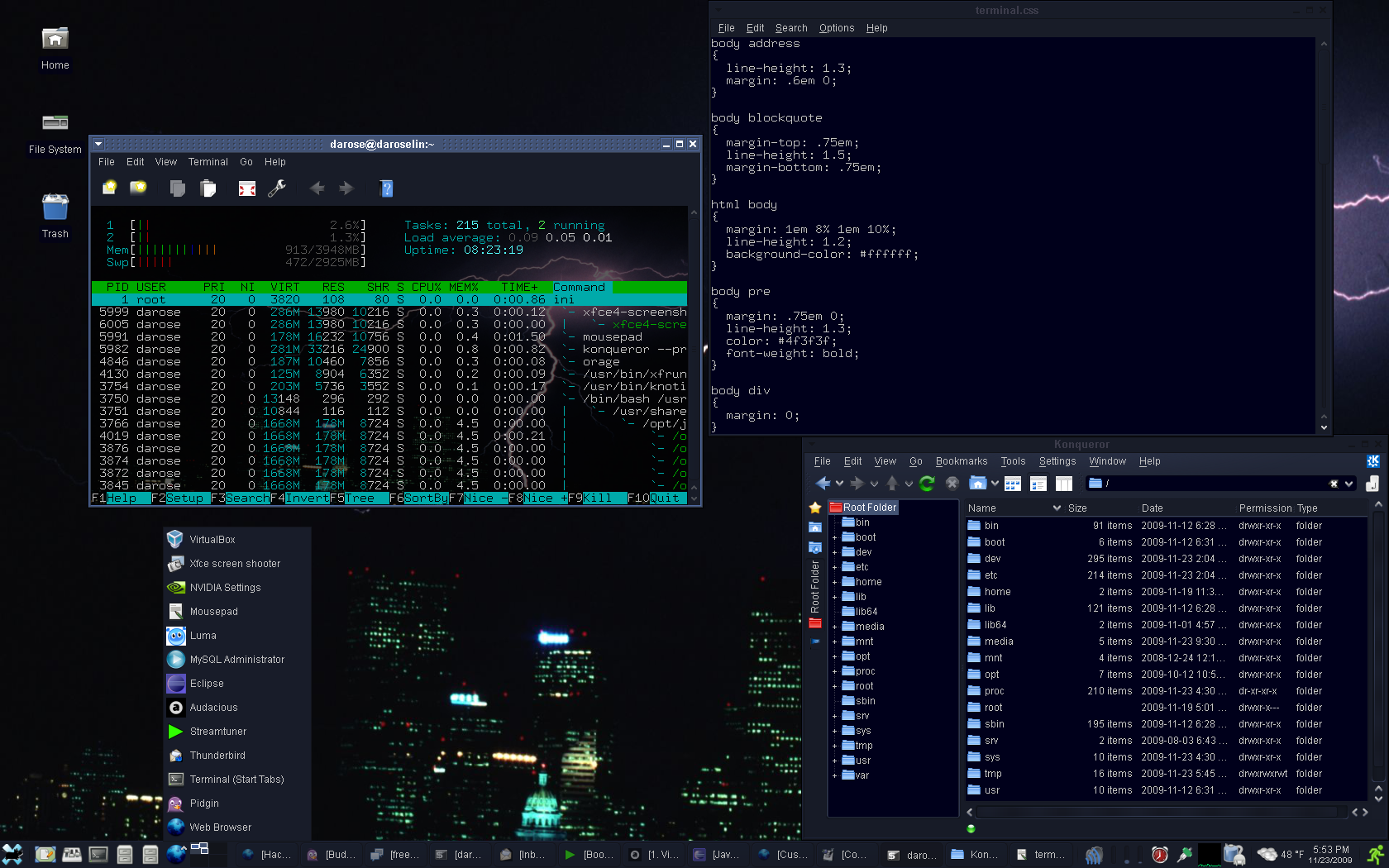
I find that lighter-colored (but not blindingly bright) text on a very
dark background is easiest on the eyes.
e.g.
text:   #C3C3C3 (light gray)
background:     #000000 (black) or #00001b (midnight blue)

http://www.darose.net/DaroseDesktop2009-11.png

HTH,

DR