Both are awesome, Yohei! Can we use both?

I like the robot one due to it working out at smaller sizes.
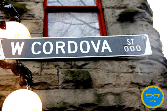
On 12-01-10 5:28 PM, "Yohei Shimomae" <[email protected]> wrote:

>Hey guys,
>
>So I got two designs to show for now.
>
>The first one borrows Patrick's street sign idea:
>http://cl.ly/3a0C3O0S3E3L3K0R2P3f
>I looked at pics of Street signs in Gastown (e.g.
>http://scoutmag.s3.amazonaws.com/2011/12/IMG_00571.jpg) and chose
>colours, shape and font based on that.
>
>The second one is what looks like a robot head:
>http://cl.ly/2o1p2R2A1p0x1R3h001t
>I may add little a bit more details to the visor since it's transparent.
>Show more mechanical guts perhaps. The nice thing about this one is it'll
>scale nicely and will still be recognizable at smaller sizes because the
>shape is fairly simple.
>
>Let me know what you guys think.
>
>
>Yohei
>
>
>On 2012-01-10, at 2:37 PM, Michael Brooks wrote:
>
>Thanks Colene.
>
>It sounds like Yohei will have something ready in the next day or two.
>
>Patrick, nice motivational technique!
>
>Michael
>
>On Tue, Jan 10, 2012 at 2:25 PM, Colene Chow
><[email protected]<mailto:[email protected]>> wrote:
>I've CC'd Yohei who has created a lot of the PhoneGap artwork.
>
>Colene
>
>
>On 12-01-10 2:03 PM, "Patrick Mueller"
><[email protected]<mailto:[email protected]>> wrote:
>
>>On Tue, Jan 10, 2012 at 16:03, Patrick Mueller
>><[email protected]<mailto:[email protected]>> wrote:
>>
>>> OTOH, good excuse to come up with some new artwork.  :-)
>>>
>>
>>In that light, I spent a few minutes in Acorn implementing one thought I
>>had for a "logo".  Basically, a street sign, with the text "CORDOVA" on
>>it.
>> Slightly skewed.  Link below.
>>
>>Warning: If someone doesn't come up with something better, this may end
>>up
>>on our home page.  :-)
>>
>>http://www.flickr.com/photos/pmuellr/6675312897/sizes/o/in/photostream/
>>
>>--
>>Patrick Mueller
>>http://muellerware.org<http://muellerware.org/>
>
>
>