set92 commented on issue #29852:
URL: https://github.com/apache/airflow/issues/29852#issuecomment-1520240321
Couldn't find a Slack channel of feedback, so I suppose the best option is here. I was testing the new UI in 2.6.0rc1, and wanted to note a couple of things I think the new UI doesn't do as good as the old one. - Too plain, before I could easily see the different types of tasks by color, now is harder to locate some of them, or I have to zoom more. Also, the background is white, the boxes are white... It is hard to see what is inside a Taskgroup and what not. - Tiny text to open Taskgroups. Before I could click on any part of the box to open them. Think this is problematic if you have a high resolution, a mouse with high DPI, or maybe a person who has a real problem and shakes a lot. Also is hard when you open one with 7 tasks, and you remember that it wasn't that one, and you want to close, and then you have to move, search for the text... - Bit picky I think, and probably not needed, is only because of inconsistency. If you click a task in graph view, it only highlights the task in grid view, which makes it hard to find it when you have a lot of Taskgroups. It would be great if it could take you to the task you selected. - Likely too picky, but I think there is too much space at the footer. It also happened before, but didn't notice it because didn't scroll. I think that's important because if the space didn't exist, all the buttons would be visible without scrolling. For example, if you enter a DAG, click a task in the grid view and think Want to see it in the graph view, you will then click Graph view, and scroll to click `Center selected task`, but then you want to check the Gantt view to check why it took so long, or maybe go to Audit Log, or check the DAG Docs, but at least in my computer I couldn't see them and I had to scroll up again. Thought in removing the header (with Admin, Docs...), but then I thought that could be useful, and I noticed the space in the footer that didn't bring any utility. Also, the annoying part was that I was unable to scroll back up easily because in the graph view the scroll is to zoom, and in the grid view the scroll goes up and down the task list, so I had to f ind an empty space where the scroll worked to go up the page. - The DAG Flow is not visible at all. Our main DAGs has around 300 Taskgroups (they are nested, so probably are less of the ones visible in the DAG Flow). In a DAG with 15 Taskgroup great, but in the normal ones can't see anything. Bugs? - When you expand a Taskgroup, the last task has a symbol like a ball and an arrow. When there are only a couple Taskgroups the arrow doesn't appear, but if there are a lot the arrow appears and as the number of Taskgroup increases it starts changing. Example: 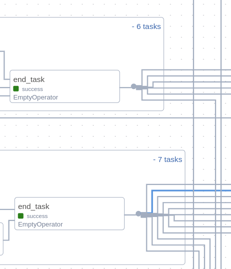 - If I open a Taskgroup in the graph view, and then I press it, the backgroud of the Taskgroup becomes light blue, and the lines between tasks they go up a couple pixels. We could call it a fun feature for when we are mad because things are not working :smile:, clicking repeatedly makes the line go up and down, becoming more noticeable. -- This is an automated message from the Apache Git Service. To respond to the message, please log on to GitHub and use the URL above to go to the specific comment. To unsubscribe, e-mail: [email protected] For queries about this service, please contact Infrastructure at: [email protected]