eddiesr93 commented on issue #62935:
URL: https://github.com/apache/airflow/issues/62935#issuecomment-5049341438
Following up on the idea of more charts on the Overview tab. Here is a **Slowest tasks** chart: for a run, it ranks the tasks by how long they took, colours each bar by state, and labels it with the duration and its share of the run. It shows the top 10, so it stays readable from 3 tasks up to thousands. Rendered in the real Dag Overview with mock data, light and dark: 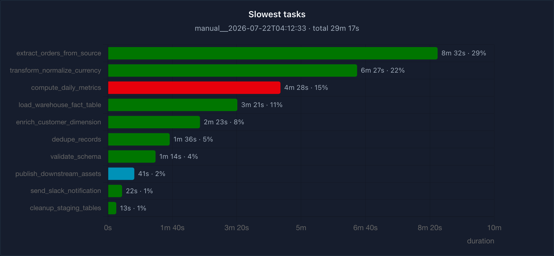 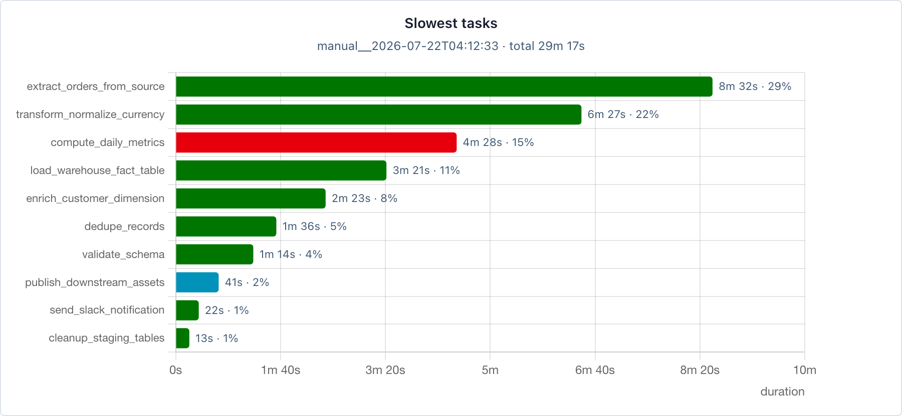 Does this direction look right? If so, I will open a PR. Happy to adjust where it lives (Dag Overview or a single run's page) and whether it summarises one run or an average across recent runs, based on what you prefer. --- Drafted-by: Claude Code (Opus 4.8); reviewed by @eddiesr93 before posting -- This is an automated message from the Apache Git Service. To respond to the message, please log on to GitHub and use the URL above to go to the specific comment. To unsubscribe, e-mail: [email protected] For queries about this service, please contact Infrastructure at: [email protected]


