http://git-wip-us.apache.org/repos/asf/incubator-weex/blob/8162f8c2/doc/source/v-0.10/guide/how-to/preview-in-playground-app.md ---------------------------------------------------------------------- diff --git a/doc/source/v-0.10/guide/how-to/preview-in-playground-app.md b/doc/source/v-0.10/guide/how-to/preview-in-playground-app.md deleted file mode 100644 index 5800737..0000000 --- a/doc/source/v-0.10/guide/how-to/preview-in-playground-app.md +++ /dev/null @@ -1,20 +0,0 @@ ---- -title: Preview in native -type: guide -order: 3.2 -version: 0.10 ---- - -# How to preview weex code in sample-app ? - -### Weex Sample Step By Step -1. Clone Weex from github [`https://github.com/apache/incubator-weex/`](https://github.com/apache/incubator-weex/) -2. Use Android Studio open Android Sample ã -3. run Sample project. -4. into Sample homePageï¼you will see this picture -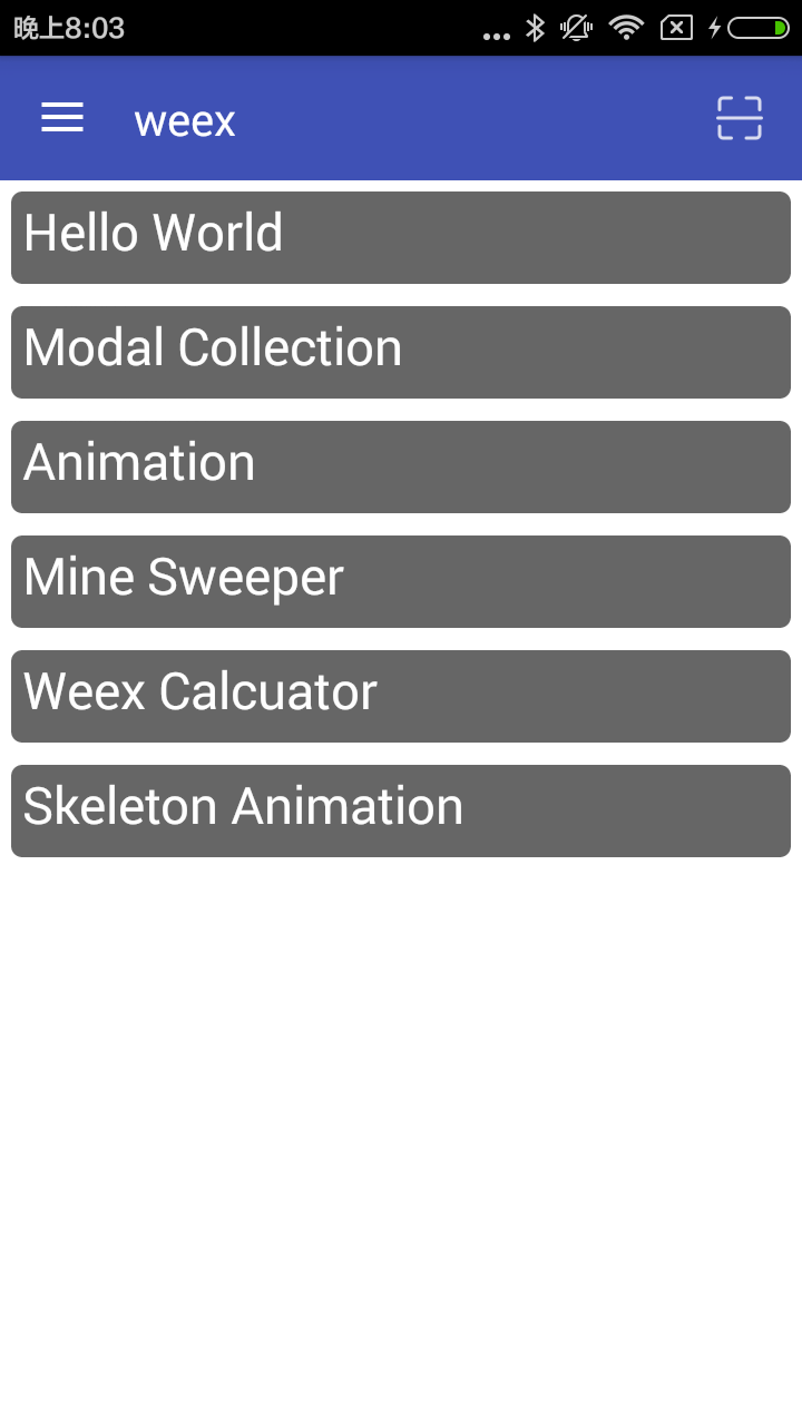 -5. Click the icon to the top right of the page to enter the two-dimensional code scanning -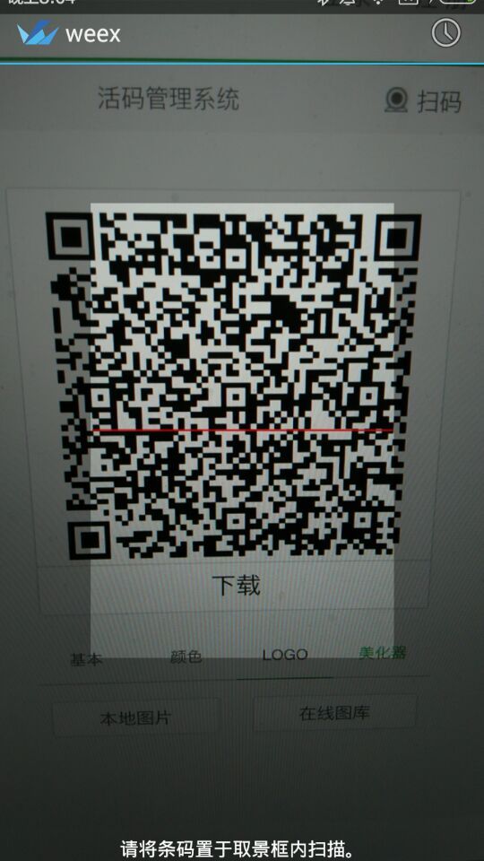 -6. use[`Weex-Toolkit`](https://github.com/alibaba/weex_toolchain/tree/master/toolkit/ )make .we to a QR code -7. you will see the page rended by Weex -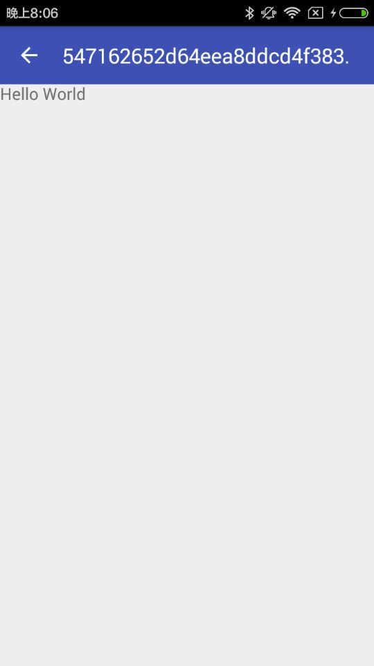
http://git-wip-us.apache.org/repos/asf/incubator-weex/blob/8162f8c2/doc/source/v-0.10/guide/how-to/require-3rd-party-libs.md ---------------------------------------------------------------------- diff --git a/doc/source/v-0.10/guide/how-to/require-3rd-party-libs.md b/doc/source/v-0.10/guide/how-to/require-3rd-party-libs.md deleted file mode 100644 index 7349520..0000000 --- a/doc/source/v-0.10/guide/how-to/require-3rd-party-libs.md +++ /dev/null @@ -1,56 +0,0 @@ ---- -title: Require 3rd Party Libs -type: guide -order: 3.6 -version: 0.10 ---- - -# How to require 3rd Party Libs ? - -In the paragraph Maintain Your Component Code, we learn that JavaScript code can be written in `<script>` tag in one component. But there must be some common functions or modules in your project, such as parsing url params, extending properties from some objects to another object and so on. It's a bad practice to copy and paste them in each component, therefore there's a urgent need of `require`. Weex provides CommonJS `require` syntax for developers. - -Let take `extend` for example. - -## Require Local Js Modules - -A basic implementation of `extend` is as follows, and it's placed in directory path `./common/utils.js`. - -```javascript -function extend(dest, src) { - for (var key in src) { - dest[key] = src[key] - } -} -exports.extend = extend -``` - -In a `.we` file, `extend` can be used with the help of `require`: - -```html -<script> - var utils = require('./common/utils') - var obj1 = {a: 1} - var obj2 = {b: 2} - utils.extend(obj1, obj2) // obj1 => {a: 1, b: 2} -</script> -``` - -## Require Installed Node Modules - -Besides, [underscore](http://underscorejs.org) is a JavaScript library that provides a whole mess of useful functional programming helpers without extending any built-in objects. It implements a more robust version of [extend](http://underscorejs.org/#extend). - -We can use underscore's extend instead of the version implemented by ourselves. After installing `underscore` to the `node_modules` directory, we can `require` and use it. - -```bash -$ npm install underscore -``` - -```html -<script> - var _ = require('underscore') - var obj1 = {a: 1} - var obj2 = {b: 2} - var obj3 = {c: 3} - var ret = _.extend(obj1, obj2, obj3) // ret => {a: 1, b: 2, c: 3} -</script> -``` http://git-wip-us.apache.org/repos/asf/incubator-weex/blob/8162f8c2/doc/source/v-0.10/guide/how-to/transform-code-into-js-bundle.md ---------------------------------------------------------------------- diff --git a/doc/source/v-0.10/guide/how-to/transform-code-into-js-bundle.md b/doc/source/v-0.10/guide/how-to/transform-code-into-js-bundle.md deleted file mode 100644 index 842ecd6..0000000 --- a/doc/source/v-0.10/guide/how-to/transform-code-into-js-bundle.md +++ /dev/null @@ -1,110 +0,0 @@ ---- -title: Transform Code into Js Bundle -type: guide -order: 3.7 -version: 0.10 ---- - -# Transform Code into Js Bundle - -Paragraphs Maintain Your Component Code and [Require 3rd Party Libs](./require-3rd-party-libs.html) show us how to write and organize weex code. However, Weex DSL code must be transformed to `js bundle` so that `js framework` can parse and execute it for iOS, Android and HTML5 portal. For more information, please refer to [How It Works -](../../advanced/how-it-works.html) and [JS Bundle Format](../../references/specs/js-bundle-format.html). - -Now come back to the topic `transform code into js bundle`. There are several ways to achieve the goal. - -## weex-toolkit - -```bash -$ npm install -g weex-toolkit -``` - -### transform a `we file` to JS Bundle - -```bash -$ weex your_best_weex.we -o . -``` - -`your_best_weex.we` will be transform to JS Bundle file `your_best_weex.js` , saved in your current directory - -### transform a `we file` to JS Bundle , watch this file ï¼auto run transformer if change happen. - -```bash -$ weex your_best_weex.we -o . --watch -``` - -### transform every we file in a directory - -```bash -$ weex we/file/storage/path -o outputpath -``` - -every `we file` in `we/file/storage/path` will be transformed to JS Bundle , saved in `outputpath` path - -please access [npmjs.com](https://www.npmjs.com/package/weex-toolkit) for more information about weex-toolkit. - -## transformer - -```bash -npm install weex-transformer -``` - -### CLI Tool - -```bash - Usage: transformer [options] <file...> - - Options: - - -h, --help output usage information - -V, --version output the version number - -l, --oldFormat [value] whether to transform to old format (default: false) - -e, --isEntry [value] whether is an entry module which has `bootstrap` (default: true) - -o, --output [path] the output file dirname -``` - -### API - -** transform(name, code, path, elements, config) ** - -```javascript -var transformer = require('weex-transformer') -var output = transformer.transform('foo', '/* code here */', '.', {}) -``` - -params: - -- `name`: string, current bundle name -- `code`: string, source code -- `path`: string *optional*, useful when find custom component in a certain path -- `elements`: object *optional*, existed custom component map -- `config`: object *optional* - * `oldFormat`: whether to transform to old format (default: false) - * `isEntry`: whether is an entry module which has `bootstrap` (default: true) - -returns: - -- an object with keys - * `result`: string, all custom components `define()` and final `bootstrap()` - * `logs`: array, corresponding warning & error logs - -## gulp weex - -```bash -$ npm install gulp-weex -``` - -```javascript -var gulp = require('gulp') -var weex = require('gulp-weex') - -gulp.task('default', function () { - return gulp.src('src/*.html') - .pipe(weex({})) - .pipe(gulp.dest('./dest')) -}) -``` - -Options: - -- `oldFormat`: whether to transform to old format (default: false) -- `isEntry`: whether is an entry module which has `bootstrap` (default: true) http://git-wip-us.apache.org/repos/asf/incubator-weex/blob/8162f8c2/doc/source/v-0.10/guide/images/tut-cli-qrcode.png ---------------------------------------------------------------------- diff --git a/doc/source/v-0.10/guide/images/tut-cli-qrcode.png b/doc/source/v-0.10/guide/images/tut-cli-qrcode.png deleted file mode 100644 index 9068c14..0000000 Binary files a/doc/source/v-0.10/guide/images/tut-cli-qrcode.png and /dev/null differ http://git-wip-us.apache.org/repos/asf/incubator-weex/blob/8162f8c2/doc/source/v-0.10/guide/images/tut-first.png ---------------------------------------------------------------------- diff --git a/doc/source/v-0.10/guide/images/tut-first.png b/doc/source/v-0.10/guide/images/tut-first.png deleted file mode 100755 index c8505e6..0000000 Binary files a/doc/source/v-0.10/guide/images/tut-first.png and /dev/null differ http://git-wip-us.apache.org/repos/asf/incubator-weex/blob/8162f8c2/doc/source/v-0.10/guide/images/tut-second.png ---------------------------------------------------------------------- diff --git a/doc/source/v-0.10/guide/images/tut-second.png b/doc/source/v-0.10/guide/images/tut-second.png deleted file mode 100755 index 1259abf..0000000 Binary files a/doc/source/v-0.10/guide/images/tut-second.png and /dev/null differ http://git-wip-us.apache.org/repos/asf/incubator-weex/blob/8162f8c2/doc/source/v-0.10/guide/images/tut1.jpg ---------------------------------------------------------------------- diff --git a/doc/source/v-0.10/guide/images/tut1.jpg b/doc/source/v-0.10/guide/images/tut1.jpg deleted file mode 100644 index 8af0f3f..0000000 Binary files a/doc/source/v-0.10/guide/images/tut1.jpg and /dev/null differ http://git-wip-us.apache.org/repos/asf/incubator-weex/blob/8162f8c2/doc/source/v-0.10/guide/images/tut2.jpg ---------------------------------------------------------------------- diff --git a/doc/source/v-0.10/guide/images/tut2.jpg b/doc/source/v-0.10/guide/images/tut2.jpg deleted file mode 100644 index c3e8a6e..0000000 Binary files a/doc/source/v-0.10/guide/images/tut2.jpg and /dev/null differ http://git-wip-us.apache.org/repos/asf/incubator-weex/blob/8162f8c2/doc/source/v-0.10/guide/images/tut3.png ---------------------------------------------------------------------- diff --git a/doc/source/v-0.10/guide/images/tut3.png b/doc/source/v-0.10/guide/images/tut3.png deleted file mode 100644 index 5473905..0000000 Binary files a/doc/source/v-0.10/guide/images/tut3.png and /dev/null differ http://git-wip-us.apache.org/repos/asf/incubator-weex/blob/8162f8c2/doc/source/v-0.10/guide/images/tut4.gif ---------------------------------------------------------------------- diff --git a/doc/source/v-0.10/guide/images/tut4.gif b/doc/source/v-0.10/guide/images/tut4.gif deleted file mode 100644 index eed4395..0000000 Binary files a/doc/source/v-0.10/guide/images/tut4.gif and /dev/null differ http://git-wip-us.apache.org/repos/asf/incubator-weex/blob/8162f8c2/doc/source/v-0.10/guide/index.md ---------------------------------------------------------------------- diff --git a/doc/source/v-0.10/guide/index.md b/doc/source/v-0.10/guide/index.md deleted file mode 100644 index bb6941c..0000000 --- a/doc/source/v-0.10/guide/index.md +++ /dev/null @@ -1,211 +0,0 @@ ---- -title: Tutorial -type: guide -order: 1 -version: 0.10 ---- - -# Tutorial - -We will make a simple but realistic list, in which the technologies Weex uses will be shown. This form of list also works for a lot of e-commercial apps and mobile sites. - -## Getting Started - -Let's get started with the list item, which contains one `image` element and one `text` right behind. - -```html -<template> - <div class="container"> - <div class="cell"> - <image class="thumb" src="http://t.cn/RGE3AJt";></image> - <text class="title">JavaScript</text> - </div> - </div> -</template> - -<style> - .cell { margin-top: 10; margin-left: 10; flex-direction: row; } - .thumb { width: 200; height: 200; } - .title { text-align: center; flex: 1; color: grey; font-size: 50; } -</style> -``` - -You can directly copy and paste the above code into a Weex file named `tech_list.we` (`.we` is our recommended filename extension). - -## Preview - -Once created, we want to see the running result of the `.we` file. But before that, we must make sure the dependencies are installed. - -We should install [Node](https://nodejs.org/en/download/) first, which our Weex CLI program [Weex Toolkit](https://www.npmjs.com/package/weex-toolkit) depends on. Then install `weex-toolkit` by running the command: - -```bash -$ npm install -g weex-toolkit -``` - -When installation completed, you can check if Weex CLI is installed properly by running `weex` command in the command line. The following text is expected: - -``` -Usage: weex foo/bar/your_next_best_weex_script_file.we [options] - -Options: - --qr display QR code for native runtime, - -o,--output transform weex we file to JS Bundle, output path (single JS bundle file or dir) - -s,--server start a http file server, weex .we file will be transforme to JS bundle on the server , specify local root path using the option - ...... - --help Show help - -h, --host [default: "127.0.0.1"] -``` - -If all work well, navigate to the directory where you saved `tech_list.we`, then type: - -```bash -$ weex tech_list.we -``` - -A browser window will be opened automatically to display the running result like below (weex-toolkit version should be greater than 0.1.0, use `weex --version` to check it): - - - -## Introduce to Weex Syntax - -So it's time for introducing the syntax. - -Given the content of `tech_list.we`, Weex source code is composed of three parts -- *template*, *style*, and *script*, just like html, css, and javascript for the Web. - -Template is the skeleton that gives Weex structure. It is composed of tags which surround content and apply meaning to it. Tags have *attributes*, different attribute means different feature, for example, `class` attribute makes it possible to define the same styles for multiple tags, `onclick` attribute makes the tag respond to click event. - -Style describes how Weex tags are to be displayed. We prefer CSS very much. So we try to keep consistent with CSS standard as possible. Weex Style supports a lot of CSS features, like margin, padding, fixed and so on. Better yet, flexbox layout (flex) is well supported in Weex Style. - -Script adds *data* & *logic* to Weex tags, helping you easily access local or remote data and update tags. You can also define some methods for your tag to respond to different events. Weex Script organization learns a lot from CommonJS module style. - -More information about Weex syntax can be found in our [Syntax chapter](./syntax/index.html). - -## Add More Items - -We can't call one item a list, so we need to add more items to our tech list. Open `tech_list.we` in your favorite editor and update it's content like below: - -```html -<template> - <div class="container"> - <div class="cell"> - <image class="thumb" src="http://t.cn/RGE3AJt";></image> - <text class="title">JavaScript</text> - </div> - <div class="cell"> - <image class="thumb" src="http://t.cn/RGE3uo9";></image> - <text class="title">Java</text> - </div> - <div class="cell"> - <image class="thumb" src="http://t.cn/RGE31hq";></image> - <text class="title">Objective C</text> - </div> - </div> -</template> - -<style> - .cell{ margin-top:10 ; margin-left:10 ; flex-direction: row; } - .thumb { width: 200; height: 200; } - .title { text-align: center ; flex: 1; color: grey; font-size: 50; } -</style> -``` - -Now we will try to render our `tech_list.we` with Weex native renderer. Open your terminal and navigate to the directory where you save the `tech_list.we` again, then type: - -```bash -$ weex tech_list.we --qr -h {ip or hostname} -``` - -It's ***RECOMMENDED*** to use `-h` option to specify your local ip address or hostname. - -A QR code will be displayed in the terminal window like below: - - - -The QR code can work together with [Weex Playground App](http://alibaba.github.io/weex/download.html). Open it and tap the scan icon at the top-right corner, then scan the QR code displayed in your terminal. If all work well, a beautiful list will be displayed in your phone. - - - -Here, I must stress that the list is rendered by a native view, instead of Webkit, so your app gets faster loading and less memory overhead than common Webview renderer. - -Now open `tech_list.we` again and try to change some text, after changes saved the Weex playground App will immediately display these changes. We call that **Hot-Reload**, which is intended to help you use Weex better. - -## Add Built-in Components - -Instead of writing basic tags by yourself, Weex provides a lot of built-in components. For example, Slider is common to many apps and mobile websites, so Weex includes a built-in Slider so that you can easily use it in your script. Let's open `tech_list.we` and update it's content like below. - -```html -<template> - <div style="flex-direction: column;"> - <slider class="slider" interval="{{intervalValue}}" auto-play="{{isAutoPlay}}" > - <div class="slider-pages" repeat="{{itemList}}" onclick="goWeexSite" > - <image class="thumb" src="{{pictureUrl}}"></image> - <text class="title">{{title}}</text> - </div> - </slider> - - <div class="container" onclick="goWeexSite" > - <div class="cell"> - <image class="thumb" src="http://t.cn/RGE3AJt";></image> - <text class="title">JavaScript</text> - </div> - <div class="cell"> - <image class="thumb" src="http://t.cn/RGE3uo9";></image> - <text class="title">Java</text> - </div> - <div class="cell"> - <image class="thumb" src="http://t.cn/RGE31hq";></image> - <text class="title">Objective C</text> - </div> - </div> -</template> - -<style> - .cell { margin-top:10 ; margin-left:10 ; flex-direction: row; } - .thumb { width: 200; height: 200; } - .title { text-align: center ; flex: 1; color: grey; font-size: 50; } - .slider { - margin: 18; - width: 714; - height: 230; - } - .slider-pages { - flex-direction: row; - width: 714; - height: 200; - } -</style> - -<script> -module.exports = { - data: { - intervalValue:"1000", - isShowIndicators:"true", - isAutoPlay:"true", - itemList: [ - {title: 'Java', pictureUrl: 'http://t.cn/RGE3uo9'}, - {title: 'Objective C', pictureUrl: 'http://t.cn/RGE31hq'}, - {title: 'JavaScript', pictureUrl: 'http://t.cn/RGE3AJt'} - ] - }, - methods: { - goWeexSite: function () { - this.$openURL('http://alibaba.github.io/weex/') - } - } -} -</script> -``` - -Open terminal and run the command again: - -```bash -$ weex tech_list.we -``` - -You should see a slider prepend to our list. - - - -More information about Slider component can be found [here](../references/components/slider.html). - -Just as the previous example, the slider can be rendered in native, easily in Weex playground, or in your App. Please refer [the document](./advanced/integrate-to-android.html) for integrating Weex into your App. http://git-wip-us.apache.org/repos/asf/incubator-weex/blob/8162f8c2/doc/source/v-0.10/guide/syntax/comm.md ---------------------------------------------------------------------- diff --git a/doc/source/v-0.10/guide/syntax/comm.md b/doc/source/v-0.10/guide/syntax/comm.md deleted file mode 100644 index 84e49a1..0000000 --- a/doc/source/v-0.10/guide/syntax/comm.md +++ /dev/null @@ -1,228 +0,0 @@ ---- -title: Communications -type: guide -order: 2.8 -version: 0.10 ---- - -# Communicate Between Components - -## For Child-Parent Communication - -Children component can use `this.$dispatch([String type], [Object detail])` method passing information to parent component. first argument meaning type of message , second argument is the message object. If any parent of the child component register the same type of listener using `$on([String type], [Function callback])` method , the callback will be execute with one argument , the message object will be `detail` property of the the argument. - -eg: - -```html -<we-element name="foo"> - <template> - <div> - <image src="{{imageUrl}}" onclick="test"></image> - <text>{{title}}</text> - </div> - </template> - <script> - module.exports = { - data: { - title: '', - imageUrl: '' - }, - methods: { - test: function () { - this.$dispatch('notify', {a: 1}) - } - } - } - </script> -</we-element> - -<template> - <foo title="..." image-url="..."></foo> -</template> - -<script> - module.exports = { - created: function () { - this.$on('notify', function(e) { - // when <foo> image tag be clicked ,the function will be executing. - // e.detail is `{a: 1}` - }) - } - } -</script> -``` - -## For Parent-Child Communication - -Parent component can use `this.$vm([String id])` get vm instance of child component. you can access child component information using the vm instance. - -```html -<we-element name="foo"> - <template> - <div> - <image src="{{imageUrl}}"></image> - <text>{{title}}</text> - </div> - </template> - <script> - module.exports = { - data: { - title: '', - imageUrl: '' - }, - methods: { - setTitle: function (t) { - this.title = t - } - } - } - </script> -</we-element> - -<template> - <div> - <text onclick="test">click to update foo</text> - <foo id="fooEl" title="..." image-url="..."></foo> - </div> -</template> - -<script> - module.exports = { - methods: { - test: function (e) { - var foo = this.$vm('fooEl') - foo.setTitle('...') - foo.imageUrl = '...' - } - } - } -</script> -``` - -## Parent to Children (multi-child) Communication - -Parent can using `this.$broadcast([String type], [Object detail])` broadcast message to all of children. - -eg: - -```html -<we-element name="bar"> - <template> - <div> - <image src="{{imageUrl}}"></image> - </div> - </template> - <script> - module.exports = { - data: { - imageUrl: '' - }, - created: function() { - var self = this - this.$on('changeImage', function(e) { - self.imageUrl = e.detail.imageUrl - }) - } - } - </script> -</we-element> - -<we-element name="foo"> - <template> - <div> - <bar></bar> - <text>{{title}}</text> - </div> - </template> - <script> - module.exports = { - data: { - title: '' - }, - created: function() { - var self = this - this.$on('changeTitle', function(e) { - self.title = e.detail.title - }) - } - } - </script> -</we-element> - -<template> - <div> - <text onclick="test">click to update foo</text> - <foo></foo> - <bar></bar> - </div> -</template> - -<script> - module.exports = { - methods: { - test: function (e) { - this.$broadcast('changeTitle', { - title: '...' - }) - this.$broadcast('changeImage', { - imageUrl: '...' - }) - } - } - } -</script> -``` - -## Siblings Communication - -siblings components can using common parent as bridge for passing information - -eg: - -```html -<we-element name="foo"> - <template>...</template> - <script> - module.exports = { - methods: { - callbar: function () { - this.$dispatch('callbar', {a: 1}) - } - } - } - </script> -</we-element> - -<we-element name="bar"> - <template>...</template> - <script> - module.exports = { - created: function() { - this.$on('callbar', function(e) { - // e.detail.a - }) - } - } - </script> -</we-element> - -<template> - <div> - <foo></foo> - <bar></bar> - </div> -</template> - -<script> - module.exports = { - created: function () { - var self = this - this.$on('callbar', function(e) { - self.$broadcast('callbar', e.detail) - }) - } - } -</script> -``` - -At last, you can learn how to write [config & data](./config-n-data.html) for a Weex page. http://git-wip-us.apache.org/repos/asf/incubator-weex/blob/8162f8c2/doc/source/v-0.10/guide/syntax/composed-component.md ---------------------------------------------------------------------- diff --git a/doc/source/v-0.10/guide/syntax/composed-component.md b/doc/source/v-0.10/guide/syntax/composed-component.md deleted file mode 100644 index 547096f..0000000 --- a/doc/source/v-0.10/guide/syntax/composed-component.md +++ /dev/null @@ -1,114 +0,0 @@ ---- -title: Composed Component -type: guide -order: 2.6 -version: 0.10 ---- - -# Composed Component - -If some part of weex file is reused often, you could create a composed component represent these part. - -You can create a file named `foo.we` to define a composed component, the component name is just `<foo>`. - -```html -<!-- foo.we --> -<template> - <container style="flex-direction: row;"> - <image src="{{image}}" style="width:100;height:100;"></image> - <text>{{title}}</text> - </container> -</template> -<script> - module.exports = { - data: { - title: null, - image: null - } - } -</script> -``` - -The content of `foo.we` also consists of `<template>`, `<style>` and `<script>`. - -Once composed component been defined, you can use `<foo>` in a file which is in the same folder with `foo.we`. - -```html -<template> - <foo title="..." image="..."></foo> -</template> -``` - -## Nesting Components - -Composed component supports nesting. For example: - -```html -<!-- somepath/foo.we --> -<template> - <container style="flex-direction: row;"> - <image src="{{image}}"></image> - <text>{{title}}</text> - </container> -</template> -<script> - module.exports = { - data: { - // The key is required if you want this property observed - // and could be updated from changing parent attribute - title: null, - image: null - } - } -</script> -``` - -```html -<!-- somepath/foo-list.we --> -<template> - <container> - <text>{{description}}</text> - <foo repeat="{{list}}" title="{{text}}" image="{{img}}"></foo> - </container> -</template> -<script> - module.exports = { - data: { - description: '', - // If no keys written here. There will be no data binding effect - // from parent attribute "list". - list: [] - } - } -</script> -``` - -```html -<!-- somepath/main.we --> -<template> - <foo-list list="{{list}}"></foo-list> -</template> -<script> - module.exports = { - data: { - list: [ - {text: '...', img: '...'}, - {text: '...', img: '...'}, - {text: '...', img: '...'}, - ... - ] - } - } -</script> -``` - -The `main.we` uses `<foo-list>` from `foo-list.we`. And `<foo-list>` uses `<foo>` from `foo.we`. - -## Notes - -- Every composed component have an independent `<style>` work scope. -- If child component have `id` attribute, you can access the context of the child component by `this.$vm(id)` and find an element by `this.$el(id)`. See more about [find an element](./id.html). -- Please refer to [communicate between components](./comm.html) for more communication issues. -- The keys must be existed in `data` options **explicitly** if you want to make the data observation work both through inside data changes and outside attribute changes. - -Next is how to [find an element](./id.html). http://git-wip-us.apache.org/repos/asf/incubator-weex/blob/8162f8c2/doc/source/v-0.10/guide/syntax/config-n-data.md ---------------------------------------------------------------------- diff --git a/doc/source/v-0.10/guide/syntax/config-n-data.md b/doc/source/v-0.10/guide/syntax/config-n-data.md deleted file mode 100644 index 37b8e12..0000000 --- a/doc/source/v-0.10/guide/syntax/config-n-data.md +++ /dev/null @@ -1,61 +0,0 @@ ---- -title: Page Config & Data -type: guide -order: 2.9 -version: 0.10 ---- - -# Page Config & Data - -You can write some instance config and data in some additional `<script>` at the **top-level** Weex component. - -* the instance config could declare some meta informations like which sdk/client version it supports or "downgrade" to HTML5 renderer. This part would be extended more in the future. -* the instance data could set an external data which would be processed instead of the default top-level component data. - -They all make Weex files more extendable and configurable and works easy with other tools & services like CMS system. - -```html -<!-- definition of sub components --> -<element name="sub-component-a">...</element> -<element name="sub-component-b">...</element> -<element name="sub-component-c">...</element> - -<!-- definition of top-level component --> -<template>...</template> -<style></style> -<script> - module.exports = { - data: function () {return {x: 1, y: 2}} - } -</script> - -<!-- instance config and data --> -<script type="config"> - { - downgrade: { - ios: { - os: '9', // all of 9.x.x - app: '~5.3.2', - framework: '^1.3', // all of 1.3.x - deviceModel: ['AAAA', 'BBBB'] - }, - android: { - os: '*', // all of version - app: '^5', - framework: '', - deviceModel: '' - } - } - } -</script> -<script type="data"> - {y: 200} -</script> -``` - -Notice that these two additional `<script>` are both optinal and have `type="config|data"` attribute and only works when it's the top-level component of a Weex instance. - -So that's all about Weex syntax. For more reading, please check out: - -* [how-tos](../how-to/index.html) articles and -* [advanced](../../advanced/index.html) topics. http://git-wip-us.apache.org/repos/asf/incubator-weex/blob/8162f8c2/doc/source/v-0.10/guide/syntax/data-binding.md ---------------------------------------------------------------------- diff --git a/doc/source/v-0.10/guide/syntax/data-binding.md b/doc/source/v-0.10/guide/syntax/data-binding.md deleted file mode 100644 index 497735c..0000000 --- a/doc/source/v-0.10/guide/syntax/data-binding.md +++ /dev/null @@ -1,248 +0,0 @@ ---- -title: Data-Binding -type: guide -order: 2.1 -version: 0.10 ---- - -# Data-Binding - -In Weex, we use the *mustache* syntax `{% raw %}{{...}}{% endraw %}` to bind data in `<template>` which are defined in `<script>`. Once data and template is bound, the data changes will influence the corresponding template content immediately and automatically. - -## Binding data path - -```html -<template> - <container> - <text style="font-size: {{size}}">{{title}}</text> - </container> -</template> - -<script> - module.exports = { - data: { - size: 48, - title: 'Alibaba Weex Team' - } - } -</script> -``` - -The code above will bind the `title` and `size` data field to `template`. - -We can also use `.` syntax to bind cascading data structure. Let's look at the following code snippet: - -```html -<template> - <container> - <text style="font-size: {{title.size}}">{{title.value}}</text> - </container> -</template> - -<script> - module.exports = { - data: { - title: { - size: 48, - value: 'Alibaba Weex Team' - } - } - } -</script> -``` - -## In-template expression - -Inside data bindings, Weex supports simply javascript expressions, e.g. - -```html -<template> - <container style="flex-direction: row;"> - <text>{{firstName + ' ' + lastName}}</text> - </container> -</template> - -<script> - module.exports = { - data: { - firstName: 'John', - lastName: 'Smith' - } - } -</script> -``` - -The expression will be evaluated in the data scope of current context. - -**NOTE: EACH BINDING CAN ONLY CONTAIN ONE SINGLE EXPRESSION** - -## Computed Properties -<span class="weex-version">0.5</span> - -According to simple operations, in-template expressions are very convenient. But if you want to put more logic into the template, you should use a computed property. - -e.g. - -```html -<template> - <container style="flex-direction: row;"> - <text>{{fullName}}</text> - <text onclick="changeName" style="margin-left:10px;">CHANGE NAME</text> - </container> -</template> - -<script> - module.exports = { - data: { - firstName: 'John', - lastName: 'Smith' - }, - computed: { - fullName: { - get: function() { - return this.firstName + ' ' + this.lastName - }, - - set: function(v) { - var s = v.split(' ') - this.firstName = s[0] - this.lastName = s[1] - } - } - }, - methods: { - changeName: function() { - this.fullName = 'Terry King' - } - } - } -</script> -``` - -Here we have declared a computed property fullName. The function we provided will be used as the getter function for concating firstName and lastName. - -Otherwise when you call `changeName` after click, the setter will be invoked and this.firstName and this.lastName will be updated accordingly. - -**NOTE: `data` and `methods` can't have duplicated fields. 'Cause in the execution context -- `this`, we can access both of them.** - -## Usage of some special attributes in Data-Binding - -### Styles: `style` or `class` - -the style of a component can be bind using the `style` attribute: - -```html -<template> - <text style="font-size: {{size}}; color: {{color}}; ...">...</text> -</template> -``` - -while style can also get bound with `class` attribute, multiple classnames can be split by spaces: - -```html -<template> - <container> - <text class="{{size}}"></text> - <text class="title {{status}}"></text> - </container> -</template> -``` - -here if `{{size}}` and `{{status}}` have empty value, then only `class="title"` will be rendered. - -* [See more about style and class](./style-n-class.html) - -### Event Handler: `on...` - -The event handler is an attribute which name has a prefix `on...`. The other part of attribute name is event type and the value is event handler name. We don't need to add mustache around the method name or add parentheses to call it. - -```html -<template> - <text onclick="toggle">Toggle</text> -</template> - -<script> - module.exports = { - methods: { - toggle: function () { - // todo - } - } - } -</script> -``` - -### `if` & `repeat` - -`if` attribute can control the display of a component by a truthy/falsy value. - -```html -<template> - <container style="flex-direction: column;"> - <text onclick="toggle">Toggle</text> - <image src="..." if="{{shown}}"></image> - </container> -</template> - -<script> - module.exports = { - data: { - shown: true - }, - methods: { - toggle: function () { - this.shown = !this.shown - } - } - } -</script> -``` - -We can also use `repeat` attribute to generate a list. - -**NOTE: When you want to mutate an array in `data`. Something limitations existing below:** - -When you directly set an item with the index (`vm.items[0] = {};`), it won't trigger view update. So we have a prototype methods: `$set(index, item)`. - -```javascript -// same as `example1.items[0] = ...` but triggers view update -example1.items.$set(0, { childMsg: 'Changed!'}) -``` - -When you modify the length of the Array (`vm.items.length = 0`), it won't trigger view update too. We recommend you just replace `items` with an empty array instead. - -```javascript -// same as `example2.items.length = 0` but triggers view update -example2.items = [] -``` - -* [See more about display logic control](./display-logic.html) - -### `static` - -`static` attribute can cancel the data binding, and the data changes will not be synchronized to UI. - -```html -<template> - <div static> - <text>{{ word }}</text> - </div> -</template> - -<script> - module.exports = { - ready: function() { - this.word = 'Data changes' - }, - data: { - word: 'Hello, static' - } - } -</script> -``` - -As shown above, after the `static` attribute is added, the rendering result will be `Hello, static`, which is equivalent to rendering a static node. The change of the data `word` in ready function will not be listened, so the text value will not change. -`static` property is designed to reduce the long list or pure static page memory overhead. Be careful with it, as it will likely break your page logic. - -Next, let's have a look at [style and class](./style-n-class.html). - http://git-wip-us.apache.org/repos/asf/incubator-weex/blob/8162f8c2/doc/source/v-0.10/guide/syntax/display-logic.md ---------------------------------------------------------------------- diff --git a/doc/source/v-0.10/guide/syntax/display-logic.md b/doc/source/v-0.10/guide/syntax/display-logic.md deleted file mode 100644 index 842e188..0000000 --- a/doc/source/v-0.10/guide/syntax/display-logic.md +++ /dev/null @@ -1,173 +0,0 @@ ---- -title: Display Logic Control -type: guide -order: 2.4 -version: 0.10 ---- - -# Display Logic Control - -There are two attributes for display logic control: `if` and `repeat`. We can create Weex page structure and effects more flexible with them. - - > **Notes:** The display logic could't apply on the root element within `<template>`, please don't use `if` or `repeat` directive on it. - -## `if` - -`if` attribute can control the display of a component by a truthy/falsy value. If the value is truthy, then the component will generated, otherwise it will be removed. - -```html -<template> - <container> - <text onclick="toggle">Toggle</text> - <image src="..." if="{{shown}}"></image> - </container> -</template> - -<script> - module.exports = { - data: { - shown: true - }, - methods: { - toggle: function () { - this.shown = !this.shown - } - } - } -</script> -``` - -## `repeat` - -`repeat` statement is just for array rendering. Every item in an array is also a structured data. This means in `repeat`ed component, you can bind their item properties directly. - -```html -<template> - <container> - <container repeat="{{list}}" class="{{gender}}"> - <image src="{{avatar}}"></image> - <text>{{nickname}}</text> - </container> - </container> -</template> - -<style> - .male {...} - .female {...} -</style> - -<script> - module.exports = { - data: { - list: [ - {gender: 'male', nickname: 'Li Lei', avatar: '...'}, - {gender: 'female', nickname: 'Han Meimei', avatar: '...'}, - ... - ] - } - } -</script> -``` - -The origin data properties which not belongs to the array will also be bound: - -```html -<template> - <container> - <container repeat="{{list}}" class="{{gender}}"> - <image src="{{avatar}}"></image> - <text>{{nickname}} - {{group}}</text> - </container> - </container> -</template> - -<style> - .male {...} - .female {...} -</style> - -<script> - module.exports = { - data: { - group: '...', - list: [ - {gender: 'male', nickname: 'Li Lei', avatar: '...'}, - {gender: 'female', nickname: 'Han Meimei', avatar: '...'}, - ... - ] - } - } -</script> -``` - -### An extension of repeat syntax - -#### use default `$index` for the index of array. - -e.g. - -```html -<div repeat="{{list}}"> - <text>No. {{$index + 1}}</text> -<div> -``` - -#### specify the key and value of array. - -e.g. - -```html -<div repeat="{{v in list}}"> - <text>No. {{$index + 1}}, {{v.nickname}}</text> -</div> -``` - -```html -<div repeat="{{(k, v) in list}}"> - <text>No. {{k + 1}}, {{v.nickname}}</text> -</div> -``` - -#### use `track-by` to specify unique attribute - -By default when replacing an array, `repeat` will cause the entire list to be re-rendered. However you can use `track-by` to specify an unique attribute as a hint, so that weex can reuse existing elements as much as possible. - -**NOTE: DO NOT USE DATA-BINDING SYNTAX FOR `track-by`** - -e.g. - -```html -<template> - <container> - <container repeat="{{list}}" track-by="nickname" class="{{gender}}"> - <image src="{{avatar}}"></image> - <text>{{nickname}} - {{group}}</text> - </container> - </container> -</template> -``` - -Later on, when you replace the array including an item of the same nickname, it knows it can reuse the existing scope and DOM elements associated with the same nickname. - -## Omitted mustache wrapper - -Particularly for the `if` and `repeat` attribute, the [mustache](https://mustache.github.io/) wrapper in values could be omitted: just the same as data-binding syntax. - -```html -<template> - <container> - <text if="shown">Hello</text> - <text if="{{shown}}">Hello</text> - </container> -</template> - -<script> - module.exports = { - data: function () {return {shown: true}} - } -</script> -``` - -The two `<text>` components are both displayed. - -Next is [render logic control](./render-logic.html). http://git-wip-us.apache.org/repos/asf/incubator-weex/blob/8162f8c2/doc/source/v-0.10/guide/syntax/events.md ---------------------------------------------------------------------- diff --git a/doc/source/v-0.10/guide/syntax/events.md b/doc/source/v-0.10/guide/syntax/events.md deleted file mode 100644 index c79dd2b..0000000 --- a/doc/source/v-0.10/guide/syntax/events.md +++ /dev/null @@ -1,59 +0,0 @@ ---- -title: Events -type: guide -order: 2.3 -version: 0.10 ---- - -# Events - -Weex allow `<template>` to bind event type and handler on an Element. The attribute name is the event type with prefix `on...` and the attribute value is handler method name. For instance: `onclick="handler"`. e.g. - -```html -<template> - <image onclick="handler" ...></image> -</template> - -<script> - module.exports = { - methods: { - handler: function (e) { - // TODO - } - } - } -</script> -``` - -When user clicks the image , handler function which defined in `<script>` code will be executed. - -## Inline Handler - -Beside a handler method name, you can also call a handler inline. - -e.g. -```html -<template> - <image onclick="handler('arg1', $event)" ...></image> -</template> - -<script> - module.exports = { - methods: { - handler: function (arg1, e) { - // TODO - } - } - } -</script> -``` - -## Event Object - -When an event handler called, it will receive an event object as the first argument. Every event object will contains following properties. - -* `type`: event name, eg: `click` -* `target`: target `Element` of the event -* `timestamp`: time stamp that event triggered - -Next, let's have a look at [display logic control](./display-logic.html). http://git-wip-us.apache.org/repos/asf/incubator-weex/blob/8162f8c2/doc/source/v-0.10/guide/syntax/id.md ---------------------------------------------------------------------- diff --git a/doc/source/v-0.10/guide/syntax/id.md b/doc/source/v-0.10/guide/syntax/id.md deleted file mode 100644 index eaa6e04..0000000 --- a/doc/source/v-0.10/guide/syntax/id.md +++ /dev/null @@ -1,65 +0,0 @@ ---- -title: Find an Element -type: guide -order: 2.7 -version: 0.10 ---- - -# Find an Element - -In Weex, we may set the `id` property for a particular element, just as unique identification of a particular element. - -`id` can be used by `this.$el(id)` to find an element with a certain id. Take the API [`scrollToElement()`](../../references/modules/dom.html#scrolltoelementnode-options) For example: - -```html -<template> - <container> - <text id="top">Top</text> - <container style="height: 10000; background-color: #999999;"> - </container> - <text onclick="back2Top">Back to Top</text> - </container> -</template> -<script> - var dom = require('@weex-module/dom') - module.exports = { - methods: { - back2Top: function () { - var top = this.$el('top') - dom.scrollToElement(top) - } - } - } -</script> -``` - -`id` can also work with `repeat` attribute [See more about display logical control](./display-logic.html), and ensure repetitive elements with different `id`: - -```html -<template> - <container> - <image id="{{imgId}}" src="{{imgUrl}}" onclick="getImageId" repeat="{{images}}"></image> - </container> -</template> -<script> - module.exports = { - data: { - images: [ - {imgId: 1, imgUrl: '...'}, - {imgId: 2, imgUrl: '...'}, - {imgId: 3, imgUrl: '...'}, - ... - ] - }, - methods: { - getImageId: function(e) { - // get e.target.id - } - } - } -</script> -``` - -Additionally, in the [composed components](./composed-component.html), we can get the corresponding sub component through `this.$vm(id)` APIs. - -Next is how to [send messages between composed components](./comm.html). http://git-wip-us.apache.org/repos/asf/incubator-weex/blob/8162f8c2/doc/source/v-0.10/guide/syntax/index.md ---------------------------------------------------------------------- diff --git a/doc/source/v-0.10/guide/syntax/index.md b/doc/source/v-0.10/guide/syntax/index.md deleted file mode 100644 index 448c40a..0000000 --- a/doc/source/v-0.10/guide/syntax/index.md +++ /dev/null @@ -1,122 +0,0 @@ ---- -title: Syntax -type: guide -order: 2 -has_chapter_content: true -version: 0.10 ---- - -# Syntax - -*The syntax of Weex is deeply inspired from [Vue.js](http://vuejs.org/), an elegant JavaScript framework with component system and reactive data binding.* - -A simple Weex page sample is just a piece of `<template>` code, a piece of `<style>` code and a piece of `<script>` code. The three parts together describe a whole Weex page. - -- `<template>`: *required*. Just uses HTML syntax and describes the structure of a Weex page, which is build upon several tags. Each tag means a type of *component*. -- `<style>`: *optional*. Describes the presentation details, and the content is based on CSS syntax. -- `<script>`: *optional*. Describes the data and behavior with JavaScript syntax. It defines data and how these data are processed etc. - -```html -<template> - <!-- (required) the structure of page --> -</template> - -<style> - /* (optional) stylesheet */ -</style> - -<script> - /* (optional) the definition of data, methods and life-circle */ -</script> -``` - -## `<template>` - -We describe page structure in `<template>` tag like the following definition: - -```html -<template> - <container> - <image style="width: 200; height: 200;" src="http://gtms02.alicdn.com/tps/i2/TB1QHKjMXXXXXadXVXX20ySQVXX-512-512.png";></image> - <text>Alibaba Weex Team</text> - </container> -</template> -``` - -Here `container` tag is the root element of the component. `image` tag describes a picture, while `text` tag means a paragraph of text. - -Just similar to HTML, each component could have its own attributes, some components also have children as their sub components. - -The root element of template: In a `template` tag, there could be only one root component which has no display logics directive. Here are three types of root component we support now: - -- `<container>`: a common native container -- `<scroller>`: a native scroll view -- `<list>`: a native cell-reusable list view - -Only these type of components are allowed for root element. - -* [See all built-in components](../../references/components/index.html). - -## `<style>` - -You can consider the Weex style syntax is a subset of the CSS syntax, but there is still some differences. - -First we could write inline `style` attribute in `<template>` element. Second we could use the `class` attribute to apply stylesheets, which are defined with single-class selectors in `<style>` code. Here is an example: - -```html -<template> - <container> - <text style="font-size: 64;">Alibaba</text> - <text class="large">Weex Team</text> - </container> -</template> - -<style> - .large {font-size: 64;} -</style> -``` - -Both the two `text` components above have the same `font-size`, which is `64` pixel. - -* [See common styles in Weex](../../references/common-style.html) - - -### Notes! -weex is basically following [HTML attribute](https://en.wikipedia.org/wiki/HTML_attribute) naming rule , so please **do not use CamelCase** in your attribute , **long-name** with â-â as delimiter is much better. - -## `<script>` - -The syntax is JavaScript (ES5) and it describes data and behavior of a Weex page. Here we create three paragraphs: - -```html -<template> - <container> - <text>The time is {{datetime}}</text> - <text>{{title}}</text> - <text>{{getTitle()}}</text> - </container> -</template> - -<script> - module.exports = { - data: { - title: 'Alibaba', - datetime: null - }, - methods: { - getTitle: function () { - return 'Weex Team' - } - }, - created: function() { - this.datetime = new Date().toLocaleString() - } - } -</script> -``` - -This piece of `<script>` code will generate some component options and assign it to `module.exports`. The three text components above respectively shows the current datetime, 'Alibaba' and 'Weex Team'. The `data` in the `<script>` code stores component data which could be used for [data-binding](./data-binding.html) in the `<template>`. When data changes, the bound value will be updated automatically. Also it could be read and written by `this.x` in its methods. - -* [See component definitions references](../../references/component-defs.html) - -Next, let's have a look at [data-binding](./data-binding.html). http://git-wip-us.apache.org/repos/asf/incubator-weex/blob/8162f8c2/doc/source/v-0.10/guide/syntax/render-logic.md ---------------------------------------------------------------------- diff --git a/doc/source/v-0.10/guide/syntax/render-logic.md b/doc/source/v-0.10/guide/syntax/render-logic.md deleted file mode 100644 index be967e1..0000000 --- a/doc/source/v-0.10/guide/syntax/render-logic.md +++ /dev/null @@ -1,35 +0,0 @@ ---- -title: Render Logic Control -type: guide -order: 2.5 -version: 0.10 ---- - -# Render Logic Control - -## `append` - -Attribute `append` do not have data-binding. It won't change the final rendering effect. But it determines whether this component should be rendered as a whole tree or a single node with child nodes appended after. - -`append` has two key attributes, `tree` and `node`, the usage is: - -```html -<template> - <container> - <container id="world" append="tree"> - <text>Hello World!</text> - </container> - <container id="weex" append="node"> - <text>Hello Weex!</text> - </container> - </container> -</template> -``` - -In the code snippet above, the element with id 'world' will wait for all its children to be rendered then it will be rendered entirely, while the element with id 'weex' will only render itself to the page, then its child elements will be rendered to page one by one. - -The rendering result is obvious, The latter statement will render the element a bit faster on the first-paint, but the total time might be longger than `append="tree"` case. - -By default, elements are rendered as `node` mode. Once an element is in `tree` rendering mode, its children elements will always be rendered in `tree` mode. - -Next we will introduce [composed component](./composed-component.html). http://git-wip-us.apache.org/repos/asf/incubator-weex/blob/8162f8c2/doc/source/v-0.10/guide/syntax/style-n-class.md ---------------------------------------------------------------------- diff --git a/doc/source/v-0.10/guide/syntax/style-n-class.md b/doc/source/v-0.10/guide/syntax/style-n-class.md deleted file mode 100644 index 4337992..0000000 --- a/doc/source/v-0.10/guide/syntax/style-n-class.md +++ /dev/null @@ -1,118 +0,0 @@ ---- -title: Style & Class -type: guide -order: 2.2 -version: 0.10 ---- - -# Style & Class - -## The Basic Syntax - -CSS style description can be viewed as a series of key-value pairs,each of which describes a particular style, such as the width and height of a component. - -```css -.box { - width: 400; - height: 50; -} -``` - -The format of key-value pairs is `prop-name: prop-value;`. The key name is `prop-name`, the value name is `prop-value`. Usually,the key name and the value name follow Horizontal connection nomenclature, the value may be a number(the default units is px); The key and the value must be separated by `:`, between each key-value pairs must be separated by `;`. - -The style description will appear on a weex page in two formats: - -* Style attribute of `<template>` label -* Stylesheets of `<style>` label - -### style attribute - -The style written in the style label, for example: - -```html -<template> - <container style="width: 400; height: 50;"> - ... - </container> -</template> -``` - -It is said that the width and height of `<container>` label is 400 pixels and 50 pixels respectively. - -### the `<style>` tag - -For example: - -```html -<style> - .wrapper {width: 600;} - .title {width: 400; height: 50;} - .highlight {color: #ff0000;} -</style> -``` - -The stylesheets contain multiple style rules, each style rule has only one class which is contained by its style selector, a pair of curly braces `{...}`, and the styles of the curly braces. For example: - -```css -.title { - width: 400; - height: 50; -} -``` - -The above is a rule. - -### Class attribute - -The selectors of `<style>` label are matched with the class attribute of `<template>` label, we should use spaces to separate the class names. For example: - -```html -<template> - <container class="wrapper"> - <text class="title">...</text> - <text class="title highlight">...</text> - </container> -</template> -<style> - .wrapper {width: 600;} - .title {width: 400; height: 50;} - .highlight {color: #ff0000;} -</style> -``` - -It means that the width of the outermost container is 600px, The inside of the two title text is 400 pixels wide 50 pixels high, the second piece of text is red. - -### Notes - -* In order to simplify the page design and the complete underlying implementation, the width of our default screen is unified to 750 pixels, different screens should be scaled with corresponding ratio. -* The CSS standard may support a lot of selectors, but now weex only support single-class selector. -* The CSS standard can support many types of length units, but now weex only support pixel, and the `px` unit could be ignored, you can write number directly. More details can be found in [commmon styles](../../references/common-style.html). -* The styles of Weex cannot be inherited to children elements, this is different to the CSS standard, such as `color` and `font-size`. -* The CSS standard contains a lot of styles, but weex only sopport few styles which include layouts such as box model, flexbox, positions. And styles include `font-size`, `color`, etc. - -## With Data-binding - -Page [data](./data-binding.html) can be bound in `style` and `class` attribute. For example: - -```html -<template> - <container> - <text style="font-size: {{fontSize}};">Alibaba</text> - <text class="large {{textClass}}">Weex Team</text> - </container> -</template> -<style> - .large {font-size: 32;} - .highlight {color: #ff0000;} -</style> -<script> - module.exports = { - data: { - fontSize: 32, - textClass: 'highlight' - } - } -</script> -``` - -Next, let's have a look at [events](./events.html). http://git-wip-us.apache.org/repos/asf/incubator-weex/blob/8162f8c2/doc/source/v-0.10/references/api.md ---------------------------------------------------------------------- diff --git a/doc/source/v-0.10/references/api.md b/doc/source/v-0.10/references/api.md deleted file mode 100644 index a62d5b8..0000000 --- a/doc/source/v-0.10/references/api.md +++ /dev/null @@ -1,84 +0,0 @@ ---- -title: Component APIs -type: references -order: 1.3 -version: 0.10 ---- - -# APIs - -You can access these apis through `this`(Vm) context in script methods. - -e.g. - -```html -<script> -module.exports = { - methods: { - somemethod: function() { - this.$vm('someId'); - } - } -} -</script> -``` - -## $(id) - -**Deprecated**, please use `$vm` instead. - -## $el(id) - -Return the element referenced by specific id. - -### Arguments - -* `id`*(string)*: the unique identifier. - -### Returns - -* *(Element)*: an Element object referenced. - -### Tips -* id is only guaranteed to be unique within the current (page)components, if you are looking for the parent components or child components, you can make use of the communication mode between components. -* Further reading: [id](../guide/syntax/id.html), [Communicate Between Components](../guide/syntax/comm.html) - -## $vm(id) - -Return the vm object referenced by specific id. - -### Arguments - -* `id`*(string)*: the unique identifier. - -### Returns - -* `vm`*(Vm)*: a Vm object referenced. - -### Tips -* id is only guaranteed to be unique within the current (page)components, if you are looking for the parent components or child components, you can make use of the communication mode between components. -* Further reading: [id](../guide/syntax/id.html), [Communicate Between Components](../guide/syntax/comm.html) - -## $getConfig() - -Get the current global environment variables and configuration information. - -### Returns - - * `config`*(object)*: the object of config. - * `bundleUrl`*(string)*: the url of bundle. - * `debug`*(boolean)*: if is debug mode. - * `env`*(object)*: a object of envrioment. - * `weexVersion`*(string)*: a version of weex sdk. - * `appName`*(string)*: a name of app. - * `appVersion`*(string)*: a version of app. - * `platform`*(string)*: the platform, one of `iOS`, `Android` and `Web`. - * `osVersion`*(string)*: the version of os. - * `deviceModel`*(string)*: the model of device. **native only** - * `deviceWidth`*(number)*: the width of device, in pixels. - * `deviceHeight`*(number)*: the height of device, in pixels. - -## $call(module, method, ...args) - -**Deprecated**, please use `require('@weex-module/module')[method](...args)` instead. See [modules](./modules/index.html) for more information - http://git-wip-us.apache.org/repos/asf/incubator-weex/blob/8162f8c2/doc/source/v-0.10/references/bubble.md ---------------------------------------------------------------------- diff --git a/doc/source/v-0.10/references/bubble.md b/doc/source/v-0.10/references/bubble.md deleted file mode 100644 index ba59a90..0000000 --- a/doc/source/v-0.10/references/bubble.md +++ /dev/null @@ -1,150 +0,0 @@ ---- -title: Event Bubble -type: references -order: 1.3 -version: 0.10 ---- - -# Event Bubble <span class="api-version">v0.13+</span> - -Weex 1.0 implements the W3C standard event bubbling mechanism. - -### Usage - -```html -<template> - <div class="root" onclick="rootClick" bubble="true"> - <div> - <text style="font-size: 40px;">{{rootText}}</text> - </div> - <div class="outer" onclick="parentClick"> - <div> - <text style="font-size: 40px;">{{parentText}}</text> - </div> - <text class="inner" onclick="click">{{innerText}}</text> - </div> - </div> -</template> - -<script> - module.exports = { - data: { - innerText: 'click me', - parentText: '', - rootText: '' - }, - methods: { - click: function(e) { - this.innerText = 'inner bubble' - }, - parentClick: function(e) { - this.parentText = 'parent bubble' - }, - rootClick: function(e) { - this.rootText = 'root bubble' - } - } - } -</script> - -<style> - .inner { - font-size: 40px; - text-align: center; - background-color: #7a9b1b; - padding: 40px; - } - - .outer { - font-size: 40px; - text-align: center; - background-color: #9b7a1b; - padding: 120px; - } - - .root { - font-size: 40px; - text-align: center; - background-color: #7a1b9b; - padding: 80px; - } -</style> -``` - -[try it](http://dotwe.org/weex/dbfeb926e003986e2eea88c8ccdadb92) - -Run the above code, open with the client, click on the middle of the elements, you can see the event spread up, followed by the trigger. - -### Notice - -One thing should be noticed: **For compatibility with previous versions, Weex does not turn on event bubbling by default. You need to add `bubble = "true"` on the root element's properties to turn on the bubbling mechanism. Otherwise, the event will not be propagated upwards, keeping the same effect as the previous version.** - -### stopPropagation - -In the event handler function, you can use the `e.stopPropagation()` method to prevent the event from escalating. Note that `e.stopPropagation()` differs from `bubble = "true"`, which affects only the current elements and the propagation of parent elements, without affecting the propagation of child elements; the latter is a switching mechanism that is added for compatibility, Will be a global shutdown or open the bubble mechanism, the two can co-exist, as follows: - -```html -<template> - <div class="root" onclick="rootClick" bubble="true"> - <div> - <text style="font-size: 40px;">{{rootText}}</text> - </div> - <div class="outer" onclick="parentClick"> - <div> - <text style="font-size: 40px;">{{parentText}}</text> - </div> - <text class="inner" onclick="click">{{innerText}}</text> - </div> - </div> -</template> - -<script> - module.exports = { - data: { - innerText: 'click me', - parentText: '', - rootText: '' - }, - methods: { - click: function(e) { - this.innerText = 'inner bubble' - }, - parentClick: function(e) { - this.parentText = 'parent bubble' - e.stopPropagation() - }, - rootClick: function(e) { - this.rootText = 'root bubble' - // e.stopPropagation() - } - } - } -</script> - -<style> - .inner { - font-size: 40px; - text-align: center; - background-color: #7a9b1b; - padding: 40px; - } - - .outer { - font-size: 40px; - text-align: center; - background-color: #9b7a1b; - padding: 120px; - } - - .root { - font-size: 40px; - text-align: center; - background-color: #7a1b9b; - padding: 80px; - } -</style> -``` - -[try it](http://dotwe.org/weex/0cab45a7c62e8bebedd2ffd83a8e1256) - -Run the above code, open with the client, click on the middle of the element, you can see the event up to the parent element is terminated, no longer continue to spread to the root element. http://git-wip-us.apache.org/repos/asf/incubator-weex/blob/8162f8c2/doc/source/v-0.10/references/cheatsheet.md ---------------------------------------------------------------------- diff --git a/doc/source/v-0.10/references/cheatsheet.md b/doc/source/v-0.10/references/cheatsheet.md deleted file mode 100644 index 68ac69a..0000000 --- a/doc/source/v-0.10/references/cheatsheet.md +++ /dev/null @@ -1,102 +0,0 @@ -# Weex Cheat Sheet - -## Native Components - -| component | attribtues | styles | events | special parent | children | -| ---- | ---- | ---- | ---- | ---- | ---- | -| `<div>` | - | **box model**<br>**flexbox**<br>`position`<br>`background-color`<br>`opacity` | `click`<br>`appear`<br>`disappear` | - | (any) | -| `<text>` | `value` | **box model**<br>flex<br>`position`<br>`background-color`<br>`opacity`<br>`color`<br>`font-size`<br>`font-style`<br>`font-weight`<br>`text-decoration`<br>`text-align`<br>`text-overflow`<br>`line-height` | `click`<br>`appear`<br>`disappear` | - | text only | -| `<image>` | `src` | **box model**<br>**flexbox**<br>`position`<br>`background-color`<br>`opacity`<br>`resize` | `click`<br>`appear`<br>`disappear` | - | (none) | -| `<scroller>` | `show-scrollbar`<br>`scroll-direction` | **box model**<br>**flexbox**<br>`position`<br>`background-color`<br>`opacity` | `click`<br>`appear`<br>`disappear` | - | (any) | -| `<list>` | `loadmoreoffset` | **box model**<br>**flexbox**<br>`position`<br>`background-color`<br>`opacity` | `click`<br>`appear`<br>`disappear`<br>`loadmore`<br>`refresh`<br>`loading` | - | `<cell>`<br>`<header>`<br>`<refresh>`<br>`<loading>` | -| `<cell>` | - | **box model**<br>**flexbox**<br>`position`<br>`background-color`<br>`opacity` | `click`<br>`appear`<br>`disappear` | `<list>` | (any) | -| `<slider>` | `auto-play` | **box model**<br>**flexbox**<br>`position`<br>`background-color`<br>`opacity` | `click`<br>`appear`<br>`disappear`<br>`change` | - | (any)<br>`<indicator>` | -| `<indicator>` | - | **box model**<br>**flexbox**<br>`position`<br>`item-color`<br>`item-selected-color`<br>`item-size` | `click`<br>`appear`<br>`disappear` | `<slider>` | (none) | -| `<wxc-navpage>` | `height`<br>`background-color`<br>`title`<br>`title-color`<br>`left-item-title`<br>`left-item-color`<br>`right-item-title`<br>`right-item-color`<br>`left-item-src`<br>`right-item-src` | **box model**<br>**flexbox**<br>`position`<br>`background-color`<br>`opacity` | `click`<br>`appear`<br>`disappear`<br>`naviBar.leftItem.click`<br>`naviBar.rightItem.click` | - | (any) | -| `<wxc-tabbar>` | `tab-items` | **box model**<br>**flexbox**<br>`position`<br>`background-color`<br>`opacity` | `tabBar.onClick` | - | (none) | -| `<embed>` | `src` | **box model**<br>**flexbox**<br>`position`<br>`background-color`<br>`opacity` | `click`<br>`appear`<br>`disappear` | - | (none) | -| `<web>` | `src` | **box model**<br>**flexbox**<br>`position`<br>`background-color`<br>`opacity` | `click`<br>`appear`<br>`disappear`<br>`pagestart`<br>`pagefinish`<br>`error` | - | (none) | -| `<video>` | `src`<br>`play-status`<br>`auto-play` | **box model**<br>**flexbox**<br>`position`<br>`background-color`<br>`opacity` | `click`<br>`appear`<br>`disappear`<br>`start`<br>`pause`<br>`finish`<br>`fail` | - | (none) | -| `<a>` | `href` | **box model**<br>**flexbox**<br>`position`<br>`background-color`<br>`opacity` | `click`<br>`appear`<br>`disappear` | - | (any) | -| `<input>` | `type`<br>`value`<br>`placeholder`<br>`disabled`<br>`autofocus` | **box model**<br>**flexbox**<br>`position`<br>`background-color`<br>`opacity`<br>`placeholder-color`<br>`color`<br>`font-size`<br>`font-style`<br>`font-weight`<br>`text-align` | `click`<br>`appear`<br>`disappear` | - | (none) | -| `<switch>` | `checked`<br>`disabled` | **box model**<br>**flexbox**<br>`position`<br>`background-color`<br>`opacity` | `appear`<br>`disappear`<br>`input`<br>`change`<br>`focus`<br>`blur` | - | (none) | - -## Native Modules - -| module | apis | -| ---- | ---- | -| `@weex-module/dom` | `scrollToElement(node, { offset })` | -| `@weex-module/modal` | `toast({ message, duration })`<br>`alert({ message, okTitle }, callback)`<br>`confirm({ message, okTitle, cancelTitle }, callback(result))`<br>`prompt({ message, okTitle, cancelTitle }, callback(result, data))` | -| `@weex-module/stream` | `fetch({ method, url, headers, type, body }, callback({ status, ok, statusText, data, headers }), progressCallback({ readyState, status, length, statusText, headers}))` | -| `@weex-module/webview` | `goBack(ref)`<br>`goForward(ref)`<br>`reload(ref)` | -| `@weex-module/navigator` | `push({ url, animated }, callback)`<br>`pop({ animated }, callback)` | -| `@weex-module/animation` | `transition(node, { styles, duration, timingFunction, delay, transform-origin }, callback)` | - -## Special Template Syntax - -* `<foo x="abc">` -* `{% raw %}<foo x="{{expr}}">{% endraw %}` -* `<foo style="name1: value1; name2: value2">` -* `{% raw %}<foo style="name1: value1; name2: {{expr}}; name3: ...">{% endraw %}` -* `<foo class="a b c">` -* `{% raw %}<foo class="a {{expr}} c">{% endraw %}` -* `<foo onclick="methodName">` -* `<foo id="abc">` -* `<foo if="expr">` -* `<foo repeat="item in list">` -* `<foo repeat="(key,item) in list">` -* `<component type="foo">` -* `{% raw %}<component type="{{expr}}">{% endraw %}` - -## ViewModel APIs - -* `this.$vm(el)` -* `this.$el(el)` -* `this.$getConfig()` -* `this.$emit(type, data)` -* `this.$dispatch(type, data)` -* `this.$broadcast(type, data)` - -## ViewModel Options - -* `data` -* `methods` -* `computed` -* `init`, `created`, `ready` -* `events` - -example: - -```javascript -module.exports = { - - data: function () { - return { - x: 1, - y: 2 - } - } - - methods: { - foo: function () { - console.log('foo') - } - }, - - computed: { - z: function () { - return this.x + this.y - } - }, - - events: { - custom: function (e) { - console.log(e) - } - }, - - init: function () {}, - created: function () {}, - ready: function () {} -} -``` http://git-wip-us.apache.org/repos/asf/incubator-weex/blob/8162f8c2/doc/source/v-0.10/references/color-names.md ---------------------------------------------------------------------- diff --git a/doc/source/v-0.10/references/color-names.md b/doc/source/v-0.10/references/color-names.md deleted file mode 100644 index a61112b..0000000 --- a/doc/source/v-0.10/references/color-names.md +++ /dev/null @@ -1,182 +0,0 @@ ---- -title: List of the names of colors -type: references -order: 1.7 -version: 0.10 ---- - -# List of the names of colors - -### Basic color keywords: - -| Color Name | Hex rgb | -| ---------- | ------- | -| black | #000000 | -| silver | #C0C0C0 | -| gray | #808080 | -| white | #FFFFFF | -| maroon | #800000 | -| red | #FF0000 | -| purple | #800080 | -| fuchsia | #FF00FF | -| green | #008000 | -| lime | #00FF00 | -| olive | #808000 | -| yellow | #FFFF00 | -| navy | #000080 | -| blue | #0000FF | -| teal | #008080 | -| aqua | #00FFFF | - -### Extended color keywords: - -| Color Name | Hex rgb | -| ---------- | ------- | -| aliceblue | #F0F8FF | -| antiquewhite | #FAEBD7 | -| aqua | #00FFFF | -| aquamarine | #7FFFD4 | -| azure | #F0FFFF | -| beige | #F5F5DC | -| bisque | #FFE4C4 | -| black | #000000 | -| blanchedalmond | #FFEBCD | -| blue | #0000FF | -| blueviolet | #8A2BE2 | -| brown | #A52A2A | -| burlywood | #DEB887 | -| cadetblue | #5F9EA0 | -| chartreuse | #7FFF00 | -| chocolate | #D2691E | -| coral | #FF7F50 | -| cornflowerblue | #6495ED | -| cornsilk | #FFF8DC | -| crimson | #DC143C | -| cyan | #00FFFF | -| darkblue | #00008B | -| darkcyan | #008B8B | -| darkgoldenrod | #B8860B | -| darkgray | #A9A9A9 | -| darkgreen | #006400 | -| darkgrey | #A9A9A9 | -| darkkhaki | #BDB76B | -| darkmagenta | #8B008B | -| darkolivegreen | #556B2F | -| darkorange | #FF8C00 | -| darkorchid | #9932CC | -| darkred | #8B0000 | -| darksalmon | #E9967A | -| darkseagreen | #8FBC8F | -| darkslateblue | #483D8B | -| darkslategray | #2F4F4F | -| darkslategrey | #2F4F4F | -| darkturquoise | #00CED1 | -| darkviolet | #9400D3 | -| deeppink | #FF1493 | -| deepskyblue | #00BFFF | -| dimgray | #696969 | -| dimgrey | #696969 | -| dodgerblue | #1E90FF | -| firebrick | #B22222 | -| floralwhite | #FFFAF0 | -| forestgreen | #228B22 | -| fuchsia | #FF00FF | -| gainsboro | #DCDCDC | -| ghostwhite | #F8F8FF | -| gold | #FFD700 | -| goldenrod | #DAA520 | -| gray | #808080 | -| green | #008000 | -| greenyellow | #ADFF2F | -| grey | #808080 | -| honeydew | #F0FFF0 | -| hotpink | #FF69B4 | -| indianred | #CD5C5C | -| indigo | #4B0082 | -| ivory | #FFFFF0 | -| khaki | #F0E68C | -| lavender | #E6E6FA | -| lavenderblush | #FFF0F5 | -| lawngreen | #7CFC00 | -| lemonchiffon | #FFFACD | -| lightblue | #ADD8E6 | -| lightcoral | #F08080 | -| lightcyan | #E0FFFF | -| lightgoldenrodyellow | #FAFAD2 | -| lightgray | #D3D3D3 | -| lightgreen | #90EE90 | -| lightgrey | #D3D3D3 | -| lightpink | #FFB6C1 | -| lightsalmon | #FFA07A | -| lightseagreen | #20B2AA | -| lightskyblue | #87CEFA | -| lightslategray | #778899 | -| lightslategrey | #778899 | -| lightsteelblue | #B0C4DE | -| lightyellow | #FFFFE0 | -| lime | #00FF00 | -| limegreen | #32CD32 | -| linen | #FAF0E6 | -| magenta | #FF00FF | -| maroon | #800000 | -| mediumaquamarine | #66CDAA | -| mediumblue | #0000CD | -| mediumorchid | #BA55D3 | -| mediumpurple | #9370DB | -| mediumseagreen | #3CB371 | -| mediumslateblue | #7B68EE | -| mediumspringgreen | #00FA9A | -| mediumturquoise | #48D1CC | -| mediumvioletred | #C71585 | -| midnightblue | #191970 | -| mintcream | #F5FFFA | -| mistyrose | #FFE4E1 | -| moccasin | #FFE4B5 | -| navajowhite | #FFDEAD | -| navy | #000080 | -| oldlace | #FDF5E6 | -| olive | #808000 | -| olivedrab | #6B8E23 | -| orange | #FFA500 | -| orangered | #FF4500 | -| orchid | #DA70D6 | -| palegoldenrod | #EEE8AA | -| palegreen | #98FB98 | -| paleturquoise | #AFEEEE | -| palevioletred | #DB7093 | -| papayawhip | #FFEFD5 | -| peachpuff | #FFDAB9 | -| peru | #CD853F | -| pink | #FFC0CB | -| plum | #DDA0DD | -| powderblue | #B0E0E6 | -| purple | #800080 | -| red | #FF0000 | -| rosybrown | #BC8F8F | -| royalblue | #4169E1 | -| saddlebrown | #8B4513 | -| salmon | #FA8072 | -| sandybrown | #F4A460 | -| seagreen | #2E8B57 | -| seashell | #FFF5EE | -| sienna | #A0522D | -| silver | #C0C0C0 | -| skyblue | #87CEEB | -| slateblue | #6A5ACD | -| slategray | #708090 | -| slategrey | #708090 | -| snow | #FFFAFA | -| springgreen | #00FF7F | -| steelblue | #4682B4 | -| tan | #D2B48C | -| teal | #008080 | -| thistle | #D8BFD8 | -| tomato | #FF6347 | -| turquoise | #40E0D0 | -| violet | #EE82EE | -| wheat | #F5DEB3 | -| white | #FFFFFF | -| whitesmoke | #F5F5F5 | -| yellow | #FFFF00 | -| yellowgreen | #9ACD32 | - http://git-wip-us.apache.org/repos/asf/incubator-weex/blob/8162f8c2/doc/source/v-0.10/references/common-attrs.md ---------------------------------------------------------------------- diff --git a/doc/source/v-0.10/references/common-attrs.md b/doc/source/v-0.10/references/common-attrs.md deleted file mode 100644 index 2ed0310..0000000 --- a/doc/source/v-0.10/references/common-attrs.md +++ /dev/null @@ -1,78 +0,0 @@ ---- -title: Common Attribute -type: references -order: 1.5 -version: 0.10 ---- - -# Common Attribute - -Attributes provide additional information about weex tags. All weex tags can have attributes, attributes are always specified in the start tag and usually come in name/value pairs like: name="value". Mustache can be used inside a value. -All of weex tags have the following attributesï¼ - -## id - -Specifies a unique id for an element in `<template>` scope. With `id` attribute you can easily refer a weex tag. - -```html -<div id="logo"></div> -<div id="item-{{index}}"></div> -``` - -## style - -Specifies an inline style for an element. - -```html -<div style="width: 200; height: 200"></div> -<div style="padding: {{x}}; margin: 0"></div> -``` - -## class - -Specifies one or more classnames for an element (refers to a class in a style sheet). - -```html -<div class="button"></div> -<div class="button {{btnStatus}}"></div> -``` - -## repeat - -We can use the `repeat` attribute to render a list of items based on an array. The `repeat` attribute has a special syntax in the form of `item in items`, where `items` is the source data array and `item` is an alias for the array element being iterated on. - -```html -<div repeat={{list}}></div> -<div repeat={{item in list}}></div> -``` - -## if - -Provide a boolean value to decide whether or not to display current tag. - -```html -<div if="true"></div> -<div if="{{opened}}"></div> -<div if="{{direction === 'row'}}"></div> -``` - -## append - -By providing the value of tree or node, it determines the progress of rendering. - -```html -<div append="tree/node"></div> -``` - -## Event Handing (on...) - -Register event handlers on weex tag. - -```html -<div onclick="openDetail"></div> -<div onappear="{{loadMore}}"></div> -``` - -## Notes! - -Weex is basically following [HTML attribute](https://en.wikipedia.org/wiki/HTML_attribute) naming rule, so please **do not use CamelCase** in your attribute, **kebab-case** with "-" as delimiter is much better. http://git-wip-us.apache.org/repos/asf/incubator-weex/blob/8162f8c2/doc/source/v-0.10/references/common-event.md ---------------------------------------------------------------------- diff --git a/doc/source/v-0.10/references/common-event.md b/doc/source/v-0.10/references/common-event.md deleted file mode 100644 index c8e0836..0000000 --- a/doc/source/v-0.10/references/common-event.md +++ /dev/null @@ -1,120 +0,0 @@ ---- -title: Common Events -type: references -order: 1.9 -version: 0.10 ---- - -# Common Events - -Weex provide the ability to let events trigger action, like starting a JavaScript when a user click on a component. Bellow are the common event attributes that can be added to weex components to define event actions. - -## Click event - -The onclick attribute fires on a click gesture on the element. -**Notes: ** The `input` and `switch` component does not currently support the `click` event, please use `change` or `input` event instead. - -### event object - -- `type` : `click` -- `target` : The target component where the event is triggered -- `timestamp` : Timestamp when event is triggered - -**Example:** - -```html -<template> - <text style="font-size: 60px" onclick="{{update}}">I am {{name}}</text> -</template> - -<script> - module.exports = { - data: { - name: 'Tom' - }, - methods: { - update: function () { - this.name = this.name === 'Tom' ? 'Jerry' : 'Tom' - } - } - } -</script> -``` - - -## Longpress event - -If a `longpress` event is bound to a component, the event will be triggered when user long press on it. -**Notes: ** The `input` and `switch` component does not currently support the `click` event, please use `change` or `input` event instead. - -### event object - -- `type` : `longpress` -- `target` : The target component where the event is triggered -- `timestamp` : Timestamp when event is triggered - -**Example:** - -```html -<template> - <div style="width: 400px; height: 200px; background-color: {{bg}}; - justify-content: center; align-items: center;" onlongpress="{{update}}"> - <text style="font-size: 60px">Press me</text> - </div> -</template> - -<script> - module.exports = { - data: { - bg: '#FF0000' - }, - methods: { - update: function () { - this.bg = this.bg === '#FF0000' ? '#00FF00' : '#FF0000' - } - } - } -</script> -``` - -## Appear event - -If a appear event is bound to a component inside a scrollable container, the event will be triggered when the component comes to be visible. - -### event object - -- `type` : `appear` -- `target` : The target component where the event is triggered -- `timestamp` : Timestamp when event is triggered -- `direction` : The direction in which the scroller is scrolling. Could be `up` or `down`. - -[example](http://dotwe.org/3fa162a65fbf0c7e2655fbc1bebbfc38) - -## Disappear event - -If a `disappear` event is bound to a component inside a scrollable container, the event will be triggered when the component scrolls out of viewport and disappears from your sight. - -### event object - -- `type` : `disappear` -- `target` : The target component where the event is triggered -- `timestamp` : Timestamp when event is triggered -- `direction` : The direction in which the scroller is scrolling. Could be `up` or `down`. - -[example](http://dotwe.org/3fa162a65fbf0c7e2655fbc1bebbfc38) - -## Page event - -Weex provides you with simple management of page status, such as `viewappear` and `viewdisappear`. -The `viewappear` event will be triggered when page is about to show or before any animations are configured for showing. For example, when calling `push` method in `navigator` module, this event will be trigged in new page. -The `viewdisappear` event will be triggeded when page is about to dismiss. -Different from `appear` and `disappear` of component, these two events focus on the status of whole page, so **they must be bound to the root component**. -In addititon, these events also can be bound to body component which is not root actually such as `wxc-navpage`. - -### event object - -- `type` : `viewappear` or `viewdisappear` -- `target` : The target component where the event is triggered -- `timestamp` : Timestamp when event is triggered - -[example](http://dotwe.org/3fa162a65fbf0c7e2655fbc1bebbfc38) http://git-wip-us.apache.org/repos/asf/incubator-weex/blob/8162f8c2/doc/source/v-0.10/references/common-style.md ---------------------------------------------------------------------- diff --git a/doc/source/v-0.10/references/common-style.md b/doc/source/v-0.10/references/common-style.md deleted file mode 100644 index 8ae8224..0000000 --- a/doc/source/v-0.10/references/common-style.md +++ /dev/null @@ -1,208 +0,0 @@ ---- -title: Common Style -type: references -order: 1.6 -version: 0.10 ---- - -# Common Style - -All of weex tags share some common style rules - -## Box Model - - - -Weex box model based on the CSS box model, all of weex elements can be considered as boxes. The term "box model" is used when talking about design and layout. The box model is essentially a box that wraps around every HTML element. It consists of margins, borders, paddings, and the actual content. - -you can use the definition below in weex box model. - -- `width`: `length` type, default value `0` -- `height`: `length` type, default value `0` -- `padding`: `length` type, default value `0`, (space around content, between element content and the element border) - - `padding-left`: `length` type, default value `0` - - `padding-right`: `length` type, default value `0` - - `padding-top`: `length` type, default value `0` - - `padding-bottom`: `length` type, default value `0` -- `margin`: `length` type, default value `0`, (space around elements, outside the border) - - `margin-left`: `length` type, default value `0` - - `margin-right`: `length` type, default value `0` - - `margin-top`: `length` type, default value `0` - - `margin-bottom`: `length` type, default value `0` -- `border` - - `border-style`: values `solid` | `dashed` | `dotted`, default value `solid` - - `border-left-style`: values `solid` | `dashed` | `dotted`, default value `solid` - - `border-top-style`: values `solid` | `dashed` | `dotted`, default value `solid` - - `border-right-style`: values `solid` | `dashed` | `dotted`, default value `solid` - - `border-bottom-style`: values `solid` | `dashed` | `dotted`, default value `solid` - - `border-width`: `length` type, non-negative, default value `0` - **DO NOT** use `border-width:1`. There is a default viewport `<viewport width="750">`, if the actual width of a device is 720px, then `border-width:1` will be `border-width:0.96`. As weex **do not** support sub-pixel, this border would not be rendered. - - `border-left-width`: `length` type, non-negative, default value `0` - - `border-top-width`: `length` type, non-negative, default value `0` - - `border-right-width`: `length` type, non-negative, default value `0` - - `border-bottom-width`: `length` type, non-negative, default value `0` - - `border-color`: `color` type, default value `#000000` - - `border-left-color`: `color` type, default value `#000000` - - `border-top-color`: `color` type, default value `#000000` - - `border-right-color`: `color` type, default value `#000000` - - `border-bottom-color`: `color` type, default value `#000000` - - `border-radius`: `length` type, default value `0`, (rounded borders to elements , default value is 0 meaning right angle ) - - Although the the default overflow style is `overflow:hidden` in android, a view will not be clipped by its parents' `border-radius`. This only happens on Android, it works fine on iOS. - - `border-bottom-left-radius`: `length` type, non-negative, default value `0` - - `border-bottom-right-radius`: `length` type, non-negative, default value `0` - - `border-top-left-radius`: `length` type, non-negative, default value `0` - - `border-top-right-radius`: `length` type, non-negative, default value `0` - -Notes: The rule of border-radius for a specific corner such as `border-top-left-radius` is not currently supported for component `<image>` and `<text>`. - -Weex box model uses `border-box` as the default value of `box-sizing`, meaning the width and height properties includes content, padding and border, but not the margin. - -example: - -```html -<template> - <div> - <image src="..." style="width: 400; height: 200; margin-left: 20;"></image> - </div> -</template> -``` - -## Flexbox - -Weex box style model based on the CSS flexbox, ensures that elements behave predictably and the page layout can accommodates to different screen sizes and different display devices. - -Flexbox consists of flex containers and flex items. If a weex element can containing other elements, it is a flex container. - -Notice that the old version of flexbox specification has differences with the new ones, such as whether or not to support wrapping. This is described at w3c's working drafts, and you should notice the differences among them. Also notice that the old version is only supported below the 4.4 version of android. - -### Flex container - -Flexbox is the default and only style model in Weex, so you don't have to add `display: flex;` in a container. - -- `flex-direction`: values `row` | `column`, default value `column` - -The flex-direction property specifies the direction of the flexible items inside the flex container. Default value is `column` (top-to-bottom). - -- `justify-content`: values `flex-start` | `flex-end` | `center` | `space-between`, default value `flex-start` - -The justify-content property horizontally aligns the flexible container's items when the items do not use all available space on the main-axis. Default value is `flex-start` meaning the flex items are positioned at the beginning of the container. `flex-end` means the items are positioned at the end of the container. `center` means the items are positioned at the center of the container. `space-between` means the items are positioned with space between the lines. - - - -- `align-items`: values `stretch` | `flex-start` | `center` | `flex-end`, default value `stretch` - -The align-items property vertically aligns the flexible container's items when the items do not use all available space on the cross-axis. Default value is `stretch` meaning the items are stretched to fit the container. `flex-start` means the items are positioned at the top of the container; `flex-end` means the items are positioned at the bottom of the container; `center` means items are positioned at the center of the container (vertically). - - - -### Flex item - -- `flex`: `number` type, default value `0` - -the flex property specifies the length of the flex item, relative to the rest of the flex items inside the same container. If all of the flex items set `flex: 1`, they will have equal width or height on direction of flex container's `flex-direction`. If there are two flex items, with one setting `flex: 1`, and the other setting `flex: 2`, the first one will take 1/3 container space, and the second one will take 2/3 container space. If all of flex items don't set `flex`, they will be aligned depending on the container's `justify-content` property. - - -## Examples - -a list of images with equal scales align at the vertical axis: - -```html -<template> - <div style="width: 300; height: 100;"> - <image src="..." style="flex: 1;"></image> - <image src="..." style="flex: 1;"></image> - <image src="..." style="flex: 1;"></image> - </div> -</template> -``` - -a image with fixed width aligns with a stretched text: - -```html -<template> - <div style="width: 300; height: 100;"> - <image src="..." style="width: 100; height: 100;"></image> - <text style="flex: 1;">...</text> - </div> -</template> -``` - -mixed direction alignment: - -```html -<template> - <div style="width: 100;"> - <image src="..." style="width: 100; height: 100;"></image> - <div style="flex-direction: row;"> - <text style="flex: 2; font-size: 32;">title</text> - <text style="flex: 1; font-size: 16;">$100</text> - </div> - </div> -</template> -``` - -one text align left , the other float right: - - - -```html -<template> -<div style="flex-direction: row; justify-content: space-between;"> - <text>WEEX</text> - <text>2016-05-08</text> -</div> -</template> -``` - -## Position - -we can use properties below to control placement of weex tag - -- `position`: values `relative` | `absolute` | `fixed` | `sticky`, default value `relative` - -`relative` means the item is positioned relative to its normal position. `absolute` means the item is positioned relative to its container. `fixed` keeps the elements position fixed when the page is scrolling. `sticky` keeps elements positioned inside the viewport as "stuck" at the top or "relative" at its original place depending on whether does it about to scroll out of the view. - -- `top`: `number` type, default value `0`, upward offset value -- `bottom`: `number` type, default value `0`, downward offset value -- `left`: `number` type, default value `0`, leftward offset value -- `right`: `number` type, default value `0`, rightward offset value - -### Examples - -```html -<template> - <div style="flex-direction: column;"> - <div style="height: 3000;"> - <image src="..." style="top: 50; left: 50; ..."></image> - </div> - <div style="height: 3000;"> - <image src="..." style="position: sticky; ..."></image> - </div> - <div style="height: 3000;"> - <image src="..." style="position: absolute; top: 50; left: 50; ..."></image> - </div> - </div> -</template> -``` - -## Other Common Style - -- `opacity` -- `background-color` - -## Type of Style Value - -- `length` type -- `number` type -- `color` type (*[The list of color keywords.](./color-names.html)*) -- enumerated type - -## Simple Step - -These up-to-down steps may help you to plan the whole style of weex pages. - -1. overall style: divide the whole page to different parts -2. flex alignment: align boxes in every part of page -3. position box: place box, set offset -4. element specific style: set styles for certain element if needed