http://git-wip-us.apache.org/repos/asf/incubator-weex/blob/8162f8c2/doc/source/cn/references/common-style.md ---------------------------------------------------------------------- diff --git a/doc/source/cn/references/common-style.md b/doc/source/cn/references/common-style.md deleted file mode 100644 index 3af25bc..0000000 --- a/doc/source/cn/references/common-style.md +++ /dev/null @@ -1,627 +0,0 @@ ---- -title: éç¨æ ·å¼ -type: references -order: 1.4 -version: 2.1 ---- - -# éç¨æ ·å¼ - -ææ Weex ç»ä»¶é½æ¯æ以ä¸éç¨æ ·å¼è§åã - -## ç模å - - - -Weex ç模ååºäº [CSS ç模å](https://www.w3.org/TR/css3-box/)ï¼æ¯ä¸ª Weex å ç´ é½å¯è§ä½ä¸ä¸ªçåãæ们ä¸è¬å¨è®¨è®ºè®¾è®¡æå¸å±æ¶ï¼ä¼æå°ãç模åãè¿ä¸ªæ¦å¿µã - -ç模åæè¿°äºä¸ä¸ªå ç´ æå ç¨ç空é´ãæ¯ä¸ä¸ªçåæåæ¡è¾¹çï¼å¤è¾¹è·è¾¹ç margin edge, è¾¹æ¡è¾¹ç border edge, å è¾¹è·è¾¹ç padding edge ä¸å 容边ç content edgeãè¿åå±è¾¹çï¼å½¢æä¸å±å±ççåå 裹起æ¥ï¼è¿å°±æ¯ç模å大ä½ä¸çå«ä¹ã - -**注æï¼** -Weex 对äºé¿åº¦å¼ç®ååªæ¯æ*åç´ *å¼ï¼ä¸æ¯æç¸å¯¹åä½ï¼`em`ã`rem`ï¼ã - -- `width {length}`ï¼ï¼é»è®¤å¼ 0 -- `height {length}`ï¼ï¼é»è®¤å¼ 0 -- `padding {length}`ï¼å è¾¹è·ï¼å 容åè¾¹æ¡ä¹é´çè·ç¦»ãé»è®¤å¼ 0 - - å¯æå¦ä¸åæ³ï¼ - - - `padding-left {length}`ï¼ï¼é»è®¤å¼ 0 - - `padding-right {length}`ï¼ï¼é»è®¤å¼ 0 - - `padding-top {length}`ï¼ï¼é»è®¤å¼ 0 - - `padding-bottom {length}`ï¼ï¼é»è®¤å¼ 0 -- `margin`ï¼ - - å¤è¾¹è·ï¼å ç´ åå ç´ ä¹é´ç空ç½è·ç¦»ãå¼ç±»å为 lengthï¼é»è®¤å¼ 0 - - å¯æå¦ä¸åæ³ï¼ - - - `margin-left {length}`ï¼ï¼é»è®¤å¼ 0 - - `margin-right {length}`ï¼ï¼é»è®¤å¼ 0 - - `margin-top {length}`ï¼ï¼é»è®¤å¼ 0 - - `margin-bottom {length}`ï¼ï¼é»è®¤å¼ 0 -- borderï¼ - - 设å®è¾¹æ¡ï¼`border` ç®åä¸æ¯æ类似è¿æ · `border: 1 solid #ff0000;` çç»ååæ³ã - - å¯æå¦ä¸åæ³ï¼ - - - `border-style`ï¼ - - 设å®è¾¹æ¡æ ·å¼ï¼å¼ç±»å为 stringï¼å¯éå¼ä¸º `solid` | `dashed` | `dotted`ï¼é»è®¤å¼ `solid` - - å¯æå¦ä¸åæ³ï¼ - - - `border-left-style {string}`ï¼å¯éå¼ä¸º `solid` | `dashed` | `dotted`ï¼é»è®¤å¼ `solid` - - `border-top-style {string}`ï¼å¯éå¼ä¸º `solid` | `dashed` | `dotted`ï¼é»è®¤å¼ `solid` - - `border-right-style {string}`ï¼å¯éå¼ä¸º `solid` | `dashed` | `dotted`ï¼é»è®¤å¼ `solid` - - `border-bottom-style {string}`ï¼å¯éå¼ä¸º `solid` | `dashed` | `dotted`ï¼é»è®¤å¼ `solid` - - - `border-width {length}`ï¼ - - 设å®è¾¹æ¡å®½åº¦ï¼éè´å¼, é»è®¤å¼ 0 - - å¯æå¦ä¸åæ³ï¼ - - - `border-left-width {length}`ï¼ï¼éè´å¼, é»è®¤å¼ 0 - - `border-top-width {length}`ï¼ï¼éè´å¼, é»è®¤å¼ 0 - - `border-right-width {length}`ï¼ï¼éè´å¼, é»è®¤å¼ 0 - - `border-bottom-width {length}`ï¼ï¼éè´å¼, é»è®¤å¼ 0 - - - `border-color {color}`ï¼ - - 设å®è¾¹æ¡é¢è²ï¼é»è®¤å¼ `#000000` - - å¯æå¦ä¸åæ³ï¼ - - - `border-left-color {color}`ï¼ï¼é»è®¤å¼ `#000000` - - `border-top-color {color}`ï¼ï¼é»è®¤å¼ `#000000` - - `border-right-color {color}`ï¼ï¼é»è®¤å¼ `#000000` - - `border-bottom-color {color}`ï¼ï¼é»è®¤å¼ `#000000` - - `border-radius {length}`ï¼ - - 设å®åè§ï¼é»è®¤å¼ 0 - - å¯æå¦ä¸åæ³ï¼ - - - `border-bottom-left-radius {length}`ï¼ï¼éè´å¼, é»è®¤å¼ 0 - - `border-bottom-right-radius {length}`ï¼ï¼éè´å¼, é»è®¤å¼ 0 - - `border-top-left-radius {length}`ï¼ï¼éè´å¼, é»è®¤å¼ 0 - - `border-top-right-radius {length}`ï¼ï¼éè´å¼, é»è®¤å¼ 0 - - -### 注æï¼ - -Weex ç模åç `box-sizing` é»è®¤ä¸º `border-box`ï¼å³çåç宽é«å å«å 容ãå è¾¹è·åè¾¹æ¡ç宽度ï¼ä¸å å«å¤è¾¹è·ç宽度ã - -ç®åå¨ `<image>` ç»ä»¶ä¸å°æ æ³åªå®ä¹ä¸ä¸ªæå 个è§ç `border-radius`ãæ¯å¦ä½ æ æ³å¨è¿ä¸¤ä¸ªç»ä»¶ä¸ä½¿ç¨ `border-top-left-radius`ã该约æåªå¯¹ iOS çæï¼Android 并ä¸åæ¤éå¶ã - -尽管 `overflow:hidden` å¨ Android ä¸æ¯é»è®¤è¡ä¸ºï¼ä½åªæä¸åæ¡ä»¶é½æ»¡è¶³æ¶ï¼ä¸ä¸ªç¶ view æä¼å» clip å®çå viewãè¿ä¸ªéå¶åªå¯¹ Android çæï¼iOS ä¸åå½±åã -* ç¶viewæ¯`div`, `a`, `cell`, `refresh` æ `loading`ã -* ç³»ç»çæ¬æ¯ Android 4.3 ææ´é«ã -* ç³»ç»çæ¬ä¸æ¯ Andorid 7.0ã -* ç¶ view 没æ `background-image` å±æ§æç³»ç»çæ¬æ¯ Android 5.0 ææ´é«ã - -### 示ä¾ï¼ - -```html -<template> - <div> - <image style="width: 400px; height: 200px; margin-left: 20px;" src="https://g.alicdn.com/mtb/lab-zikuan/0.0.18/weex/weex_logo_b...@3x.png";></image> - </div> -</template> -``` - -## Flexbox - -Weex å¸å±æ¨¡ååºäº CSS [`Flexbox`](http://www.w3.org/TR/css3-flexbox/)ï¼ä»¥ä¾¿ææ页é¢å ç´ çæçè½å¤ä¸è´å¯é¢æµï¼åæ¶é¡µé¢å¸å±è½éåºåç§è®¾å¤æè å±å¹å°ºå¯¸ã - -Flexbox å å« flex 容å¨å flex æå项ãå¦æä¸ä¸ª Weex å ç´ å¯ä»¥å®¹çº³å ¶ä»å ç´ ï¼é£ä¹å®å°±æ为 flex 容å¨ãéè¦æ³¨æçæ¯ï¼flexbox çèçè§èç¸è¾æ°çæäºåºå ¥ï¼æ¯å¦æ¯å¦è½æ¯æ wrappingãè¿äºé½æè¿°å¨ W3C çå·¥ä½èæ¡ä¸äºï¼ä½ éè¦æ³¨æä¸æ°èçæ¬ä¹é´çä¸åãå¦å¤ï¼èçæ¬åªå¨å®å 4.4 ç以ä¸å¾å°æ¯æã - -### Flex å®¹å¨ - -å¨ Weex ä¸ï¼Flexbox æ¯é»è®¤ä¸å¯ä¸çå¸å±æ¨¡åï¼æä»¥ä½ ä¸éè¦æå¨ä¸ºå ç´ æ·»å `display: flex;` å±æ§ã - -- `flex-direction`ï¼ - - å®ä¹äº flex 容å¨ä¸ flex æå项çæåæ¹åãå¯éå¼ä¸º `row` | `column`ï¼é»è®¤å¼ä¸º `column` - - - `column`ï¼ä»ä¸å°ä¸æåã - - `row`ï¼ä»å·¦å°å³æåã - -- `justify-content`ï¼ - - å®ä¹äº flex 容å¨ä¸ flex æå项å¨ä¸»è½´æ¹åä¸å¦ä½æå以å¤ç空ç½é¨åãå¯éå¼ä¸º `flex-start` | `flex-end` | `center` | `space-between`ï¼é»è®¤å¼ä¸º `flex-start`ã - - - `flex-start`ï¼æ¯é»è®¤å¼ï¼ææç flex æå项é½æåå¨å®¹å¨çåé¨ï¼ - - `flex-end`ï¼åæå³çæå项æåå¨å®¹å¨çåé¨ï¼ - - `center`ï¼å³ä¸é´å¯¹é½ï¼æå项æåå¨å®¹å¨ä¸é´ã两边çç½ï¼ - - `space-between`ï¼è¡¨ç¤ºä¸¤ç«¯å¯¹é½ï¼ç©ºç½ååå°å¡«å å° flex æå项ä¹é´ã - -  - -- `align-items`ï¼ - - å®ä¹äº flex 容å¨ä¸ flex æå项å¨çºµè½´æ¹åä¸å¦ä½æå以å¤ç空ç½é¨åãå¯éå¼ä¸º `stretch` | `flex-start` | `center` | `flex-end`ï¼é»è®¤å¼ä¸º `stretch`ã - - - `stretch` æ¯é»è®¤å¼ï¼å³æ伸é«åº¦è³ flex 容å¨ç大å°ï¼ - - `flex-start` åæ¯ä¸å¯¹é½ï¼ææçæå项æåå¨å®¹å¨é¡¶é¨ï¼ - - `flex-end` æ¯ä¸å¯¹é½ï¼ææçæå项æåå¨å®¹å¨åºé¨ï¼ - - `center` æ¯ä¸é´å¯¹é½ï¼æææå项é½åç´å°å± ä¸æ¾ç¤ºã - -  - -### Flex æå项 - -flex å±æ§å®ä¹äº flex æå项å¯ä»¥å ç¨å®¹å¨ä¸å©ä½ç©ºé´ç大å°ãå¦æææçæå项设置ç¸åçå¼ `flex: 1`ï¼å®ä»¬å°å¹³ååé å©ä½ç©ºé´. å¦æä¸ä¸ªæå项设置çå¼ä¸º `flex: 2`ï¼å ¶å®çæå项设置çå¼ä¸º `flex: 1`ï¼é£ä¹è¿ä¸ªæå项æå ç¨çå©ä½ç©ºé´æ¯å ¶å®æå项ç2åã - -- `flex {number}`ï¼å¼ä¸º number ç±»åã - -### ç¤ºä¾ - -ä¸ä¸ªç®åçç½æ ¼å¸å±ã - - - -```html -<template> - <div> - <div v-for="(v, i) in list" class="row"> - <div v-for="(text, k) in v" class="item"> - <div> - <text>{{text}}</text> - </div> - </div> - </div> - </div> -</template> -<style scoped> - .item{ - flex:1; - justify-content: center; - align-items:center; - border-width:1; - } - .row{ - flex-direction: row; - height:80px; - } -</style> -<script> - module.exports = { - data: function () { - return { - list:[ - ['A', 'B', 'C'], - ['D', 'E', 'F'], - ['G', 'H', 'I'] - ] - } - } - } -</script> -``` - -ä¸ä¸ªå¨ç¸å¯¹äºå±å¹æ°´å¹³å± ä¸ï¼å ¨å±å± ä¸ç `<div>`ã - -```html -<template> - <div class="wrapper"> - <div class="box"> - </div> - </div> -</template> - -<style scoped> - .wrapper { - position: absolute; - top: 0; - right: 0; - bottom: 0; - left: 0; - background-color: #cccccc; - justify-content: center; - align-items: center; - } - .box { - width: 200px; - height: 200px; - background-color: #fc0000; - } -</style> -``` - -## å®ä½ - -Weex æ¯æ `position` å®ä½ï¼ç¨æ³ä¸ CSS position 类似ã为å ç´ è®¾ç½® `position` åï¼å¯éè¿ `top`ã`right`ã`bottom`ã`left` å个å±æ§è®¾ç½®å ç´ åæ ã - -- `position {string}`ï¼ - - 设置å®ä½ç±»åãå¯éå¼ä¸º `relative` | `absolute` | `fixed` | `sticky`ï¼é»è®¤å¼ä¸º `relative`ã - - - `relative` æ¯é»è®¤å¼ï¼æçæ¯ç¸å¯¹å®ä½ï¼ - - `absolute` æ¯ç»å¯¹å®ä½ï¼ä»¥å ç´ ç容å¨ä½ä¸ºåèç³»ï¼ - - `fixed` ä¿è¯å ç´ å¨é¡µé¢çªå£ä¸ç对åºä½ç½®æ¾ç¤ºï¼ - - `sticky` æçæ¯ä» å½å ç´ æ»å¨å°é¡µé¢ä¹å¤æ¶ï¼å ç´ ä¼åºå®å¨é¡µé¢çªå£ç顶é¨ã -- `top {number}`ï¼è·ç¦»ä¸æ¹çå移éï¼é»è®¤ä¸º 0ã -- `bottom {number}`ï¼è·ç¦»ä¸æ¹çå移éï¼é»è®¤ä¸º 0ã -- `left {number}`ï¼è·ç¦»å·¦æ¹çå移éï¼é»è®¤ä¸º 0ã -- `right {number}`ï¼è·ç¦»å³æ¹çå移éï¼é»è®¤ä¸º 0ã - -**注æï¼** - -1. Weex ç®åä¸æ¯æ `z-index` 设置å ç´ å±çº§å ³ç³»ï¼ä½é åçå ç´ å±çº§æ´é«ï¼å æ¤ï¼å¯¹äºå±çº§é«çå ç´ ï¼å¯å°å ¶æåå¨åé¢ã -2. å¦æå®ä½å ç´ è¶ è¿å®¹å¨è¾¹çï¼å¨ Android ä¸ï¼è¶ åºé¨åå°**ä¸å¯è§**ï¼åå å¨äº Android 端å ç´ `overflow` é»è®¤å¼ä¸º `hidden`ï¼ä½ç®å Android æä¸æ¯æ设置 `overflow: visible`ã - -### ç¤ºä¾ - - - -```html -<template scoped> - <div class="wrapper"> - <div class="box box1"> - </div> - <div class="box box2"> - </div> - <div class="box box3"> - </div> - </div> -</template> - -<style> - .wrapper { - position: absolute; - top: 0; - right: 0; - bottom: 0; - left: 0; - background-color: #cccccc; - } - .box { - width: 400px; - height: 400px; - position: absolute; - } - .box1 { - top: 0; - left: 0; - background-color: #ff0000; - } - .box2 { - top: 150px; - left: 150px; - background-color: #0055dd; - } - .box3 { - top: 300px; - left: 300px; - background-color: #00ff49; - } -</style> -``` - -## transform - -transform å±æ§åå ç´ åºç¨ 2D 转æ¢ã该å±æ§å 许æ们对å ç´ è¿è¡æ转ã缩æ¾ã移å¨æå¾æã - -ç®åæ¯æç transform 声ææ ¼å¼: - -- translate( <number/percentage> [, <number/percentage>]?) -- translateX( <number/percentage> ) -- translateY( <number/percentage> ) -- scale( <number>) -- scaleX( <number> ) -- scaleY( <number> ) -- rotate( <angle/degree> ) -- rotateX( <angle/degree> ) <span class="api-version">v0.14+</span> -- rotateY( <angle/degree> ) <span class="api-version">v0.14+</span> -- perspective( <number> ) Android 4.1å以ä¸çæ¬æ¯æ <span class="api-version">v0.16+</span> -- transform-origin: number/percentage/keyword(top/left/right/bottom) - -### ç¤ºä¾ - -```HTML -<template> - <div class="wrapper"> - <div class="transform"> - <text class="title">Transformed element</text> - </div> - </div> -</template> - -<style> - .transform { - align-items: center; - transform: translate(150px,200px) rotate(20deg); - transform-origin: 0 -250px; - border-color:red; - border-width:2px; - } - .title {font-size: 48px;} -</style> -``` - - - -## transition <span class="api-version">v0.17.0+</span> - -ç°å¨æ¨å¯ä»¥å¨CSSä¸ä½¿ç¨transitionå±æ§æ¥æåæ¨åºç¨ç交äºæ§ä¸è§è§æåï¼transitionä¸å æ¬å¸å±å¨ç»ï¼å³LayoutAnimationï¼ç°å¨å¸å±äº§çååçåæ¶ä¹è½ä½¿ç¨transition带æ¥çæµç å¨ç»ãtransitionå 许CSSçå±æ§å¼å¨ä¸å®çæ¶é´åºé´å å¹³æ»å°è¿æ¸¡ã - -### åæ° - -- ``transition-property``:å 许è¿æ¸¡å¨ç»çå±æ§åï¼è®¾ç½®ä¸åæ ·å¼transitionææçé®å¼å¯¹ï¼é»è®¤å¼ä¸ºç©ºï¼è¡¨ç¤ºä¸æ§è¡ä»»ä½transitionï¼ä¸è¡¨ååºäºææåæ³çåæ°å±æ§ï¼ - -| åæ°å | æè¿° | -| --------------- | ------------------------------ | -| width | transitionè¿æ¸¡æ§è¡çæ¶åæ¯å¦ç»ä»¶ç宽度åä¸å¨ç» | -| height | transitionè¿æ¸¡æ§è¡çæ¶åæ¯å¦ç»ä»¶çé«åº¦åä¸å¨ç» | -| top | transitionè¿æ¸¡æ§è¡çæ¶åæ¯å¦ç»ä»¶ç顶é¨è·ç¦»åä¸å¨ç» | -| bottom | transitionè¿æ¸¡æ§è¡çæ¶åæ¯å¦ç»ä»¶çåºé¨è·ç¦»åä¸å¨ç» | -| left | transitionè¿æ¸¡æ§è¡çæ¶åæ¯å¦ç»ä»¶ç左侧è·ç¦»åä¸å¨ç» | -| right | transitionè¿æ¸¡æ§è¡çæ¶åæ¯å¦ç»ä»¶çå³ä¾§è·ç¦»åä¸å¨ç» | -| backgroundColor | transitionè¿æ¸¡æ§è¡çæ¶åæ¯å¦ç»ä»¶çèæ¯é¢è²åä¸å¨ç» | -| opacity | transitionè¿æ¸¡æ§è¡çæ¶åæ¯å¦ç»ä»¶çä¸éæ度åä¸å¨ç» | -| transform | transitionè¿æ¸¡æ§è¡çæ¶åæ¯å¦ç»ä»¶çåæ¢ç±»ååä¸å¨ç» | - -- ``transition-duration``:æå®transitionè¿æ¸¡çæç»æ¶é´ (åä½æ¯æ¯«ç§)ï¼é»è®¤å¼æ¯ `0`ï¼è¡¨ç¤ºæ²¡æå¨ç»ææã - -- ``transition-delay``:æå®è¯·æ±transitionè¿æ¸¡æä½å°æ§è¡transitionè¿æ¸¡ä¹é´çæ¶é´é´é (åä½æ¯æ¯«ç§æè ç§)ï¼é»è®¤å¼æ¯ `0`ï¼è¡¨ç¤ºæ²¡æ延è¿ï¼å¨è¯·æ±åç«å³æ§è¡transitionè¿æ¸¡ã - -- ``transition-timing-function``:æè¿°transitionè¿æ¸¡æ§è¡çé度æ²çº¿ï¼ç¨äºä½¿transitionè¿æ¸¡æ´ä¸ºå¹³æ»ãé»è®¤å¼æ¯ `ease`ãä¸è¡¨ååºäºææåæ³çå±æ§ï¼ - -| å±æ§å | æè¿° | -| ------------------------------ | ---------------------------------------- | -| ease | transitionè¿æ¸¡éæ¸åæ ¢çè¿æ¸¡ææ | -| ease-in | transitionè¿æ¸¡æ ¢éå¼å§ï¼ç¶ååå¿«çè¿æ¸¡ææ | -| ease-out | transitionè¿æ¸¡å¿«éå¼å§ï¼ç¶ååæ ¢çè¿æ¸¡ææ | -| ease-in-out | transitionè¿æ¸¡æ ¢éå¼å§ï¼ç¶ååå¿«ï¼ç¶åæ ¢éç»æçè¿æ¸¡ææ | -| linear | transitionè¿æ¸¡ä»¥åéåå | -| cubic-bezier(x1, y1, x2, y2) | 使ç¨ä¸é¶è´å¡å°å½æ°ä¸èªå®ä¹transitionååè¿ç¨ï¼å½æ°çåæ°å¼å¿ é¡»å¤äº 0 å° 1 ä¹é´ãæ´å¤å ³äºä¸æ¬¡è´å¡å°çä¿¡æ¯è¯·åé [cubic-bezier](http://cubic-bezier.com/) å [Bézier curve](https://en.wikipedia.org/wiki/B%C3%A9zier_curve). | - -### ç¤ºä¾ - -```html -<style scoped> - .panel { - margin: 10px; - top:10px; - align-items: center; - justify-content: center; - border: solid; - border-radius: 10px; - - transition-property: width,height,backgroundColor; - transition-duration: 0.3s; - transition-delay: 0s; - transition-timing-function: cubic-bezier(0.25, 0.1, 0.25, 1.0); - } -</style> -``` - -## 伪类 <span class="api-version">v0.9.5+</span> - -Weex æ¯æåç§ä¼ªç±»ï¼`active`, `focus`, `disabled`, `enabled` - -ææç»ä»¶é½æ¯æ `active`, ä½åªæ `input` ç»ä»¶å `textarea` ç»ä»¶æ¯æ `focus`, `enabled`, `disabled`ã - -### è§å - -- åæ¶çæçæ¶åï¼ä¼å 级é«è¦çä¼å çº§ä½ - - - ä¾å¦ï¼`input:active:enabled` å `input:active` åæ¶çæï¼åè è¦çåè - -- äºèè§åå¦ä¸æ示 - - 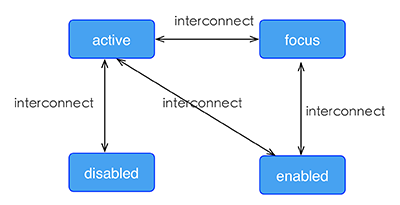 - -### ç¤ºä¾ - -```html -<template> - <div class="wrapper"> - <image :src="logoUrl" class="logo"></image> - </div> -</template> - -<style scoped> - .wrapper { - align-items: center; - margin-top: 120px; - } - .title { - font-size: 48px; - } - .logo { - width: 360px; - height: 82px; - background-color: red; - } - .logo:active { - width: 180px; - height: 82px; - background-color: green; - } -</style> - -<script> - export default { - props: { - logoUrl: { - default: 'https://alibaba.github.io/weex/img/weex_logo_b...@3x.png' - }, - target: { - default: 'World' - } - }, - methods: { - update (e) { - this.target = 'Weex'; - } - } - }; -</script> -``` - -[è¯ä¸ä¸](http://dotwe.org/vue/df2c8f254620d6d30d0906ee75fe5b99) - -## 线æ§æ¸å <span class="api-version">v0.10+</span> - -Weex æ¯æ线æ§æ¸åèæ¯ï¼å ·ä½ä»ç»å¯åè [W3C description of the gradient](https://developer.mozilla.org/en-US/docs/Web/CSS/CSS_Images/Using_CSS_gradients)ã - -ææç»ä»¶åæ¯æ线æ§æ¸åã - -### ä½¿ç¨ - - ä½ å¯ä»¥éè¿ `background-image` å±æ§å建线æ§æ¸åã - -```css -background-image: linear-gradient(to top,#a80077,#66ff00); -``` - -ç®åæä¸æ¯æ `radial-gradient`ï¼å¾åæ¸åï¼ã - -Weex ç®ååªæ¯æ两ç§é¢è²çæ¸åï¼æ¸åæ¹åå¦ä¸ï¼ - -* to right - ä»å·¦åå³æ¸å -* to left - ä»å³åå·¦æ¸å -* to bottom - ä»ä¸å°ä¸æ¸å -* to top - ä»ä¸å°ä¸æ¸å -* to bottom right - ä»å·¦ä¸è§å°å³ä¸è§ -* to top left - ä»å³ä¸è§å°å·¦ä¸è§ - -### Note - -- `background-image` ä¼å 级é«äº `background-color`ï¼è¿æå³çåæ¶è®¾ç½® `background-image` å `background-color`ï¼`background-color` 被è¦çã -- ä¸è¦ä½¿ç¨ `background` ç®å. - -### ç¤ºä¾ - -```html -<template> - <scroller style="background-color: #3a3a3a"> - <div class="container1" style="background-image:linear-gradient(to right,#a80077,#66ff00);"> - <text class="direction">to right</text> - </div> - <div class="container1" style="background-image:linear-gradient(to left,#a80077,#66ff00);"> - <text class="direction">to left</text> - </div> - <div class="container1" style="background-image:linear-gradient(to bottom,#a80077,#66ff00);"> - <text class="direction">to bottom</text> - </div> - <div class="container1" style="background-image:linear-gradient(to top,#a80077,#66ff00);"> - <text class="direction">to top</text> - </div> - <div style="flex-direction: row;align-items: center;justify-content: center"> - <div class="container2" style="background-image:linear-gradient(to bottom right,#a80077,#66ff00);"> - <text class="direction">to bottom right</text> - </div> - <div class="container2" style="background-image:linear-gradient(to top left,#a80077,#66ff00);"> - <text class="direction">to top left</text> - </div> - </div> - </scroller> -</template> -<style> - .container1 { - margin: 10px; - width: 730px; - height: 200px; - align-items: center; - justify-content: center; - border: solid; - border-radius: 10px; - } - - .container2 { - margin: 10px; - width: 300px; - height: 300px; - align-items: center; - justify-content: center; - border: solid; - border-radius: 10px; - } - - .direction { - font-size: 40px; - color: white; - } -</style> -``` - -## é´å½±(box-shadow) <span class="api-version">v0.11+</span> - -Weex æ¯æé´å½±å±æ§ï¼`active`, `focus`, `disabled`, `enabled` `inset(å¯é)`,`offset-x`,`offset-y`, `blur-radius`,`color` - - -### 注æ - -- box-shadowä» ä» æ¯æiOS - -### ç¤ºä¾ - -```html -<template> - <div class="wrapper"> - <div style="width:400px; height:60px;background-color: #FFE4C4; box-shadow:20px 10px rgb(255, 69, 0);"> - <text class="title" style="text-align: center">Hello {{target}}</text> - </div> - <div style="margin-top: 80px;width:400px; height:60px;background-color: #FFE4C4; box-shadow: 20px 10px 5px rgba(255, 69, 0, 0.8);"> - <text class="title" style="text-align: center">Hello {{target}}</text> - </div> - <div style="margin-top: 80px;width:400px; height:60px;background-color: #FFE4C4; box-shadow:inset 20px 10px 5px rgba(255, 69, 0, 0.8);"> - <text class="title" style="text-align: center">Hello {{target}}</text> - </div> - <div style="margin-top: 80px;width:400px; height:60px;background-color: #FFE4C4; box-shadow:inset 20px 10px 5px rgb(255, 69, 0);"> - <text class="title" style="text-align: center">Hello {{target}}</text> - </div> - <div style="margin-top: 80px;width:400px; height:60px;background-color: #FFE4C4; box-shadow:20px 10px 5px black;"> - <text class="title" style="text-align: center">Hello {{target}}</text> - </div> - <div style="margin-top: 80px;width:400px; height:60px;background-color: #FFE4C4; box-shadow:20px 10px 5px #008B00;"> - <text class="title" style="text-align: center">Hello {{target}}</text> - </div> - </div> -</template> - -<style scoped> - .wrapper {align-items: center; margin-top: 120px;} - .title {font-size: 48px;} -</style> - -<script> - module.exports = { - data: function () { - return { - logoUrl: 'https://alibaba.github.io/weex/img/weex_logo_b...@3x.png', - target: 'World' - }; - } - }; -</script> -``` - -## å ¶ä»åºæ¬æ ·å¼ - -- `opacity {number}`ï¼åå¼èå´ä¸º [0, 1] åºé´ãé»è®¤å¼æ¯ 1ï¼å³å®å ¨ä¸éæï¼0 æ¯å®å ¨éæï¼0.5 æ¯ 50% çéæ度ã -- `background-color {color}`ï¼è®¾å®å ç´ çèæ¯è²ï¼å¯éå¼ä¸ºè²å¼ï¼æ¯æRGBï¼ `rgb(255, 0, 0)` ï¼ï¼RGBAï¼ `rgba(255, 0, 0, 0.5)` ï¼ï¼åå è¿å¶ï¼ `#ff0000` ï¼ï¼ç²¾ç®åæ³çåå è¿å¶ï¼ `#f00` ï¼ï¼è²å¼å ³é®åï¼`red`ï¼ï¼é»è®¤å¼æ¯ `transparent` ã - -**注æï¼** [è²å¼çå ³é®åå表](./color-names.html)ã - -## ä¸ææ ·å¼ - -å¦æ对äºæ ·å¼åæ³éè¦æ´å¤ä¸æåèï¼å¯åèæ¯ä¸ªç»ä»¶çææ¡£ä¸ï¼é½æ常è§çä¾åå¯ä¾åèã - -ä½ å¯ä»¥æç §ä»¥ä¸æ¥éª¤æ¥è§å Weex 页é¢çæ ·å¼ã - -1. å ¨å±æ ·å¼è§åï¼å°æ´ä¸ªé¡µé¢åå²æåéç模åã -2. flex å¸å±ï¼æåå对é½é¡µé¢æ¨¡åã -3. å®ä½çåï¼å®ä½å¹¶è®¾ç½®å移éã -4. ç»èæ ·å¼å¤çï¼å¢å ç¹å®çå ·ä½æ ·å¼ã
http://git-wip-us.apache.org/repos/asf/incubator-weex/blob/8162f8c2/doc/source/cn/references/components/a.md ---------------------------------------------------------------------- diff --git a/doc/source/cn/references/components/a.md b/doc/source/cn/references/components/a.md deleted file mode 100644 index 5e54b0c..0000000 --- a/doc/source/cn/references/components/a.md +++ /dev/null @@ -1,85 +0,0 @@ ---- -title: <a> -type: references -order: 2.1 -version: 2.1 ---- - -# <a> - -`<a>` ç»ä»¶å®ä¹äºæåæ个页é¢çä¸ä¸ªè¶ é¾æ¥. æ¤ç»ä»¶çä½ç¨åç¨æ³ä¸HTML5ä¸ç [`<a>`](https://developer.mozilla.org/en-US/docs/Web/HTML/Element/a) é常类似ï¼åºå«å¨äº Weex ç `<a>` ç»ä»¶**ä¸è½**ç´æ¥å¨éé¢æ·»å ææ¬ï¼å符串ï¼ï¼å¦æè¦å±ç¤ºææ¬ï¼åºè¯¥æ·»å `<text>` ç»ä»¶ã - -## åç»ä»¶ - -æ¤ç»ä»¶æ¯æé¤äºèªå·±å¤çææ Weex ç»ä»¶ä½ä¸ºåç»ä»¶ã - -## ç¹æ§ - -- `href {string}`ï¼å®ä¹äºè¶ é¾æ¥ç URLã - -## æ ·å¼ - -`<a>` æ¯æææéç¨æ ·å¼ã - -- ç模å -- `flexbox` å¸å± -- `position` -- `opacity` -- `background-color` - -æ¥ç [ç»ä»¶éç¨æ ·å¼](../common-style.html)ã - -## äºä»¶ - -`<a>` æ¯æææéç¨äºä»¶ã - -- `click` - **注æï¼**æ们ä¸è½ä¿è¯ `click` äºä»¶å `href` 跳转çæ§è¡é¡ºåºã建议ä¸è¦ä½¿ç¨ `click` äºä»¶æ¥å¤ç `href` 跳转åçé»è¾å¤çã -- `longpress` -- `appear` -- `disappear` - -æ¥ç [éç¨äºä»¶](../common-event.html)ã - -## 约æ - -- **ä¸è½**ç´æ¥å¨ `<a>` ä¸æ·»å ææ¬ã - -- 请ä¸è¦ä¸º `<a>` æ·»å `click` äºä»¶ãæ们ä¸è½ç¡®ä¿ `click` äºä»¶å `href` 跳转çæ§è¡é¡ºåºã - -## ç¤ºä¾ - -```html -<template> - <div class="wrapper"> - <a class="button" href="http://dotwe.org/raw/dist/3e0e40f9ddad79f98cd236753965ffd8.js";> - <text class="text">Jump</text> - </a> - </div> -</template> - -<style scoped> - .wrapper { - flex-direction: column; - justify-content: center; - } - .button { - width: 450px; - margin-top: 30px; - margin-left: 150px; - padding-top: 20px; - padding-bottom: 20px; - border-width: 2px; - border-style: solid; - border-color: #DDDDDD; - background-color: #F5F5F5 - } - .text { - font-size: 60px; - color: #666666; - text-align: center; - } -</style> -``` - -[try it](http://dotwe.org/vue/025db54e37123ab5336a4b848397660f) http://git-wip-us.apache.org/repos/asf/incubator-weex/blob/8162f8c2/doc/source/cn/references/components/cell.md ---------------------------------------------------------------------- diff --git a/doc/source/cn/references/components/cell.md b/doc/source/cn/references/components/cell.md deleted file mode 100644 index 09f402f..0000000 --- a/doc/source/cn/references/components/cell.md +++ /dev/null @@ -1,108 +0,0 @@ ---- -title: <cell> -type: references -order: 2.6 -version: 2.1 ---- - -# <cell> - -ç¨äºå®ä¹å表ä¸çåå表项ï¼ç±»ä¼¼äº HTML ä¸ç `ul` ä¹äº `li`ãWeex ä¼å¯¹ `<cell>` è¿è¡é«æçå ååæ¶ä»¥è¾¾å°æ´å¥½çæ§è½ï¼è¯¥ç»ä»¶å¿ é¡»ä½ä¸º[`<list>`](./list.html) ç»ä»¶çåç»ä»¶, è¿æ¯ä¸ºäºä¼åæ»å¨æ¶çæ§è½ã - -## åç»ä»¶ - -æ¯æææ Weex çç»ä»¶ä½ä¸ºå®çåç»ä»¶ã - -## å±æ§ -* `keep-scroll-position {boolean}`: <span class="api-version">v0.11+</span> List æå ¥æ°æ®åæ¯å¦ä¿æä¸æ¬¡æ»å¨çä½ç½® - -## æ ·å¼ - -**注æï¼** - -ç±äº `<cell>` æ¬èº«æ¯ä¸ä¸ªå®¹å¨ï¼å ¶å¸å±ç± `<list>` è¿è¡ç®¡çï¼ä½ ä¸è½ç» `<cell>` 设å®`flex`å¼ã `<cell>`ç宽度çäºç¶ç»ä»¶ `<list>` ç宽度ï¼å¹¶ä¸ `<cell>` é«åº¦èªéåºï¼æå® `margin` æ ·å¼ä¹ä¸èµ·ä½ç¨ã - -- éç¨æ ·å¼ï¼æ¯æææéç¨æ ·å¼ - - - ç模å - - `flexbox` å¸å± - - `position` - - `opacity` - - `background-color` - - æ¥ç [ç»ä»¶éç¨æ ·å¼](../common-style.html) - -## äºä»¶ - -- éç¨äºä»¶ - - æ¯æææéç¨äºä»¶ï¼ - - - `click` - - `longpress` - - `appear` - - `disappear` - - æ¥ç [éç¨äºä»¶](../common-event.html) - -## ç¤ºä¾ - -```html -<template> - <list class="list" @loadmore="fetch" loadmoreoffset="10"> - <cell class="cell" v-for="num in lists"> - <div class="panel"> - <text class="text">{{num}}</text> - </div> - </cell> - </list> -</template> - -<script> - const modal = weex.requireModule('modal') - const LOADMORE_COUNT = 4 - - export default { - data () { - return { - lists: [1, 2, 3, 4, 5] - } - }, - methods: { - fetch (event) { - modal.toast({ message: 'loadmore', duration: 1 }) - - setTimeout(() => { - const length = this.lists.length - for (let i = length; i < length + LOADMORE_COUNT; ++i) { - this.lists.push(i + 1) - } - }, 800) - } - } - } -</script> - -<style scoped> - .panel { - width: 600px; - height: 250px; - margin-left: 75px; - margin-top: 35px; - margin-bottom: 35px; - flex-direction: column; - justify-content: center; - border-width: 2px; - border-style: solid; - border-color: rgb(162, 217, 192); - background-color: rgba(162, 217, 192, 0.2); - } - .text { - font-size: 50px; - text-align: center; - color: #41B883; - } -</style> -``` - -[try it](http://dotwe.org/vue/d31c85e7cd2dc54fa098e920a5376c38) http://git-wip-us.apache.org/repos/asf/incubator-weex/blob/8162f8c2/doc/source/cn/references/components/div.md ---------------------------------------------------------------------- diff --git a/doc/source/cn/references/components/div.md b/doc/source/cn/references/components/div.md deleted file mode 100644 index 90d8711..0000000 --- a/doc/source/cn/references/components/div.md +++ /dev/null @@ -1,116 +0,0 @@ ---- -title: <div> -type: references -order: 2.3 -version: 2.1 ---- - -# <div> - -`<div>` ç»ä»¶æ¯ç¨äºå è£ å ¶å®ç»ä»¶çæåºæ¬å®¹å¨ãæ¯æææçéç¨æ ·å¼ãç¹æ§ã`flexbox` å¸å±ãå ¶ç±»ä¼¼äº HTML ç `<div>` 容å¨ï¼ä½**ä¸è½**ç´æ¥å¨éé¢æ·»å ææ¬ï¼å符串ï¼ï¼å¦æè¦å±ç¤ºææ¬ï¼åºè¯¥ä½¿ç¨ `<text>` ç»ä»¶ãåå²çæ¬ä¸ï¼`<div>` å«åæ¯ `<container>`ï¼ç®å**å·²ç»å¼ç¨**ã - -**注æï¼** - -`<div>` åµå¥å±çº§ä¸å¯è¿æ·±ï¼å¦å容æå¼èµ·æ§è½é®é¢ï¼å»ºè®®æ§å¶å¨ **10** å±ä»¥å ã - -ä¸ä¸ªç®åä¾åï¼ - -```html -<template> - <div> - <text class="text">Hello World!</text> - </div> -</template> - -<style> -.text { - font-size: 70px; - color: #ff0000 -} -</style> - -<script></script> -``` - -[ä½éªä¸ä¸](http://dotwe.org/vue/ea4f528a0b381640b77ba03fcc69a90a) - - - -## åç»ä»¶ - -`<div>` åºæ¬å®¹å¨ç»ä»¶ï¼å æ¤æ¯æå æ¬ `<div>` å¨å çä»»ä½ç»ä»¶ä½ä¸ºèªå·±çåç»ä»¶ãå æ¤ï¼å¨åä¸ä¸ªç»ä»¶æ¶ï¼æ¨èå¤å±ä½¿ç¨ `<div>` ä½ä¸ºæ ¹å®¹å¨ã - -## æ ·å¼ - -`<div>` æ¯æææéç¨æ ·å¼ï¼ - -- ç模å -- `flexbox` å¸å± -- `position` -- `opacity` -- `background-color` - -æ¥ç [ç»ä»¶éç¨æ ·å¼](../common-style.html) - -## äºä»¶ - -`<div>` æ¯æææéç¨äºä»¶ï¼ - -- `click` -- `longpress` -- `appear` -- `disappear` - -æ¥ç [éç¨äºä»¶](../common-event.html) - -## 约æ - -1. **ä¸è½**ç´æ¥å¨ `<div>` ä¸æ·»å ææ¬ã - - é误示ä¾ï¼âHello World!â æ æ³è¢«æ£å¸¸æ¸²æã - - ```html - <template> - <div>Hello World!</div> - </template> - - <style> - .text { - font-size: 70; - color: #ff0000 - } - </style> - - <script></script> - ``` - - [ä½éªä¸ä¸](http://dotwe.org/vue/541f016de379c8764ddcdd9da0cabc24) - -2. `<div>` å¨ native ä¸ä¸å¯æ»å¨ï¼å³ä½¿æ¾å¼è®¾ç½®é«åº¦ä¹ä¸æ ·ã - - [é误示ä¾](http://dotwe.org/vue/6795753d1a51662b8a7282b129dc7ddf) - -## ç¤ºä¾ - -```html -<template> - <div> - <div class="box"></div> - </div> -</template> - -<style scoped> - .box { - border-width: 2px; - border-style: solid; - border-color: #BBB; - width: 250px; - height: 250px; - margin-top: 250px; - margin-left: 250px; - background-color: #EEE; - } -</style> -``` - -[try it](http://dotwe.org/vue/edfbd1806508cb86254b03dc0b8e28ac) http://git-wip-us.apache.org/repos/asf/incubator-weex/blob/8162f8c2/doc/source/cn/references/components/image.md ---------------------------------------------------------------------- diff --git a/doc/source/cn/references/components/image.md b/doc/source/cn/references/components/image.md deleted file mode 100644 index c096a48..0000000 --- a/doc/source/cn/references/components/image.md +++ /dev/null @@ -1,185 +0,0 @@ ---- -title: <image> -type: references -order: 2.4 -version: 2.1 ---- - -# <image> - -`<image>` ç»ä»¶ç¨äºæ¸²æå¾çï¼å¹¶ä¸å®ä¸è½å å«ä»»ä½åç»ä»¶ãæ°ç Vue 2.0 ä¸**ä¸æ¯æ**ç¨ `<img>` ä½ç®åã - -éè¦æ³¨æçæ¯ï¼éè¦æç¡®æå® `width` å `height`ï¼å¦åå¾çæ æ³æ¾ç¤ºã - -ç®åä¾åï¼ - -```html -<template> - <div> - <image style="width: 560px;height: 560px;" src="https://img.alicdn.com/tps/TB1z.55OFXXXXcLXXXXXXXXXXXX-560-560.jpg";></image> - </div> -</template> -``` - -[ä½éªä¸ä¸](http://dotwe.org/vue/1d6145d98cbdb8c66c69b4d4dcd2744d) - -## åç»ä»¶ - -`<image>` ç»ä»¶ä¸æ¯æä»»ä½åç»ä»¶ï¼å æ¤ä¸è¦å°è¯å¨ `<image>` ç»ä»¶ä¸æ·»å ä»»ä½ç»ä»¶ãå¦æéè¦å®ç° `background-image` çææï¼å¯ä»¥ä½¿ç¨ `<image>` ç»ä»¶å `position` å®ä½æ¥ç°å®ï¼å¦ä¸é¢ä»£ç ã - -```html -<template> - <div> - <image style="width:750px; height:750px;" src="https://img.alicdn.com/tps/TB1z.55OFXXXXcLXXXXXXXXXXXX-560-560.jpg";></image> - <div class="title"> - <text style="font-size:50px; color: #ff0000">ä½ å¥½ï¼image</text> - </div> - </div> -</template> -<style> - .title{ - position:absolute; - top:50; - left:10; - } -</style> -``` - -[ä½éªä¸ä¸](http://dotwe.org/vue/0a81d27b5dbc68ea3bf5f9fd56c882e8) - -## ç¹æ§ - -`<image>` ç»ä»¶ï¼å å« `src` å `resize` 两个éè¦ç¹æ§ã - -- `src {string}`ï¼å®ä¹å¾çé¾æ¥ï¼ç®åå¾çæä¸æ¯ææ¬å°å¾çã -- `resize {string}`ï¼å¯ä»¥æ§å¶å¾ççæ伸ç¶æï¼å¼è¡ä¸ºå W3C æ åä¸è´ã - - å¯éå¼ä¸ºï¼ - - - `stretch`ï¼é»è®¤å¼ï¼æå®å¾çæç §å®¹å¨æ伸ï¼æå¯è½ä½¿å¾ç产çå½¢åã - - `cover`ï¼æå®å¾çå¯ä»¥è¢«è°æ´å°å®¹å¨ï¼ä»¥ä½¿å¾çå®å ¨è¦çèæ¯åºåï¼å¾çæå¯è½è¢«åªè£ã - - `contain`ï¼æå®å¯ä»¥ä¸ç¨èè容å¨ç大å°ï¼æå¾åæ©å±è³æ大尺寸ï¼ä»¥ä½¿å ¶å®½åº¦åé«åº¦å®å ¨éåºå 容åºåã - - ä¾åï¼ - -  - -- `placeholder`: <span class="api-version">v0.9+</span> <string> å½æºå¾çä¸è½½ä¸æ¶æ¾ç¤ºä¸å¼ å ä½å¾ã - - [ä½éªä¸ä¸](http://dotwe.org/vue/18e71ab3484bb6751ad77ff7d5195404) - -## æ ·å¼ - -- éç¨æ ·å¼ï¼æ¯æææéç¨æ ·å¼ - - - ç模å - - `flexbox` å¸å± - - `position` - - `opacity` - - `background-color` - - æ¥ç [ç»ä»¶éç¨æ ·å¼](../common-style.html) - -## äºä»¶ - -- `load`: <sup class="api-version">v0.8+</sup>ï¼å½å¾çå è½½å®ææ¶è§¦åãç®åå¨ AndroidãiOS ä¸æ¯æï¼H5 æä¸æ¯æã[示ä¾](http://dotwe.org/vue/e291159ac60b35dcd4994638a78d54ad) - - - äºä»¶å¯¹è±¡ - - `success`: å½å¾çæåå è½½æ¶ä¸º`true`ï¼å¦å为`false` - - `size`: å¾ççåå§å°ºå¯¸ï¼å å«ä¸¤ä¸ªåæ°ï¼`naturalWidth` 代表å¾ççåå§å®½åº¦åç´ å¼ï¼`naturalHeight` 代表å¾ççåå§é«åº¦å¼ãè¿ä¸¤ä¸ªåæ°çé»è®¤å¼é½ä¸º`0` - -- éç¨äºä»¶ - - æ¯æææéç¨äºä»¶ï¼ - - - `click` - - `longpress` - - `appear` - - `disappear` - - æ¥ç [éç¨äºä»¶](../common-event.html) - -## ç»ä»¶æ¹æ³ - <sup class="api-version">v0.16.0+</sup> - - - saveï¼ä¿åå½åå¾çå°æ¬å° - - åæ° - åè°å½æ°ä½ä¸ºæ¹æ³å ¥åï¼æ¥æ¶ä¿åç»æ. - ``` - var image = this.$refs.imageRef; // image æ¯ä¹åå·²ç»å®ä¹è¿çref - image.save(function(result) { - console.log(JSON.stringify(result)) - }); - ``` - - å¼æ¥è¿åçæ°æ®æè¿° - ``` - { -  "success" : true/false, // ä¿åæåæ失败 -  "errorDesc": "errordesc" // å¨success 为falseçæ åµä¼è¿å - } - ``` - - 说æ -Â å¯¹äº iOS ç³»ç»éè¦æ·»å `NSPhotoLibraryAddUsageDescription`ç¸å访é®æé, iOS 11 éè¦åæ·»å ä¸ä¸ª`NSPhotoLibraryAddUsageDescription`æé, [æ¥çæ´å¤iOSç³»ç»æé](https://developer.apple.com/library/content/documentation/General/Reference/InfoPlistKeyReference/Articles/CocoaKeys.html) - - [è¯ä¸è¯](http://dotwe.org/vue/fadcd44a7031943ff0feaaf1895df414) - -## 约æ - -1. éè¦æå®å®½é«ï¼ -2. ä¸æ¯æåç»ä»¶ã - -## ç¤ºä¾ - -```html -<template> - <scroller class="wrapper" > - <div class="page-head" > - <image class="title-bg" resize="cover" src="https://img.alicdn.com/tps/TB1dX5NOFXXXXc6XFXXXXXXXXXX-750-202.png";></image> - <div class="title-box"> - <text class="title">Alan Mathison Turing</text> - </div> - </div> - <div class="article"> - <text class="paragraph">Alan Mathison Turing ( 23 June 1912 â 7 June 1954) was an English computer scientist, mathematician, logician, cryptanalyst and theoretical biologist. He was highly influential in the development of theoretical computer science, providing a formalisation of the concepts of algorithm and computation with the Turing machine, which can be considered a model of a general purpose computer.Turing is widely considered to be the father of theoretical computer science and artificial intelligence.</text> - <text class="paragraph">During the Second World War, Turing worked for the Government Code and Cypher School (GC&CS) at Bletchley Park, Britain's codebreaking centre. For a time he led Hut 8, the section responsible for German naval cryptanalysis. He devised a number of techniques for speeding the breaking of German ciphers, including improvements to the pre-war Polish bombe method, an electromechanical machine that could find settings for the Enigma machine. Turing played a pivotal role in cracking intercepted coded messages that enabled the Allies to defeat the Nazis in many crucial engagements, including the Battle of the Atlantic; it has been estimated that this work shortened the war in Europe by more than two years and saved over fourteen million lives.</text> - <text class="paragraph">After the war, he worked at the National Physical Laboratory, where he designed the ACE, among the first designs for a stored-program computer. In 1948 Turing joined Max Newman's Computing Machine Laboratory at the Victoria University of Manchester, where he helped develop the Manchester computers and became interested in mathematical biology. He wrote a paper on the chemical basis of morphogenesis, and predicted oscillating chemical reactions such as the BelousovâZhabotinsky reaction, first observed in the 1960s.</text> - <text class="paragraph">Turing was prosecuted in 1952 for homosexual acts, when by the Labouchere Amendment, "gross indecency" was still criminal in the UK. He accepted chemical castration treatment, with DES, as an alternative to prison. Turing died in 1954, 16 days before his 42nd birthday, from cyanide poisoning. An inquest determined his death as suicide, but it has been noted that the known evidence is also consistent with accidental poisoning. In 2009, following an Internet campaign, British Prime Minister Gordon Brown made an official public apology on behalf of the British government for "the appalling way he was treated." Queen Elizabeth II granted him a posthumous pardon in 2013.</text> - </div> - </scroller> -</template> - -<style> - .page-head { - width: 750px; - height: 200px; - } - .title-bg { - width: 750px; - height: 200px; - } - .title-box { - width: 750px; - height: 200px; - justify-content: center; - align-items: center; - position: absolute; - top: 0; - right: 0; - bottom: 0; - left: 0; - } - .title { - color: #ffffff; - font-size: 32px; - font-weight: bold; - } - .article { - padding: 20px; - } - .paragraph{ - margin-bottom: 15px; - } -</style> -``` - -[try it](http://dotwe.org/vue/e2122bc245beafb0348d79bfd1274904) http://git-wip-us.apache.org/repos/asf/incubator-weex/blob/8162f8c2/doc/source/cn/references/components/index.md ---------------------------------------------------------------------- diff --git a/doc/source/cn/references/components/index.md b/doc/source/cn/references/components/index.md deleted file mode 100644 index 9a02e72..0000000 --- a/doc/source/cn/references/components/index.md +++ /dev/null @@ -1,24 +0,0 @@ ---- -title: å 建ç»ä»¶ -type: references -order: 2 -version: 2.1 ---- - -# å 建ç»ä»¶ - -- [<a>](./a.html) -- [<indicator>](./indicator.html) -- [<switch>](./switch.html) -- [<text>](./text.html) -- [<textarea>](./textarea.html) -- [<video>](./video.html) -- [<web>](./web.html) -- [<div>](./div.html) -- [<image>](./image.html) -- [<input>](./input.html) -- [<list>](./list.html) -- [<cell>](./cell.html) -- [<refresh> & <loading>](./refresh.html) -- [<scroller>](./scroller.html) -- [<slider>](./slider.html) \ No newline at end of file http://git-wip-us.apache.org/repos/asf/incubator-weex/blob/8162f8c2/doc/source/cn/references/components/indicator.md ---------------------------------------------------------------------- diff --git a/doc/source/cn/references/components/indicator.md b/doc/source/cn/references/components/indicator.md deleted file mode 100644 index aa1cab4..0000000 --- a/doc/source/cn/references/components/indicator.md +++ /dev/null @@ -1,136 +0,0 @@ ---- -title: <indicator> -type: references -order: 2.11 -version: 2.1 ---- - -# <indicator> - -`<indicator>` ç»ä»¶ç¨äºæ¾ç¤ºè½®æå¾æ示å¨ææï¼å¿ é¡»å å½ [`<slider>`](./slider.html) ç»ä»¶çåç»ä»¶ä½¿ç¨ã - -## åç»ä»¶ - -`<indicator>` ç»ä»¶æ²¡æä»»ä½åç»ä»¶ã - -## æ ·å¼ - -`<indicator>` ç»ä»¶æä¸äºç§ææ ·å¼ï¼å¦ä¸ï¼ - -- `item-color {color}`ï¼è®¾ç½®é¡¹çé¢è²ï¼å¯ä»¥æ¯é¢è²çå称ï¼ä¾å¦ `red`ï¼ä¹å¯ä»¥æ¯ 16 è¿å¶çé¢è²ï¼ä¾å¦ `#RRGGBB`ã - -- `item-selected-color {color}`ï¼è¢«éä¸æ¶çé¢è²ï¼å¯ä»¥æ¯é¢è²çå称ï¼`red`ï¼ä¹å¯ä»¥æ¯ 16 è¿å¶çé¢è²ï¼ä¾å¦ `#RRGGBB`ã - -- `item-size {number}`ï¼å ç´ ç个æ°ã - -- éç¨æ ·å¼ - - ç模å - - `flexbox` å¸å± - - `position` - - `opacity` - - `background-color` - - æ¥ç [ç»ä»¶éç¨æ ·å¼](../common-style.html) - -**注æ 1ï¼** - -è¿ééè¦æ³¨æä¸ç¹ï¼`<indicator>` ç `position` ä¸ä» ä¾èµ `top`ã`left`ã`bottom` å `right` æ ·å¼ï¼åæ¶ä¼åè `width`å `height` æ ·å¼ã`<indicator>` é»è®¤ç宽é«ç»§æ¿äº `<slider>`ï¼å¦æ `<slider>` æªè®¾ç½®å®½é«ï¼éè¦æ¾å¼çç» `<indicator>` 设置宽é«å¼ã - -**注æ 2ï¼** - -`background-color` ä¸æ¨è使ç¨ï¼å»ºè®®ä½¿ç¨ `item-color` å `item-selected-color` 代æ¿ã - - -## äºä»¶ - -æ¯æææéç¨äºä»¶ã - -- `click` -- `longpress` -- `appear` -- `disappear` - -æ¥ç [éç¨äºä»¶](../common-event.html) - -## 约æ - -1. ä¸æ¯æåç»ä»¶ã - -## ç¤ºä¾ - -```html -<template> - <div> - <slider class="slider" interval="4500" @change="onchange"> - <div class="frame" v-for="img in imageList"> - <image class="image" resize="cover" :src="img.src"></image> - <text class="title">{{img.title}}</text> - </div> - <indicator class="indicator"></indicator> - </slider> - </div> -</template> - -<style> - .image { - width: 700px; - height: 700px; - } - .slider { - margin-top: 25px; - margin-left: 25px; - width: 700px; - height: 700px; - border-width: 2px; - border-style: solid; - border-color: #41B883; - } - .title { - position: absolute; - top: 20px; - left: 20px; - padding-left: 20px; - width: 200px; - color: #FFFFFF; - font-size: 36px; - line-height: 60px; - background-color: rgba(0, 0, 0, 0.3); - } - .frame { - width: 700px; - height: 700px; - position: relative; - } - .indicator { - width: 700px; - height: 700px; - item-color: green; - item-selected-color: red; - item-size: 50px; - position: absolute; - top: 200px; - left: 200px; - } -</style> - -<script> - export default { - data () { - return { - imageList: [ - { title: 'item A', src: 'https://gd2.alicdn.com/bao/uploaded/i2/T14H1LFwBcXXXXXXXX_!!0-item_pic.jpg'}, - { title: 'item B', src: 'https://gd1.alicdn.com/bao/uploaded/i1/TB1PXJCJFXXXXciXFXXXXXXXXXX_!!0-item_pic.jpg'}, - { title: 'item C', src: 'https://gd3.alicdn.com/bao/uploaded/i3/TB1x6hYLXXXXXazXVXXXXXXXXXX_!!0-item_pic.jpg'} - ] - } - }, - methods: { - onchange (event) { - console.log('changed:', event.index) - } - } - } -</script> -``` - -[try it](http://dotwe.org/vue/e1b4fd8a37ed4cafd8f5e161698754aa) http://git-wip-us.apache.org/repos/asf/incubator-weex/blob/8162f8c2/doc/source/cn/references/components/input.md ---------------------------------------------------------------------- diff --git a/doc/source/cn/references/components/input.md b/doc/source/cn/references/components/input.md deleted file mode 100644 index 3cf83fd..0000000 --- a/doc/source/cn/references/components/input.md +++ /dev/null @@ -1,344 +0,0 @@ ---- -title: <input> -type: references -order: 2.5 -version: 2.1 ---- - -# <input> - -Weex å ç½®ç `<input>` ç»ä»¶ç¨æ¥å建æ¥æ¶ç¨æ·è¾å ¥å符çè¾å ¥ç»ä»¶ã `<input>` ç»ä»¶çå·¥ä½æ¹å¼å `type` å±æ§çå¼èå¼ï¼æ¯å¦ `<text>`ï¼Â `password`ï¼`url`ï¼`email`ï¼`tel` çã - -**注æï¼** - -æ¤ç»ä»¶ä¸æ¯æ `click` äºä»¶ã请çå¬ `<input>` æ `change` æ¥ä»£æ¿ `click` äºä»¶ã - -## åç»ä»¶ - -ä¸æ¯æåç»ä»¶ã - -## ç¹æ§ - -- `type {string}`ï¼æ§ä»¶çç±»åï¼é»è®¤å¼æ¯Â `<text>`ã`type` å¼å¯ä»¥æ¯ `text`ï¼`password`ï¼`url`ï¼`email`ï¼`tel` ï¼`number` ãæ¯ä¸ª `type` å¼é½ç¬¦å W3C æ åã -- `value {string}`ï¼ç»ä»¶çæ¥æ¶å°çè¾å ¥å符ã -- `placeholder {string}`ï¼æ示ç¨æ·å¯ä»¥è¾å ¥ä»ä¹ã æ示ææ¬ä¸è½æå车ææ¢è¡ã -- `disabled {boolean}`ï¼å¸å°ç±»åçæ°æ®ï¼è¡¨ç¤ºæ¯å¦æ¯æè¾å ¥ãé常 `click` äºä»¶å¨ `disabled` æ§ä»¶ä¸æ¯å¤±æçã -- `autofocus {boolean}`ï¼å¸å°ç±»åçæ°æ®ï¼è¡¨ç¤ºæ¯å¦å¨é¡µé¢å è½½æ¶æ§ä»¶èªå¨è·å¾è¾å ¥ç¦ç¹ã -- `maxlength {nubmer}`ï¼<sup class="wx-v">v0.7</sup>ä¸ä¸ªæ°å¼ç±»åçå¼ï¼è¡¨ç¤ºè¾å ¥çæ大é¿åº¦ã -- `return-key-type {string}`ï¼<sup class="wx-v">v0.11</sup>é®çè¿åé®çç±»å,æ¯æ defalut;go;next;search;send,doneã - -## æ ·å¼ - -- `placeholder-color {color}`ï¼placeholder å符é¢è²ãé»è®¤å¼æ¯Â `#999999` - - -- 伪类<span class="api-version">v0.9.5+</span>: `input` æ¯æ以ä¸ä¼ªç±»ï¼ - - * `active` - * `focus` - * `disabled` - * `enabled` - -- text styles - - æ¯æ `color` - - æ¯æ `font-size` - - æ¯æ `font-style` - - æ¯æ `font-weight` - - æ¯æ `text-align` - - æ¥ç [ææ¬æ ·å¼](../text-style.html) - -- éç¨æ ·å¼ï¼æ¯æææéç¨æ ·å¼ - - ç模å - - `flexbox` å¸å± - - `position` - - `opacity` - - `background-color` - - æ¥ç [ç»ä»¶éç¨æ ·å¼](../common-style.html) - -## äºä»¶ - -- `input`: è¾å ¥å符çå¼æ´æ¹ã - - äºä»¶ä¸ event 对象å±æ§ï¼ - - - `value`: 触åäºä»¶çç»ä»¶ï¼ - - `timestamp`: äºä»¶åçæ¶çæ¶é´æ³,ä» æ¯æAndroidã - -- `change`: å½ç¨æ·è¾å ¥å®ææ¶è§¦åãé常å¨Â `blur` äºä»¶ä¹åã - - äºä»¶ä¸ event 对象å±æ§ï¼ - - - `value`: 触åäºä»¶çç»ä»¶ï¼ - - - `timestamp`: äºä»¶åçæ¶çæ¶é´æ³,ä» æ¯æAndroidã - -- `focus`: ç»ä»¶è·å¾è¾å ¥ç¦ç¹ã - - äºä»¶ä¸ event 对象å±æ§ï¼ - - - `timestamp`: äºä»¶åçæ¶çæ¶é´æ³,ä» æ¯æAndroidã - -- `blur`: ç»ä»¶å¤±å»è¾å ¥ç¦ç¹ã - - äºä»¶ä¸ event 对象å±æ§ï¼ - - - `timestamp`: äºä»¶åçæ¶çæ¶é´æ³,ä» æ¯æAndroidã -- `return`: é®çç¹å»è¿åé®ã - - äºä»¶ä¸ event 对象å±æ§ï¼ - - - `returnKeyType`: äºä»¶åçæ¶çè¿åé®ç±»åã - - `value`: 触åäºä»¶çç»ä»¶çææ¬ï¼ - -- éç¨äºä»¶ - - **注æï¼** - ä¸æ¯æ `click` äºä»¶ã 请çå¬ `input` æ `change` äºä»¶ä»£æ¿ã - - æ¯æ以ä¸éç¨äºä»¶ï¼ - - - `longpress` - - `appear` - - `disappear` - - æ¥ç [éç¨äºä»¶](../common-event.html) - - - -## Methods - -- `focus()` <span class="api-version">v0.9+</span> - - `focus()` æ¹æ³ç¨äºå° `input` ç»ä»¶èç¦ã - -- `blur()` <span class="api-version">v0.9+</span> - - `blur()` æ¹æ³ç¨äºä» `input` ç»ä»¶ä¸ç§»é¤ç¦ç¹å¹¶å ³é软é®çï¼å¦æå®å ·æç¦ç¹ï¼ã -- `setSelectionRange(selectionStart,selectionEnd)` <span class="api-version">v0.11+</span>设置ææ¬éåº - - `selectionStart {number}`ï¼è®¾ç½®ææ¬éåºçèµ·å§ç¹ - - `selectionEnd {number}`ï¼è®¾ç½®ææ¬éåºçèµ·ç»ç¹ -- `getEditSelectionRange(callback[selectionStart,selectionEnd])` <span class="api-version">v0.11+</span>设置ææ¬éåº - - `selectionStart {number}`ï¼è·åææ¬éåºçèµ·å§ç¹ - - `selectionEnd {number}`ï¼è·åææ¬éåºçèµ·ç»ç¹ -## 约æ - -ç®åä¸æ¯æ `this.$el(id).value = ''` è¿ç§æ¹å¼æ¹å input valueãåªæ¯æå¨ `<input>` ç»ä»¶ç `input`ã`change` äºä»¶ä¸æ¹åã - -## ç¤ºä¾ - -```html -<template> - <div> - <div> - <text style="font-size: 40px">oninput: {{txtInput}}</text> - <text style="font-size: 40px">onchange: {{txtChange}}</text> - <text style="font-size: 40px">onreturntype: {{txtReturnType}}</text> - <text style="font-size: 40px">selection: {{txtSelection}}</text> - - </div> - <scroller> - <div> - <div style="background-color: #286090"> - <text class="title" style="height: 80 ;padding: 20;color: #FFFFFF">input type = text</text> - </div> - <input type="text" placeholder="Input Text" class="input" :autofocus=true value="" @change="onchange" @input="oninput"/> - </div> - - <div> - <div style="background-color: #286090"> - <text class="title" style="height: 80 ;padding: 20;color: #FFFFFF">input type = password</text> - </div> - <input type="password" placeholder="Input Password" class="input" @change="onchange" @input="oninput"/> - </div> - - <div> - <div style="background-color: #286090"> - <text class="title" style="height: 80 ;padding: 20;color: #FFFFFF">input type = url</text> - </div> - <input type="url" placeholder="Input URL" class="input" @change="onchange" @input="oninput"/> - </div> - - <div> - <div style="background-color: #286090"> - <text class="title" style="height: 80 ;padding: 20;color: #FFFFFF">input type = email</text> - </div> - <input type="email" placeholder="Input Email" class="input" @change="onchange" @input="oninput"/> - </div> - - <div> - <div style="background-color: #286090"> - <text class="title" style="height: 80 ;padding: 20;color: #FFFFFF">input type = tel</text> - </div> - <input type="tel" placeholder="Input Tel" class="input" @change="onchange" @input="oninput"/> - </div> - - <div> - <div style="background-color: #286090"> - <text class="title" style="height: 80 ;padding: 20;color: #FFFFFF">input type = time</text> - </div> - <input type="time" placeholder="Input Time" class="input" @change="onchange" @input="oninput"/> - </div> - - <div> - <div style="background-color: #286090"> - <text class="title" style="height: 80 ;padding: 20;color: #FFFFFF">input type = number</text> - </div> - <input type="number" placeholder="Input number" class="input" @change="onchange" @input="oninput"/> - </div> - - <div> - <div style="background-color: #286090"> - <text class="title" style="height: 80 ;padding: 20;color: #FFFFFF">input type = date</text> - </div> - <input type="date" placeholder="Input Date" class="input" @change="onchange" @input="oninput" max="2017-12-12" min="2015-01-01"/> - </div> - - <div> - <div style="background-color: #286090"> - <text class="title" style="height: 80 ;padding: 20;color: #FFFFFF">input return-key-type = default</text> - </div> - <input type="text" placeholder="please input" return-key-type="default" class="input" @change="onchange" @return = "onreturn" @input="oninput" /> - </div> - - <div> - <div style="background-color: #286090"> - <text class="title" style="height: 80 ;padding: 20;color: #FFFFFF">input return-key-type = go</text> - </div> - <input type="text" placeholder="please input" return-key-type="go" class="input" @change="onchange" @return = "onreturn" @input="oninput" /> - </div> - - <div> - <div style="background-color: #286090"> - <text class="title" style="height: 80 ;padding: 20;color: #FFFFFF">input return-key-type = next</text> - </div> - <input type="text" placeholder="please input" return-key-type="next" class="input" @change="onchange" @return = "onreturn" @input="oninput" /> - </div> - - <div> - <div style="background-color: #286090"> - <text class="title" style="height: 80 ;padding: 20;color: #FFFFFF">input return-key-type = search</text> - </div> - <input type="text" placeholder="please input" return-key-type="search" class="input" @change="onchange" @return = "onreturn" @input="oninput" /> - </div> - - <div> - <div style="background-color: #286090"> - <text class="title" style="height: 80 ;padding: 20;color: #FFFFFF">input return-key-type = send</text> - </div> - <input type="text" placeholder="please input" return-key-type="send" class="input" @change="onchange" @return = "onreturn" @input="oninput" /> - </div> - - <div> - <div style="background-color: #286090"> - <text class="title" style="height: 80 ;padding: 20;color: #FFFFFF">input return-key-type = done</text> - </div> - <input type="text" placeholder="please input" return-key-type="done" class="input" @change="onchange" @return = "onreturn" @input="oninput" /> - </div> - - - <div> - <div style="background-color: #286090"> - <text class="title" style="height: 80 ;padding: 20;color: #FFFFFF">function focus() & blur()</text> - </div> - <div style="flex-direction: row;margin-bottom: 16px;justify-content: space-between"> - <text class="button" value="Focus" type="primary" @click="focus"></text> - <text class="button" value="Blur" type="primary" @click="blur"></text> - </div> - - <input type="text" placeholder="Input1" class="input" value="" ref="input1"/> - </div> - - - <div> - <div style="background-color: #286090"> - <text class="title" style="height: 80 ;padding: 20;color: #FFFFFF">input selection</text> - </div> - <div style="flex-direction: row;margin-bottom: 16px;justify-content: space-between"> - <text class="button" value="setRange" type="primary" @click="setRange"></text> - <text class="button" value="getSelectionRange" type="primary" @click="getSelectionRange"></text> - </div> - <input type="text" ref="inputselection" placeholder="please input" value="123456789" class="input" @change="onchange" @return = "onreturn" @input="oninput"/> - </div> - - - - </scroller> - </div> -</template> - -<style scoped> - .input { - font-size: 60px; - height: 80px; - width: 750px; - } - .button { - font-size: 36; - width: 200; - color: #41B883; - text-align: center; - padding-top: 10; - padding-bottom: 10; - border-width: 2; - border-style: solid; - margin-right: 20; - border-color: rgb(162, 217, 192); - background-color: rgba(162, 217, 192, 0.2); - } -</style> - -<script> - module.exports = { - data: function () { - return { - txtInput: '', - txtChange: '', - txtReturnType: '', - txtSelection:'', - autofocus: false - }; - }, - methods: { - ready: function () { - var self = this; - setTimeout(function () { - self.autofocus = true; - }, 1000); - }, - onchange: function (event) { - this.txtChange = event.value; - console.log('onchange', event.value); - }, - onreturn: function (event) { - this.txtReturnType = event.returnKeyType; - console.log('onreturn', event.type); - }, - oninput: function (event) { - this.txtInput = event.value; - console.log('oninput', event.value); - }, - focus: function () { - this.$refs['input1'].focus(); - }, - blur: function () { - this.$refs['input1'].blur(); - }, - setRange: function() { - console.log(this.$refs["inputselection"]); - this.$refs["inputselection"].setSelectionRange(2, 6); - }, - getSelectionRange: function() { - console.log(this.$refs["inputselection"]); - var self = this; - this.$refs["inputselection"].getSelectionRange(function(e) { - self.txtSelection = e.selectionStart +'-' + e.selectionEnd; - }); - } - } - }; -</script> -``` - -[ä½éªä¸ä¸](http://dotwe.org/vue/3470e4d0194f3879a72d38e2ab02cc9f) http://git-wip-us.apache.org/repos/asf/incubator-weex/blob/8162f8c2/doc/source/cn/references/components/list.md ---------------------------------------------------------------------- diff --git a/doc/source/cn/references/components/list.md b/doc/source/cn/references/components/list.md deleted file mode 100644 index 8e1e63c..0000000 --- a/doc/source/cn/references/components/list.md +++ /dev/null @@ -1,172 +0,0 @@ ---- -title: <list> -type: references -order: 2.5 -version: 2.1 ---- - -# <list> - -`<list>` ç»ä»¶æ¯æä¾åç´å表åè½çæ ¸å¿ç»ä»¶ï¼æ¥æå¹³æ»çæ»å¨åé«æçå å管çï¼é常éåç¨äºé¿å表çå±ç¤ºãæç®åç使ç¨æ¹æ³æ¯å¨ `<list>` æ ç¾å 使ç¨ä¸ç»ç±ç®åæ°ç» `repeat` çæç `<cell>` æ ç¾å¡«å ã - -## åç»ä»¶ - -`<list>` ç»ä»¶æ¯ææ´å¤é«çº§åè½ï¼ç±ä»¥ä¸åç»ä»¶æä¾ï¼ - -- `<cell>` - - ç¨äºå®ä¹å表ä¸çåå表项ï¼ç±»ä¼¼äº HTML ä¸ç `ul` ä¹äº `li`ãWeex ä¼å¯¹ `<cell>` è¿è¡é«æçå ååæ¶ä»¥è¾¾å°æ´å¥½çæ§è½ã - - 使ç¨æ档请æ¥ç [`<cell>`](./cell.html)ã - -- `header` <sup class="wx-v">0.6.1+</sup> - - å½ `<header>` å°è¾¾å±å¹é¡¶é¨æ¶ï¼å¸éå¨å±å¹é¡¶é¨ã - -- `<refresh>` - - ç¨äºç»å表添å ä¸æå·æ°çåè½ã - - 使ç¨æ档请æ¥ç [`<refresh>`](./refresh.html) - -- `<loading>` - - `<loading>` ç¨æ³ä¸ç¹æ§å `<refresh>` 类似ï¼ç¨äºç»å表添å ä¸æå è½½æ´å¤çåè½ã - - 使ç¨æ档请æ¥ç [`<loading>`](./loading.html) - -**注æï¼** - -`<list>` çåç»ä»¶åªè½å æ¬ä»¥ä¸åç§ç»ä»¶ææ¯ `fix` å®ä½çç»ä»¶ï¼å ¶ä»å½¢å¼çç»ä»¶å°ä¸è½è¢«æ£ç¡®ç渲æã - -## ç¹æ§ - -- `loadmoreoffset {number}`ï¼é»è®¤å¼ä¸º 0ï¼è§¦å `loadmore` äºä»¶æéè¦çåç´å移è·ç¦»ï¼è®¾å¤å±å¹åºé¨ä¸ `<list>` åºé¨ä¹é´çè·ç¦»ï¼ãå½ `<list>` çæ»å¨æ¡æ»å¨å°è¶³å¤æ¥è¿ `<list>` åºé¨æ¶å°ä¼è§¦å `loadmore` è¿ä¸ªäºä»¶ã -- `offset-accuracy {number}` <sup class="wx-v">0.11+</sup>ï¼æ§å¶`onscroll`äºä»¶è§¦åçé¢çï¼é»è®¤å¼ä¸º10ï¼è¡¨ç¤ºä¸¤æ¬¡`onscroll`äºä»¶ä¹é´å表è³å°æ»å¨äº10pxã注æï¼å°è¯¥å¼è®¾ç½®ä¸ºè¾å°çæ°å¼ä¼æé«æ»å¨äºä»¶éæ ·ç精度ï¼ä½åæ¶ä¹ä¼éä½é¡µé¢çæ§è½ã - -  - -- `offset-accuracy`ï¼é»è®¤å¼æ¯0ï¼è§¦å `scroll` äºä»¶æéè¦çåç´å移è·ç¦»ã -## æ ·å¼ - -- éç¨æ ·å¼ï¼æ¯æææéç¨æ ·å¼ - - - ç模å - - `flexbox` å¸å± - - `position` - - `opacity` - - `background-color` - - æ¥ç [ç»ä»¶éç¨æ ·å¼](../common-style.html) - -## äºä»¶ - -- `loadmore` <sup class="wx-v">0.5+</sup>ï¼å¦æå表æ»å¨å°åºé¨å°ä¼ç«å³è§¦åè¿ä¸ªäºä»¶ï¼ä½ å¯ä»¥å¨è¿ä¸ªäºä»¶çå¤çå½æ°ä¸å è½½ä¸ä¸é¡µçå表项ã -- `scroll` <sup class="wx-v">0.11+</sup>: å表åçæ»å¨æ¶å°ä¼è§¦å该äºä»¶ï¼äºä»¶çé»è®¤æ½æ ·ç为10pxï¼å³å表æ¯æ»å¨10px触åä¸æ¬¡ï¼å¯éè¿å±æ§`offset-accuracy`设置æ½æ ·çã - - äºä»¶ä¸ event 对象å±æ§ï¼ - - `contentSize {Object}`ï¼å表çå 容尺寸 - - `width {number}`: å表å 容宽度 - - `height {number}`: å表å 容é«åº¦ - - `contentOffset {Object}`: å表çå移尺寸 - - `x {number}`: xè½´ä¸çå移é - - `y {number}`: yè½´ä¸çå移é - - [ä½éªä¸ä¸](http://dotwe.org/bc445ede8746a31360e3607d210304c5) - -- éç¨äºä»¶ - - æ¯æææéç¨äºä»¶ï¼ - - - `click` - - `longpress` - - `appear` - - `disappear` - - æ¥ç [éç¨äºä»¶](../common-event.html) - -## æ©å± - -### scrollToElement(node, options) - -æ»å¨å°å表æ个æå®é¡¹æ¯å¸¸è§éæ±ï¼`<list>` æå±äºè¯¥åè½æ¯ææ»å¨å°æå® `<cell>`ãéè¿ `dom` module 访é®ï¼æ´å¤ä¿¡æ¯å¯åè [dom module](../modules/dom.html) ã - -### resetLoadmore() <sup class="wx-v">0.9+</sup> -å¨é»è®¤æ åµä¸ï¼è§¦å`loadmore`äºä»¶åï¼å¦æå表ä¸å 容没æåçåæ´ï¼åä¸ä¸æ¬¡æ»å¨å°å表æ«å°¾æ¶å°ä¸ä¼å次触å`loadmore`äºä»¶ï¼ä½ å¯ä»¥éè¿è°ç¨`resetLoadmore()`æ¹æ³æ¥æç ´è¿ä¸éå¶ï¼è°ç¨è¯¥æ¹æ³åï¼ä¸ä¸æ¬¡æ»å¨å°å表æ«å°¾æ¶å°å¼ºå¶è§¦å`loadmore`ã - -#### åæ° - -- `node {node}`ï¼æå®ç®æ èç¹ã -- `options {Object}`ï¼ - - `offset {number}`ï¼ä¸ä¸ªå°å ¶å¯è§ä½ç½®çå移è·ç¦»ï¼é»è®¤æ¯ 0 - -## 约æ - -1. **ä¸å 许**ç¸åæ¹åç `<list>` æè `<scroller>` äºç¸åµå¥ï¼æ¢å¥è¯è¯´å°±æ¯åµå¥ç `<list>`/`<scroller>` å¿ é¡»æ¯ä¸åçæ¹åã - - 举个ä¾åï¼**ä¸å 许**ä¸ä¸ªåç´æ¹åç `<list>` åµå¥çä¸ä¸ªåç´æ¹åç `<scroller>` ä¸ï¼ä½æ¯ä¸ä¸ªåç´æ¹åç `<list>` æ¯å¯ä»¥åµå¥çä¸ä¸ªæ°´å¹³æ¹åç list æè `<scroller>` ä¸çã - -2. `<list>` ä¸ºæ ¹èç¹æ¶æ é设置é«åº¦ï¼ä½æ¯å åµ `<list>` é«åº¦**å¿ é¡»å¯è®¡ç®**ï¼ä½ å¯ä»¥ä½¿ç¨ `flex` æ `postion` å° `<list>` 设为ä¸ä¸ªååºå¼é«åº¦ï¼ä¾å¦å ¨å±æ¾ç¤ºï¼, ä¹å¯ä»¥æ¾å¼è®¾ç½® `<list>` ç»ä»¶ç `height` æ ·å¼ã - -## ç¤ºä¾ - - -```html -<template> - <list class="list" @loadmore="fetch" loadmoreoffset="10"> - <cell class="cell" v-for="num in lists"> - <div class="panel"> - <text class="text">{{num}}</text> - </div> - </cell> - </list> -</template> - -<script> - const modal = weex.requireModule('modal') - const LOADMORE_COUNT = 4 - - export default { - data () { - return { - lists: [1, 2, 3, 4, 5] - } - }, - methods: { - fetch (event) { - modal.toast({ message: 'loadmore', duration: 1 }) - - setTimeout(() => { - const length = this.lists.length - for (let i = length; i < length + LOADMORE_COUNT; ++i) { - this.lists.push(i + 1) - } - }, 800) - } - } - } -</script> - -<style scoped> - .panel { - width: 600px; - height: 250px; - margin-left: 75px; - margin-top: 35px; - margin-bottom: 35px; - flex-direction: column; - justify-content: center; - border-width: 2px; - border-style: solid; - border-color: rgb(162, 217, 192); - background-color: rgba(162, 217, 192, 0.2); - } - .text { - font-size: 50px; - text-align: center; - color: #41B883; - } -</style> -``` - -[try it](http://dotwe.org/vue/d31c85e7cd2dc54fa098e920a5376c38) http://git-wip-us.apache.org/repos/asf/incubator-weex/blob/8162f8c2/doc/source/cn/references/components/loading.md ---------------------------------------------------------------------- diff --git a/doc/source/cn/references/components/loading.md b/doc/source/cn/references/components/loading.md deleted file mode 100644 index cd630c3..0000000 --- a/doc/source/cn/references/components/loading.md +++ /dev/null @@ -1,127 +0,0 @@ ---- -title: <loading> -type: references -order: 2.7 -version: 2.1 ---- - -# <loading> - -<span class="weex-version">v0.6.1+</span> - -`<loading>` 为 `<scroller>` å `<list>` æä¾ä¸æå è½½åè½ãç¨æ³ä¸ç¹æ§ä¸ `<refresh>` ç±»ä¼¼ï¼ æ¯ `<scroller>` å `<list>` çåç»ä»¶ï¼ä¸åªè½å¨è¢« `<scroller>` å `<list>` å å«æ¶æè½è¢«æ£ç¡®ç渲æã - -## åç»ä»¶ - -- [`<text>`](./text.html) -- [`<image>`](./image.html) -- `<loading-indicator>`: `<refresh>` å `<loading>` ç»ä»¶çåç»ä»¶ï¼æ¥æé»è®¤çå¨ç»ææçå®ç°ã - -## ç¹æ§ - -- `display {string}`ï¼å¯éå¼ä¸º `show` æè `hide`ï¼ä» éè `<indicator>`ï¼`<loading>` å ¶ä»åç»ä»¶ä¾ç¶å¯è§ï¼`loading` äºä»¶ä»ä¼è¢«è§¦åã - -## æ ·å¼ - -æ¯æææéç¨æ ·å¼ã - -- ç模å -- `flexbox` å¸å± -- `position` -- `opacity` -- `background-color` - -æ¥ç [ç»ä»¶éç¨æ ·å¼](../common-style.html) - -## äºä»¶ - -- `loading`ï¼å è½½æ¶è¢«è§¦åã - -## 约æ - -- `<loading>` ä¸æ¯æ `remove`ï¼v0.9 çæ¬ä¼ä¿®å¤ã -- `display` å¼ä¸º `show` æ `hide`ãä» éè `<indicator>`ï¼`<loading>` å ¶ä»åç»ä»¶ä¾ç¶å¯è§ï¼`loading` äºä»¶ä»ä¼è¢«è§¦åã - - å¦æéè¦ `<loading>` hide æ¶éèææ¡å¹¶ä¸å触åäºä»¶ï¼æ两ç§è§£å³æ¹æ³ï¼ - - 1. ä¿®æ¹æ示ææ¡ï¼å¹¶å¨ `loading` äºä»¶ä¸æ·»å å¤æé»è¾ï¼ - 2. v0.9+ å¯éè¿ `remove` 解å³ã - -- åªè½éè¿ `display` ç¹æ§è¿è¡å±ç¤ºåéèï¼ä¸å¿ é¡»æ对åºç°ï¼å³è®¾ç½® `display="show"`,å¿ é¡»æ对åºç `display="hide"`ã - -## ç¤ºä¾ - -```html -<template> - <scroller class="scroller"> - <div class="cell" v-for="num in lists"> - <div class="panel"> - <text class="text">{{num}}</text> - </div> - </div> - <loading class="loading" @loading="onloading" :display="showLoading"> - <text class="indicator">Loading ...</text> - </loading> - </scroller> -</template> - -<script> - const modal = weex.requireModule('modal') - const LOADMORE_COUNT = 4 - - export default { - data () { - return { - showLoading: 'hide', - lists: [1, 2, 3, 4, 5] - } - }, - methods: { - onloading (event) { - modal.toast({ message: 'loading', duration: 1 }) - this.showLoading = 'show' - setTimeout(() => { - const length = this.lists.length - for (let i = length; i < length + LOADMORE_COUNT; ++i) { - this.lists.push(i + 1) - } - this.showLoading = 'hide' - }, 1500) - } - } - } -</script> - -<style scoped> - .panel { - width: 600px; - height: 250px; - margin-left: 75px; - margin-top: 35px; - margin-bottom: 35px; - flex-direction: column; - justify-content: center; - border-width: 2px; - border-style: solid; - border-color: #DDDDDD; - background-color: #F5F5F5; - } - .text { - font-size: 50px; - text-align: center; - color: #41B883; - } - .loading { - justify-content: center; - } - .indicator { - color: #888888; - font-size: 42px; - padding-top: 20px; - padding-bottom: 20px; - text-align: center; - } -</style> -``` - -[Try it](http://dotwe.org/vue/d5c1b2336a703a6e6e47c303af41ffcd) \ No newline at end of file http://git-wip-us.apache.org/repos/asf/incubator-weex/blob/8162f8c2/doc/source/cn/references/components/refresh.md ---------------------------------------------------------------------- diff --git a/doc/source/cn/references/components/refresh.md b/doc/source/cn/references/components/refresh.md deleted file mode 100644 index 24a5823..0000000 --- a/doc/source/cn/references/components/refresh.md +++ /dev/null @@ -1,132 +0,0 @@ ---- -title: <refresh> -type: references -order: 2.8 -version: 2.1 ---- - -# <refresh> - -<span class="weex-version">v0.6.1+</span> - -`<refresh>` 为 `<scroller>` å `<list>` æä¾ä¸æå è½½åè½ãç¨æ³ä¸ç¹æ§ä¸ `<loading>` 类似ï¼`<scroller>` å `<list>` çåç»ä»¶ï¼ä¸åªè½å¨è¢« `<scroller>` å `<list>` å å«æ¶æè½è¢«æ£ç¡®ç渲æã - -## åç»ä»¶ - -- [`<text>`](./text.html) -- [`<image>`](./image.html) -- `<loading-indicator>`: `<refresh>` å `<loading>` ç»ä»¶çåç»ä»¶ï¼æ¥æé»è®¤çå¨ç»ææçå®ç°ã - -## ç¹æ§ - -- `display {string}`ï¼å¯éå¼ä¸º `show` æè `hide`ï¼ä» éè `<indicator>`ï¼`<refresh>` å ¶ä»åç»ä»¶ä¾ç¶å¯è§ï¼`<refresh>` äºä»¶ä»ä¼è¢«è§¦åã - -## æ ·å¼ - -æ¯æææéç¨æ ·å¼ã - -- ç模å -- `flexbox` å¸å± -- `position` -- `opacity` -- `background-color` - -æ¥ç [ç»ä»¶éç¨æ ·å¼](../common-style.html) - -## äºä»¶ - -- `refresh`ï¼ å½ `<scroller>`/`<list>` 被ä¸ææ¶è§¦åã -- `pullingdown`<span class="weex-version">v0.6.1+</span>: å½ `<scroller>`/`<list>` 被ä¸ææ¶è§¦åï¼å¯ä»¥ä»äºä»¶çåæ°å¯¹è±¡ä¸è·å dy,pullingDistance, viewHeight, type - - ``` - dy: åå两次åè°æ»å¨è·ç¦»çå·®å¼ - pullingDistance: ä¸æçè·ç¦» - viewHeight: refreshView é«åº¦ - type: "pullingdown" 常æ°å符串 - ``` - -## 约æ - -- `<refresh>` ä¸æ¯æ `remove`ï¼v0.9 çæ¬ä¼ä¿®å¤ã -- `display` å¼ä¸º `show` æ `hide`ãä» éè `<indicator>`ï¼`<refresh>` å ¶ä»åç»ä»¶ä¾ç¶å¯è§ï¼`refresh` äºä»¶ä»ä¼è¢«è§¦åã - - å¦æéè¦ `<refresh>` hide æ¶éèææ¡å¹¶ä¸å触åäºä»¶ï¼æ两ç§è§£å³æ¹æ³ï¼ - - 1. ä¿®æ¹æ示ææ¡ï¼å¹¶å¨ `refresh` äºä»¶ä¸æ·»å å¤æé»è¾ï¼ - 2. v0.9+ å¯éè¿ `remove` 解å³ã - -- åªè½éè¿ `display` ç¹æ§è¿è¡å±ç¤ºåéèï¼ä¸å¿ é¡»æ对åºç°ï¼å³è®¾ç½® `display="show"`,å¿ é¡»æ对åºç `display="hide"`ã - -## ç¤ºä¾ - -```html -<template> - <scroller class="scroller"> - <refresh class="refresh" @refresh="onrefresh" @pullingdown="onpullingdown" :display="refreshing ? 'show' : 'hide'"> - <text class="indicator">Refreshing ...</text> - </refresh> - <div class="cell" v-for="num in lists"> - <div class="panel"> - <text class="text">{{num}}</text> - </div> - </div> - </scroller> -</template> - -<script> - const modal = weex.requireModule('modal') - - export default { - data () { - return { - refreshing: false, - lists: [1, 2, 3, 4, 5] - } - }, - methods: { - onrefresh (event) { - console.log('is refreshing') - modal.toast({ message: 'refresh', duration: 1 }) - this.refreshing = true - setTimeout(() => { - this.refreshing = false - }, 2000) - }, - onpullingdown (event) { - console.log('is onpulling down') - modal.toast({ message: 'pulling down', duration: 1 }) - } - } - } -</script> - -<style scoped> - .indicator { - color: #888888; - font-size: 42px; - text-align: center; - } - .panel { - width: 600px; - height: 250px; - margin-left: 75px; - margin-top: 35px; - margin-bottom: 35px; - flex-direction: column; - justify-content: center; - border-width: 2px; - border-style: solid; - border-color: #DDDDDD; - background-color: #F5F5F5; - } - .text { - font-size: 50px; - text-align: center; - color: #41B883; - } -</style> -``` - -[try it](http://dotwe.org/vue/d3db5f344220a6339de044a5e33c502b) - -æ´å¤ç¤ºä¾å¯æ¥ç [`<list>`](./list.html) http://git-wip-us.apache.org/repos/asf/incubator-weex/blob/8162f8c2/doc/source/cn/references/components/scroller.md ---------------------------------------------------------------------- diff --git a/doc/source/cn/references/components/scroller.md b/doc/source/cn/references/components/scroller.md deleted file mode 100644 index 69c7d5d..0000000 --- a/doc/source/cn/references/components/scroller.md +++ /dev/null @@ -1,199 +0,0 @@ ---- -title: <scroller> -type: references -order: 2.9 -version: 2.1 ---- - -# <scroller> - -<span class="weex-version">v0.6.1+</span> - -`<scroller>` æ¯ä¸ä¸ªç«ç´çï¼å¯ä»¥å®¹çº³å¤ä¸ªææä¸åçåç»ä»¶çæ»å¨å¨ãå¦æåç»ä»¶çæ»é«åº¦é«äºå ¶æ¬èº«ï¼é£ä¹ææçåç»ä»¶é½å¯æ»å¨ã - -**注æï¼** `<scroller>` å¯ä»¥å½ä½æ ¹å ç´ æè åµå¥å ç´ ä½¿ç¨ãæ¤ç»ä»¶çæ»å¨æ¹åæ¯åç´æ¹åçå½¢å¼ã - -## åç»ä»¶ - -æ¯æä»»æç±»åç Weex ç»ä»¶ä½ä¸ºå ¶åç»ä»¶ã å ¶ä¸ï¼è¿æ¯æ以ä¸ä¸¤ä¸ªç¹æ®ç»ä»¶ä½ä¸ºåç»ä»¶ï¼ - -- `<refresh>` - - ç¨äºç»å表添å ä¸æå·æ°çåè½ã - - 使ç¨æ档请æ¥ç [`<refresh>`](./refresh.html) - -- `<loading>` - - `<loading>` ç¨æ³ä¸ç¹æ§å `<refresh>` 类似ï¼ç¨äºç»å表添å ä¸æå è½½æ´å¤çåè½ã - - 使ç¨æ档请æ¥ç [`<loading>`](./loading.html) - -## ç¹æ§ - -- `show-scrollbar {boolean}`ï¼å¯éå¼ä¸º `true`/ `false`ï¼é»è®¤å¼ä¸º `true`ãæ§å¶æ¯å¦åºç°æ»å¨æ¡ã - -- `scroll-direction {string}`ï¼å¯é为 `horizontal` æè `vertical`ï¼é»è®¤å¼ä¸º `vertical` ãå®ä¹æ»å¨çæ¹åã - - `scroll-direction`å®ä¹äº scroller çæ»å¨æ¹åï¼`flex-direction` å®ä¹äº scroller çå¸å±æ¹åï¼ä¸¤ä¸ªæ¹åå¿ é¡»ä¸è´ã - - `scroll-direction` çé»è®¤å¼æ¯ `vertical`, `flex-direction` çé»è®¤å¼æ¯ `row`ã - - å½éè¦ä¸ä¸ªæ°´å¹³æ¹åç scroller æ¶ï¼ä½¿ç¨ `scroll-direction:horizontal` å `flex-direction: row`ã - - å½éè¦ä¸ä¸ªç«ç´æ¹åç scroller æ¶ï¼ä½¿ç¨ `scroll-direction:vertical` å `flex-direction: column`ãç±äºè¿ä¸¤ä¸ªå¼åæ¯é»è®¤å¼ï¼å½éè¦ä¸ä¸ªç«ç´æ¹åç scroller æ¶ï¼è¿ä¸¤ä¸ªå¼å¯ä»¥ä¸è®¾ç½®ã -- `loadmoreoffset {number}`ï¼é»è®¤å¼ä¸º 0ï¼è§¦å `loadmore` äºä»¶æéè¦çåç´å移è·ç¦»ï¼è®¾å¤å±å¹åºé¨ä¸é¡µé¢åºé¨ä¹é´çè·ç¦»ï¼ãå½é¡µé¢çæ»å¨æ¡æ»å¨å°è¶³å¤æ¥è¿é¡µé¢åºé¨æ¶å°ä¼è§¦å `loadmore` è¿ä¸ªäºä»¶ã - -  - -- ~~`loadmoreretry {number}`ï¼é»è®¤å¼ä¸º 0ï¼å½ `loadmore` 失败æ¶æ¯å¦éç½® `loadmore` ç¸å ³ç UIï¼å¼ä¸ä¸æ ·å°±ä¼éç½®ã~~ 该å±æ§å·²åºå¼ï¼è¯·ä½¿ç¨`resetLoadmore()`å½æ°å®ç°éç½®`loadmore`çæä½ã -- `offset-accuracy {number}` <sup class="wx-v">0.11+</sup>ï¼æ§å¶`onscroll`äºä»¶è§¦åçé¢çï¼é»è®¤å¼ä¸º10ï¼è¡¨ç¤ºä¸¤æ¬¡`onscroll`äºä»¶ä¹é´å表è³å°æ»å¨äº10pxã注æï¼å°è¯¥å¼è®¾ç½®ä¸ºè¾å°çæ°å¼ä¼æé«æ»å¨äºä»¶éæ ·ç精度ï¼ä½åæ¶ä¹ä¼éä½é¡µé¢çæ§è½ã - -- `offset-accuracy`ï¼é»è®¤å¼æ¯0ï¼è§¦å `scroll` äºä»¶æéè¦çåç´å移è·ç¦»ã - -## æ ·å¼ - -- éç¨æ ·å¼ï¼æ¯æææéç¨æ ·å¼ - - - ç模å - - `flexbox` å¸å± - - `position` - - `opacity` - - `background-color` - - æ¥ç [ç»ä»¶éç¨æ ·å¼](../common-style.html) - -## äºä»¶ - -- `loadmore` <sup class="wx-v">v0.5+</sup>ï¼å¦ææ»å¨å°åºé¨å°ä¼ç«å³è§¦åè¿ä¸ªäºä»¶ï¼ä½ å¯ä»¥å¨è¿ä¸ªäºä»¶çå¤çå½æ°ä¸å è½½ä¸ä¸é¡µçå表项ã -- `scroll` <sup class="wx-v">0.11+</sup>: å表åçæ»å¨æ¶å°ä¼è§¦å该äºä»¶ï¼äºä»¶çé»è®¤æ½æ ·ç为10pxï¼å³å表æ¯æ»å¨10px触åä¸æ¬¡ï¼å¯éè¿å±æ§`offset-accuracy`设置æ½æ ·çã åè§ [scroll event demo](http://dotwe.org/vue/9ef0e52bacaa20182a693f2187d851aa)ã - - äºä»¶ä¸ event 对象å±æ§ï¼ - - `contentSize {Object}`ï¼å表çå 容尺寸 - - `width {number}`: å表å 容宽度 - - `height {number}`: å表å 容é«åº¦ - - `contentOffset {Object}`: å表çå移尺寸 - - `x {number}`: xè½´ä¸çå移é - - `y {number}`: yè½´ä¸çå移é - -- `scrollstart` <sup class="wx-v">v0.17+</sup>ï¼å表åå¼å§åçæ»å¨çæ¶åä¼è§¦å该äºä»¶ï¼å¯ä»¥å¨æ¤æ§è¡æ»å¨å¼å§çé»è¾ã - -- `scrollend` <sup class="wx-v">v0.17+</sup>ï¼å表ç»ææ»å¨çæ¶åä¼è§¦å该äºä»¶ï¼å¯ä»¥å¨æ¤æ§è¡æ»å¨ç»æçé»è¾ã - -- éç¨äºä»¶ - - æ¯æææéç¨äºä»¶ï¼ - - - `click` - - `longpress` - - `appear` - - `disappear` - - æ¥ç [éç¨äºä»¶](../common-event.html) - -## æ©å± - -### scrollToElement(node, options) - -æ»å¨å°å表æ个æå®é¡¹æ¯å¸¸è§éæ±ï¼`<list>` æå±äºè¯¥åè½æ¯ææ»å¨å°æå® `<cell>`ãéè¿ `dom` module 访é®ï¼æ´å¤ä¿¡æ¯å¯åè [dom module](../modules/dom.html) ã - -### resetLoadmore() <sup class="wx-v">0.9+</sup> -å¨é»è®¤æ åµä¸ï¼è§¦å`loadmore`äºä»¶åï¼å¦æå表ä¸å 容没æåçåæ´ï¼åä¸ä¸æ¬¡æ»å¨å°å表æ«å°¾æ¶å°ä¸ä¼å次触å`loadmore`äºä»¶ï¼ä½ å¯ä»¥éè¿è°ç¨`resetLoadmore()`æ¹æ³æ¥æç ´è¿ä¸éå¶ï¼è°ç¨è¯¥æ¹æ³åï¼ä¸ä¸æ¬¡æ»å¨å°å表æ«å°¾æ¶å°å¼ºå¶è§¦å`loadmore`ã - -#### åæ° - -- `node {node}`ï¼æå®ç®æ èç¹ã -- `options {Object}`ï¼ - - `offset {number}`ï¼ä¸ä¸ªå°å ¶å¯è§ä½ç½®çå移è·ç¦»ï¼é»è®¤æ¯0 - -## 约æ - -**ä¸å 许**ç¸åæ¹åç `<list>` æè `<scroller>` äºç¸åµå¥ï¼æ¢å¥è¯è¯´å°±æ¯åµå¥ç `<list>`/`<scroller>` å¿ é¡»æ¯ä¸åçæ¹åã - -举个ä¾åï¼**ä¸å 许**ä¸ä¸ªåç´æ¹åç `<list>` åµå¥çä¸ä¸ªåç´æ¹åç `<scroller>` ä¸ï¼ä½æ¯ä¸ä¸ªåç´æ¹åç `<list>` æ¯å¯ä»¥åµå¥çä¸ä¸ªæ°´å¹³æ¹åç `<list>` æè `<scroller>` ä¸çã - -## ç¤ºä¾ - -```html -<template> - <div class="wrapper"> - <scroller class="scroller"> - <div class="row" v-for="(name, index) in rows" :ref="'item'+index"> - <text class="text" :ref="'text'+index">{{name}}</text> - </div> - </scroller> - <div class="group"> - <text @click="goto10" class="button">Go to 10</text> - <text @click="goto20" class="button">Go to 20</text> - </div> - </div> -</template> - -<script> - const dom = weex.requireModule('dom') - - export default { - data () { - return { - rows: [] - } - }, - created () { - for (let i = 0; i < 30; i++) { - this.rows.push('row ' + i) - } - }, - methods: { - goto10 (count) { - const el = this.$refs.item10[0] - dom.scrollToElement(el, {}) - }, - goto20 (count) { - const el = this.$refs.item20[0] - dom.scrollToElement(el, { offset: 0 }) - } - } - } -</script> - -<style scoped> - .scroller { - width: 700px; - height: 700px; - border-width: 3px; - border-style: solid; - border-color: rgb(162, 217, 192); - margin-left: 25px; - } - .row { - height: 100px; - flex-direction: column; - justify-content: center; - padding-left: 30px; - border-bottom-width: 2px; - border-bottom-style: solid; - border-bottom-color: #DDDDDD; - } - .text { - font-size: 45px; - color: #666666; - } - .group { - flex-direction: row; - justify-content: center; - margin-top: 60px; - } - .button { - width: 200px; - padding-top: 20px; - padding-bottom: 20px; - font-size: 40px; - margin-left: 30px; - margin-right: 30px; - text-align: center; - color: #41B883; - border-width: 2px; - border-style: solid; - border-color: rgb(162, 217, 192); - background-color: rgba(162, 217, 192, 0.2); - } -</style> -``` - -[try it](http://dotwe.org/vue/2f22f14fb711d88515e63c3f67bed46a) http://git-wip-us.apache.org/repos/asf/incubator-weex/blob/8162f8c2/doc/source/cn/references/components/slider.md ---------------------------------------------------------------------- diff --git a/doc/source/cn/references/components/slider.md b/doc/source/cn/references/components/slider.md deleted file mode 100644 index 0a23c2e..0000000 --- a/doc/source/cn/references/components/slider.md +++ /dev/null @@ -1,112 +0,0 @@ ---- -title: <slider> -type: references -order: 2.11 -version: 2.1 ---- - -# <slider> - -`<slider>` ç»ä»¶ç¨äºå¨ä¸ä¸ªé¡µé¢ä¸å±ç¤ºå¤ä¸ªå¾çï¼å¨å端ï¼è¿ç§ææ被称为 `è½®æå¾`ã - -## åç»ä»¶ - -æ¯æä»»æç±»åç Weex ç»ä»¶ä½ä¸ºå ¶åç»ä»¶ã å ¶ä¸ï¼è¿æ¯æ以ä¸ç»ä»¶ä½ä¸ºåç»ä»¶å±ç¤ºç¹æ®ææï¼ - -- `<indicator>`ï¼ç¨äºæ¾ç¤ºè½®æå¾æ示å¨ææï¼å¿ é¡»å å½ [`<slider>`](./slider.html) ç»ä»¶çåç»ä»¶ä½¿ç¨ã - -## ç¹æ§ - -- `auto-play {boolean}`ï¼å¯éå¼ä¸º `true`/`false`ï¼é»è®¤çæ¯ `false`ã - - 该å¼å³å®æ¯å¦èªå¨ææ¾è½®æãéç½® `loadmore` ç¸å ³ç UIï¼å¼ä¸ä¸æ ·å°±ä¼éç½®ã - -- `interval {number}`ï¼å¼ä¸ºæ¯«ç§æ°ï¼æ¤å¼è®¾å® slider åæ¢æ¶é´é´éãå½ `auto-play` å¼ä¸º `true` æ¶çæã -- `infinite {boolean}`ï¼å¾ªç¯ææ¾ï¼å¯éå¼ä¸º `true`/`false`ï¼é»è®¤çæ¯ `true`ã -- `offset-x-accuracy {number}`<sup class="wx-v">0.11+</sup>ï¼æ§å¶`onscroll`äºä»¶è§¦åçé¢çï¼é»è®¤å¼ä¸º10ï¼è¡¨ç¤ºä¸¤æ¬¡`onscroll`äºä»¶ä¹é´Slider Pageè³å°æ»å¨äº10pxã注æï¼å°è¯¥å¼è®¾ç½®ä¸ºè¾å°çæ°å¼ä¼æé«æ»å¨äºä»¶éæ ·ç精度ï¼ä½åæ¶ä¹ä¼éä½é¡µé¢çæ§è½ã - -## æ ·å¼ - -- éç¨æ ·å¼ï¼æ¯æææéç¨æ ·å¼ - - - ç模å - - `flexbox` å¸å± - - `position` - - `opacity` - - `background-color` - - æ¥ç [ç»ä»¶éç¨æ ·å¼](../common-style.html) - -## äºä»¶ - -- `change`: å½è½®æç´¢å¼æ¹åæ¶ï¼è§¦å该äºä»¶ã - - äºä»¶ä¸ event 对象å±æ§ï¼ - - `index`ï¼å±ç¤ºçå¾çç´¢å¼ - - `scroll` <sup class="wx-v">0.11+</sup>: å表åçæ»å¨æ¶å°ä¼è§¦å该äºä»¶ï¼äºä»¶çé»è®¤æ½æ ·ç为10pxï¼å³å表æ¯æ»å¨10px触åä¸æ¬¡ï¼å¯éè¿å±æ§`offset-accuracy`设置æ½æ ·çã - [ä½éªä¸ä¸](http://dotwe.org/vue/832e8f50cc325975b9d3aba93a9f6c39) - äºä»¶ä¸ event 对象å±æ§ï¼ - - `offsetXRatio {number}`ï¼è¡¨ç¤ºå½å页é¢çå移æ¯ä¾ï¼åå¼èå´ä¸º[-1, 1]ï¼è´å¼è¡¨ç¤ºå左侧æ»å¨ï¼æ£å¼åå³ãä¾å¦ï¼`-0.2`表示å½åitemæ20%çåºå被æ»å¨å°slider左侧边ç以å¤ï¼`0.3`表示å½åitemæ30%çåºå被æ»å¨å°sliderå³ä¾§è¾¹ç以å¤ã - - -- éç¨äºä»¶ - - æ¯æææéç¨äºä»¶ï¼ - - - `click` - - `longpress` - - `appear` - - `disappear` - - æ¥ç [éç¨äºä»¶](../common-event.html) - -## ç¤ºä¾ - -```html -<template> - <div> - <slider class="slider" interval="3000" auto-play="true"> - <div class="frame" v-for="img in imageList"> - <image class="image" resize="cover" :src="img.src"></image> - </div> - </slider> - </div> -</template> - -<style scoped> - .image { - width: 700px; - height: 700px; - } - .slider { - margin-top: 25px; - margin-left: 25px; - width: 700px; - height: 700px; - border-width: 2px; - border-style: solid; - border-color: #41B883; - } - .frame { - width: 700px; - height: 700px; - position: relative; - } -</style> - -<script> - export default { - data () { - return { - imageList: [ - { src: 'https://gd2.alicdn.com/bao/uploaded/i2/T14H1LFwBcXXXXXXXX_!!0-item_pic.jpg'}, - { src: 'https://gd1.alicdn.com/bao/uploaded/i1/TB1PXJCJFXXXXciXFXXXXXXXXXX_!!0-item_pic.jpg'}, - { src: 'https://gd3.alicdn.com/bao/uploaded/i3/TB1x6hYLXXXXXazXVXXXXXXXXXX_!!0-item_pic.jpg'} - ] - } - } - } -</script> -``` - -[try it](http://dotwe.org/vue/0c43ffd743c90b3bd9f5371062652e60) http://git-wip-us.apache.org/repos/asf/incubator-weex/blob/8162f8c2/doc/source/cn/references/components/switch.md ---------------------------------------------------------------------- diff --git a/doc/source/cn/references/components/switch.md b/doc/source/cn/references/components/switch.md deleted file mode 100644 index 42b24d9..0000000 --- a/doc/source/cn/references/components/switch.md +++ /dev/null @@ -1,133 +0,0 @@ ---- -title: <switch> -type: references -order: 2.12 -version: 2.1 ---- - -# <switch> - -<span class="weex-version">v0.6.1+</span> - -`<switch>` æ¯ Weex çå ç½®ç»ä»¶ï¼ç¨æ¥åå»ºä¸ iOS ä¸è´æ ·å¼çæé®ãä¾å¦ï¼å¨ iPhone ä¸ç设置åºç¨ä¸çé£è¡æ¨¡å¼æé®å°±æ¯ä¸ä¸ª switch æé®ã - -## åç»ä»¶ - -`<switch>` ç»ä»¶**ä¸æ¯æ**ä»»ä½åç»ä»¶ã - -## ç¹æ§ - -- `checked {boolean}`ï¼é»è®¤å¼ä¸º `false`ï¼è¡¨ææé®æ¯å¦å¼å¯ is on or not. -- `disabled {boolean}`ï¼é»è®¤å¼ä¸º `false`ï¼è¡¨ææ¯å¦æ¿æ´»æé® - -## æ ·å¼ - -å¼å¾æ³¨æçæ¯ï¼å¨è¿ä¸ªç»ä»¶ä¸ï¼æäºæ ·å¼ç»ä»¶å±æ§**ä¸è½ä½¿ç¨**ï¼å®ä»¬æ¯ï¼ - -- `width` -- `height` -- `min-width` -- `min-height` -- `margin` -- `padding` -- `border` - -**注æï¼** - -å¦æ `<switch>` ç容å¨æ²¡æ设置为 `align-itemsï¼flex-start`ï¼å Android ä¸çå¼å ³å°è¢«æ伸ã - -- éç¨æ ·å¼ - - - `flexbox` å¸å± - - `position` - - `opacity` - - `background-color` - - æ¥ç [ç»ä»¶éç¨æ ·å¼](../common-style.html) - -## äºä»¶ - -- `change`ï¼æ¹åå¼å ³ç¶ææ¶è§¦å该äºä»¶ã - - äºä»¶ä¸ event 对象å±æ§ï¼ - - - `value`: ç»ä»¶å¸å°å¼çæåã - - `timestamp`: äºä»¶çæ¶é´æ³ã - -- éç¨äºä»¶ - - æ¯æææéç¨äºä»¶ï¼ - - - `click` - - `longpress` - - `appear` - - `disappear` - - æ¥ç [éç¨äºä»¶](../common-event.html) - -## ç¤ºä¾ - -```html -<template> - <div> - <div class="example"> - <text class="label">normal</text> - <switch></switch> - </div> - <div class="example"> - <text class="label">checked</text> - <switch checked="true"></switch> - </div> - <div class="example"> - <text class="label">disabled</text> - <switch disabled="true" checked="true"></switch> - <switch disabled="true"></switch> - </div> - <div class="example"> - <text class="label">onchange</text> - <switch @change="onchange"></switch> - <text class="info">{{checked}}</text> - </div> - </div> -</template> - -<script> - export default { - data () { - return { - checked: false - } - }, - methods: { - onchange (event) { - console.log(`onchage, value: ${event.value}`) - this.checked = event.value - } - } - } -</script> - -<style scoped> - .example { - flex-direction: row; - justify-content: flex-start; - margin-top: 60px; - } - .label { - font-size: 40px; - line-height: 60px; - width: 350px; - color: #666; - text-align: right; - margin-right: 20px; - } - .info { - font-size: 30px; - line-height: 60px; - color: #BBB; - margin-left: 10px; - } -</style> -``` - -[try it](http://dotwe.org/vue/06b1d740fb69d04f9ebe9eaf730974d1) http://git-wip-us.apache.org/repos/asf/incubator-weex/blob/8162f8c2/doc/source/cn/references/components/text.md ---------------------------------------------------------------------- diff --git a/doc/source/cn/references/components/text.md b/doc/source/cn/references/components/text.md deleted file mode 100644 index b91f6f9..0000000 --- a/doc/source/cn/references/components/text.md +++ /dev/null @@ -1,136 +0,0 @@ ---- -title: <text> -type: references -order: 2.13 -version: 2.1 ---- - -# <text> - -`<text>` æ¯ Weex å ç½®çç»ä»¶ï¼ç¨æ¥å°ææ¬æç §æå®çæ ·å¼æ¸²æåºæ¥ã`<text>` åªè½å å«ææ¬å¼ï¼ä½ å¯ä»¥ä½¿ç¨Â `{% raw %}{{}}{% endraw %}` æ è®°æå ¥åéå¼ä½ä¸ºææ¬å 容ã - -## åç»ä»¶ - -æ¤ç»ä»¶ä¸æ¯æåç»ä»¶ã - -## ç¹æ§ - -- `value {string}`: ç»ä»¶çå¼ï¼ä¸Â `<text>` æ ç¾ä¸çææ¬å 容ç¸åã - -## æ ·å¼ - -- `lines {number}`: æå®ææ¬è¡æ°ãé»è®¤å¼æ¯ `0` 代表ä¸éå¶è¡æ°ã -- text styles: æ¥ç [ææ¬æ ·å¼](../text-style.html) - - - æ¯æ `color`Â æ ·å¼. - - æ¯æ `font-size`Â æ ·å¼. iOSé»è®¤å¼ï¼`32`ï¼Androidï¼ä¸å设å¤ä¸åï¼H5 é»è®¤å¼ï¼`32`. - - æ¯æ `font-style`Â æ ·å¼. - - æ¯æ `font-weight`Â æ ·å¼. - - æ¯æ `text-align`Â æ ·å¼. - - æ¯æ `text-decoration`Â æ ·å¼. - - æ¯æ `text-overflow`Â æ ·å¼. - - æ¯æ `line-height`æ ·å¼<sup class="wx-v">0.6.1+</sup> - - ä¸æ¯æ `flex-direction`, `justify-content`, `align-items` è¿äºä¸ºåèç¹è®¾ç½®çå±æ§ï¼å¹¶ä¸`<text>`没æåèç¹ã - -- éç¨æ ·å¼ï¼æ¯æææéç¨æ ·å¼ - - - ç模å - - `flexbox` å¸å± - - `position` - - `opacity` - - `background-color` - - æ¥ç [ç»ä»¶éç¨æ ·å¼](../common-style.html) - -## äºä»¶ - -- éç¨äºä»¶ - æ¯æææéç¨äºä»¶ï¼ - - - `click` - - `longpress` - - `appear` - - `disappear` - - æ¥ç [éç¨äºä»¶](../common-event.html) - -## 约æ - -1. `<text>` éç´æ¥åææ¬å¤´å°¾ç©ºç½ä¼è¢«è¿æ»¤ï¼å¦æéè¦ä¿ç头尾空ç½ï¼ææ¶åªè½éè¿æ°æ®ç»å®åå¤´å°¾ç©ºæ ¼ã - -## iconfont - -`æ¯æçæ¬:v0.12.0` - -æ¯ættfåwoffåä½æ ¼å¼çèªå®ä¹åä½, å¯ä»¥éè¿è°ç¨ `dom` module éé¢ç [addRule](../modules/dom.html#addRule)æ¹æ³, æ建èªå®ä¹ç`font-family`使ç¨, addRule å»ºè®®å¨ `beforeCreate` æè æ´æ©æ¶è°ç¨ - -```html -<template> - <div style='flex-direction:row;margin-top:50px'> - <text style='font-family:iconfont4;font-size:50;color:green'></text> - <text style='font-family:iconfont4;font-size:50;'></text> - <text style='font-family:iconfont4;font-size:60;color:blue'></text> - <text style='font-family:iconfont4;font-size:60;color:green'></text> - </div> -</template> -<script> - module.exports = { - beforeCreate: function() { - - var domModule = weex.requireModule('dom'); - //ç®åæ¯ættfãwoffæ件ï¼ä¸æ¯æsvgãeotç±»å,moreItem at http://www.iconfont.cn/ - - domModule.addRule('fontFace', { - 'fontFamily': "iconfont2", - 'src': "url('http://at.alicdn.com/t/font_1469606063_76593.ttf')" - }); - } -} -</script> -``` - -[try it](http://dotwe.org/vue/95b2c6716f37066d5f44c5c75c979394) - -## ç¤ºä¾ - -```html -<template> - <div class="wrapper"> - <div class="panel"> - <text class="text" lines="3">Weex æ¯ä¸å¥ç®åæç¨ç跨平å°å¼åæ¹æ¡ï¼è½ä»¥ Web çå¼åä½éªæ建é«æ§è½ãå¯æ©å±çåçåºç¨ãVue æ¯ä¸ä¸ªè½»é并ä¸åè½å¼ºå¤§çæ¸è¿å¼å端æ¡æ¶ã</text> - </div> - <div class="panel"> - <text class="text" lines="3">Weex is an cross-platform development solution that builds high-performance, scalable native applications with a Web development experience. Vue is a lightweight and powerful progressive front-end framework. </text> - </div> - </div> -</template> - - -<style scoped> - .wrapper { - flex-direction: column; - justify-content: center; - } - .panel { - width: 600px; - margin-left: 75px; - border-width: 2px; - border-style: solid; - border-color: #BBB; - padding-top: 15px; - padding-bottom: 15px; - padding-left: 15px; - padding-right: 15px; - margin-bottom: 30px; - } - .text { - lines: 3; - color: #666666; - font-size: 32px; - } -</style> -``` - -[try it](http://dotwe.org/vue/154e20171d350a081fba7878c53cf7d2) - -