Will, thanks for the reference. I think that helps a lot.

My opinion (I confess I have not read everything yet):
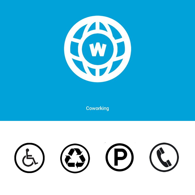
I loved the idea of Starfish. I think that makes a lot of sense. But I'm
not sure if it is easy to recognize. "P" looks like Parking. "X" seems
prohibited. Wheelchair, seems a wheelchair.

I remember the point I raised is a symbol. Not a logo. It is to be
recognized. It is not to spend the concept of coworking.

Technical differences over a symbol for logo: Symbol has no color. Has no
slogan. Has no illustration. No more message. It is simply recognized. How
Hotspot Wi-Fi.

Although I love the idea of Starfish, I think that a simple coffee mug
would be a better symbol for coworking.

What do you think?
ᐧ

On Wed, Jan 14, 2015 at 1:14 PM, Will Bennis, Locus Workspace <
[email protected]> wrote:

> Hi Folks,
>
> This seems to be in part a re-hash of a very old (2007) discussion on this
> same group that might be worth looking at first:
>
>
> https://groups.google.com/forum/#!searchin/coworking/coworking$20logo/coworking/Kx-PSRJV6P0/Adyc_cDUuW4J
>
> I think it's a very useful earlier conversation for several reasons:
>
>    - It's actively constructed by some of the early and most important
>    creators of the coworking movement
>    - It puts forth the starfish as a central image for coworking and
>    explains why
>    - It puts forth a clear argument as to why some kind of symbol for a
>    movement might be an important thing.
>    - They created a logo page on the wiki as a workplace for people to
>    try to create the ideal form, with many examples for people to contribute
>    to: http://wiki.coworking.org/w/page/16583882/Logo
>
> My sense is they were pretty far along in the conversation, so we'd do
> well to start there.
>
> Best,
> Will
>
> On Monday, January 12, 2015 at 11:17:08 PM UTC+1, Fernando Aguirre wrote:
>>
>> Hello. I'm thinking it would be interesting to be a universal symbol for
>> coworking. So you can easily identify coworking spaces in general. As there
>> is with pharmacies, schools, police, etc.
>>
>> I believe a symbol can be useful to better spread the concept. As
>> recently done with the Bug Heartbleed: http://www.bloomberg.com/news/
>> 2014-04-28/the-branding-of-a-bug-how-heartbleed-became-a-
>> household-name.html as well as the W3C made with HTML5.
>>
>> The idea is a universal symbol, distributed free of copyright. In a quick
>> study made a proposal. Is attached. Maybe some more talented designer can
>> propose something better.
>>
>> What do you think?
>>
>>
>> <https://lh6.googleusercontent.com/-A-bekElkF3s/VLRHgbDgJTI/AAAAAAAAAUU/fJeJCWj9_TI/s1600/coworking-simbol.png>
>>
>>  --
> Visit this forum on the web at http://discuss.coworking.com
> ---
> You received this message because you are subscribed to a topic in the
> Google Groups "Coworking" group.
> To unsubscribe from this topic, visit
> https://groups.google.com/d/topic/coworking/kGzQmIhyQAo/unsubscribe.
> To unsubscribe from this group and all its topics, send an email to
> [email protected].
> For more options, visit https://groups.google.com/d/optout.
>


--
Grande abraço,
Fernando Aguirre

www.fernandoaguirre.com.br
(51) 9440.9452

--
Visit this forum on the web at http://discuss.coworking.com
---
You received this message because you are subscribed to the Google Groups
"Coworking" group.
To unsubscribe from this group and stop receiving emails from it, send an email
to [email protected].
For more options, visit https://groups.google.com/d/optout.