On Wed, Sep 24, 2014 at 2:49 PM, Theppitak Karoonboonyanan
<[email protected]> wrote:
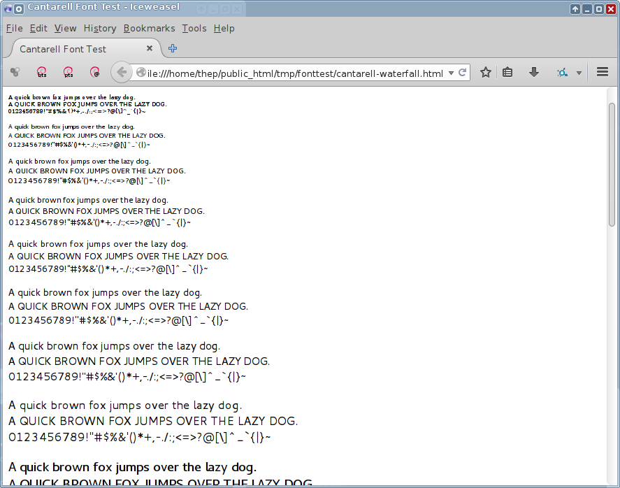
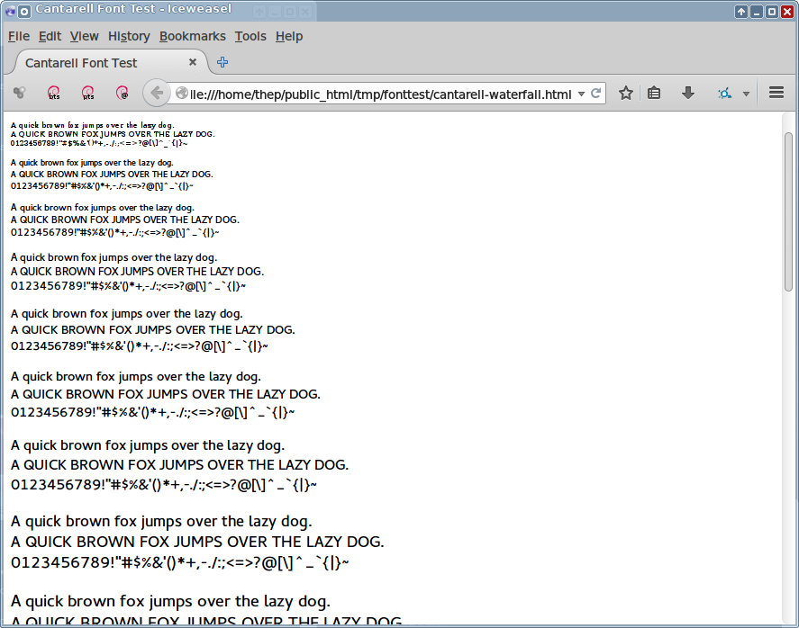
> So, the issue seems not to be on the font itself, but rather on the
> rasterizer and people's preferences.
>
> I still agree with Jason Pleau that Adobe rasterizer should be preferred.
> The reason I didn't ship OTF in my packages earlier was that, with the
> old rasterizer, while the glyphs appeared sharp for some sizes, they
> appeared inconsistent on some others.
>
> I've created a waterfall test page for Cantarell font here:
>
>   http://linux.thai.net/~thep/tmp/fonttest/cantarell-waterfall.html
>
> The paragraphs start from 6pt, then increase by 1pt up to 16pt.
> And the results of the old rasterizer is:
>
>   http://linux.thai.net/~thep/shots/20140924-cantarell-wf-old-engine.png
>
> Notice the inconsistent stem widths at 12pt and 13pt for regular
> weight, where the horizontal and diagonal stems appear thicker than
> vertical ones. (Look at the glyph M, O, Q, q, for example. And look how X
> appears thicker than F, T, H, E.)
>
> And notice how the glyphs get suddenly thicker from 13pt to 14pt.
>
> Now compare it with the result of Adobe rasterizer:
>
>   http://linux.thai.net/~thep/shots/20140924-cantarell-wf-new-engine.png
>
> The stem widths are more consistent both within the same size and
> between different sizes.

FYI, as the freeze is coming close, while my life has been extremely busy
lately (I'm getting married), I'm reverting my font packages to TTF for now,
although I think Adobe CFF rasterizer should be preferred in general,
even for Cantarell itself, not just for my fonts.

Regards,
--
Theppitak Karoonboonyanan
http://linux.thai.net/~thep/


--
To UNSUBSCRIBE, email to [email protected]
with a subject of "unsubscribe". Trouble? Contact [email protected]