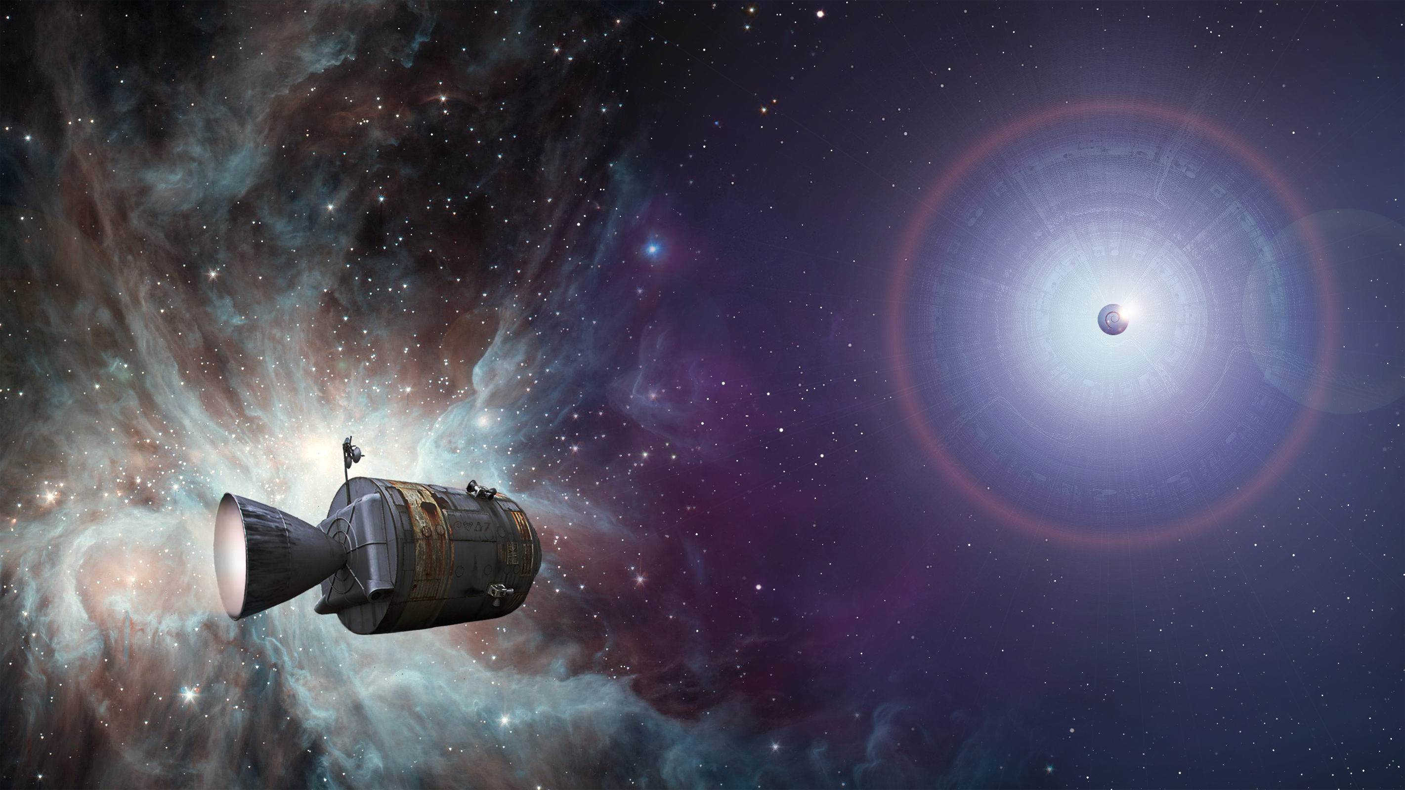
Ulrich Hansen <[email protected]> writes:

> Am 09.03.2012 um 09:21 schrieb Roman Khomasuridze:
> > As of journey, I like the concept, but nebula and spacecraft part
> > might be quite heavy on eyes,
I agree with Roman. The picture is very good and nice to look at as a
piece of art.

But as a desktop background, it is too distracting: busy, high contrast,
many colours. It jumps to the foreground!

> I added a soft shadow to the left half of the wallpaper.
> http://lazybrowndog.net/debian/wheezy/_wallpaper/journey-wallpaper-v2.jpg
>
> Does this work better for you?

I don't see much of a difference, and the above points still apply.

What could help is to significantly reduce the contrast and colour
range.

Perhaps by using a simpler starfield and removing the starburst behind
the Debian logo. Or perhaps by filtering the whole picture through a
colour, similar to what was done for the Lisp Machine background.

Or any of a number of other things you could try :-)

> I have installed my wallpaper for a couple of weeks and am really used
> to it, so this kind of feedback is really important to me.

Thank you for making this beautiful piece, and working to fit it for the
use case.

--
 \        “If you have the facts on your side, pound the facts. If you |
  `\     have the law on your side, pound the law. If you have neither |
_o__)                       on your side, pound the table.” —anonymous |
Ben Finney


--
To UNSUBSCRIBE, email to [email protected]
with a subject of "unsubscribe". Trouble? Contact [email protected]
Archive: http://lists.debian.org/[email protected]