Hi Máirín, Jef and Misha!

2010/10/4 Máirín Duffy <du...@fedoraproject.org>
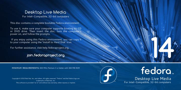
>
> The only critique I have is that it looks like there's a lot of text on
> the back and it's kind of cluttered-looking. We might want to play
> around with the positioning & spacing of the text to make it look a bit
> cleaner / more organization.
>

I tried to arrange the text on the back side.


> I think we should probably drop the GNOME logo from the desktop spin
> too. We're a GNOME distribution by default, so I think it's better to
> have a 'plain' design for the default vs desktop environment logos on
> more specialized spins. So I think it's fair enough to leave the KDE
> logo on the KDE spin.
>

Yes, it was not the best idea. I erased GNOME logo for live desktop media. I
added big fedora logo and small logo specialized spins (KDE for example).

2010/10/4 Jef van Schendel <jefvanschen...@gmail.com>

- The number "14" isn't aligned with the text below it.
>

 I aligned to right number "14".


> - I like the blue overlay, but the colour doesn't quite match with the
> rest of the wallpaper. I think the hue isn't quite right: the
> wallpaper seems to be more on the purple side compared to the blue
> used for the overlay. It's a minute difference though, on one of my
> monitors it's slightly noticeable but on the other it looks great.
>

For other spin can change the color of the bottom rectangle as the site
spins.fedoraproject.org.

New Sample image:

Desktop Live Media sleeve -
http://inkscaper.fedorapeople.org/Fedora14/media-artwork/Fedora-14-live-media-2.jpg
KDE Desktop Live Media sleeve -
http://inkscaper.fedorapeople.org/Fedora14/media-artwork/Fedora-14-kde-live-media-2.jpg

Thanks,
Alexander.
_______________________________________________
design-team mailing list
design-team@lists.fedoraproject.org
https://admin.fedoraproject.org/mailman/listinfo/design-team