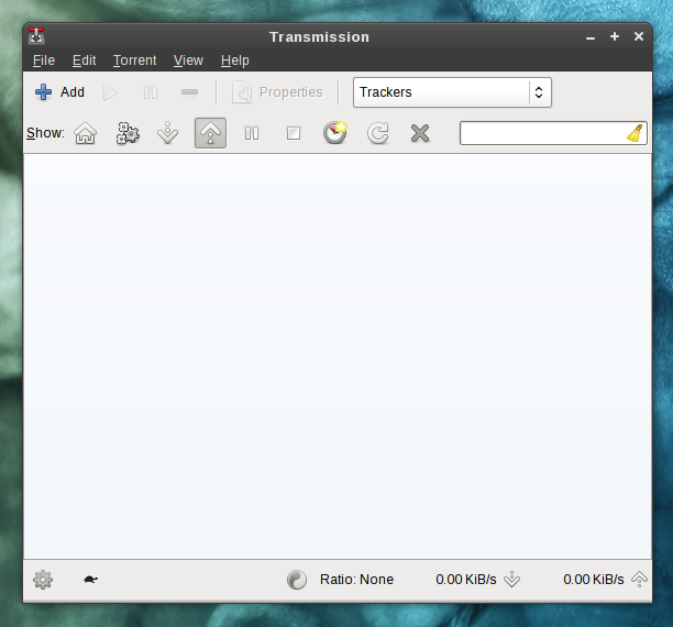
15.11.2010, 17:39, "Jef van Schendel" <[email protected]>:
> 2010/11/9 Misha Shnurapet <[email protected]>
>> Hi, Design Team!
>>
>> I got a little issue with the new filter panel introduced in Transmission
>> 2.11. I desided to ask here because it's part of Fedora and there are people
>> experienced in UI design.
>>
>> The GUI client used to have nice buttons [1] that allowed to jump quickly
>> between the lists of active / paused / seeding torrents, etc. Now that there
>> are options added, the control has been converted into combo boxes [2].
>>
>> The issue is pretty simple: I dont' like the extra-click-and-choice it takes
>> to use the combo boxes.
>>
>> I have posted a ticket [3] to the trac trying to explain my concern. Being
>> disappointed I made myself sound offensive, which I regret and feel very
>> sorry for. However, the developer agreed to see a new solution that wouldn't
>> narrow back the current functionality. Tabs wouldn't work. I'd like to
>> consult with designers if this can be improved any further. Maybe Máirín or
>> Jakub would have an idea?
>
> Hi Misha,
>
> Sorry this response took a while - I meant to reply earlier but the mail got
> lost.
>
> Here's my opinion on the matter:
>
> It's a hard decision to make. Adding functionality can be good but you also
> want to keep your software simple. In this case, it's up for the
> developers/designers of Transmission to decide which one of these provides
> more value to their users. They should consider their target audience and
> what they would want: do they value the added power over the expense of
> increased complexity?
>
> I do think it's very good that you've taken notice of this change though...
> The difference between one and two mouse clicks will not sound shocking on
> its own, but these changes can quickly add up. Transmission is known for its
> simplicity and I personally think that's very valuable. I can only tell them
> to be careful, but I'm sure the developers know this. :)
>
> By the way, the submenus inside the drop-downs shouldn't be there according
> to the HIG [1]. On the other hand. the HIG is about guidelines, not rules,
> and Transmission isn't part of GNOME. Again, it's up to the developers to
> decide if the tradeoff is worth it.
>
> What I *would* do however is give the default selection in the drop-down list
> a better label. In your screenshot they both say "All 3", which doesn't make
> clear what they do. Maybe something like "All torrents", "All states" or "All
> trackers" would be clearer here? Just an idea.
Hi.

I thought much about possible ways to improve the UI, and here's what I came up
with [1]:

Transmission could use buttons in place of one of the filter boxes like the
old-style version and show the info in tips. The other element possibly placed
in the toolbar would remain unchanged.

[1] http://shnurapet.fedorapeople.org/bt.png

--
Best regards,
Misha Shnurapet, Fedora Project Contributor
http://fedoraproject.org/wiki/User:Shnurapet
shnurapet AT fedoraproject.org, GPG: 00217306
_______________________________________________
design-team mailing list
[email protected]
https://admin.fedoraproject.org/mailman/listinfo/design-team