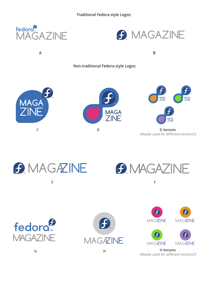
I'm not a fan of D or the variants; I think the Fedora logo, which should
be the dominant element, gets overwhelmed, then you go through a thought
process of "oh, the infinity symbol again, I get it," which is too much
thinking for a logo.
I like C better; it adds an extra element to create a new look for a
magazine but still honors the original logo. But I thought the Fedora logo
portion was too small so I made a version with the proportions changed.

png of just logo C:

https://www.dropbox.com/s/pqi6qanhry0qqec/fedora-mag-logo-C-Chestek.png

svg of all of them, with a revised C:

https://www.dropbox.com/s/27723svk97t94nd/fedora-mag-logos_ideas-chestek.svg

I have to figure out how to set up a page on the Fedora website.

Pam


On Thu, Dec 13, 2012 at 8:13 AM, Ruth Suehle <[email protected]> wrote:

> On Thu, Dec 13, 2012 at 7:00 AM, <
> [email protected]> wrote:
>
>>
>>
>> http://duffy.fedorapeople.org/art/logos/fedoramag/fedora-mag-logos_ideas-1.png
>> \
>>
>
>
> I like B, and I like D with the variants. I could also see some potential
> on postcards or shirts to have images instead of colors in the variants.
>
> The first thing that sprung to mind was if it was strange to use some kind
> of radio image, since we're broadcasting information, and the initials are
> FM. But that's also a bit beyond the usual Fedora [Thing] logo style.
>
> Ruth
>
> _______________________________________________
> design-team mailing list
> [email protected]
> https://admin.fedoraproject.org/mailman/listinfo/design-team
>
_______________________________________________
design-team mailing list
[email protected]
https://admin.fedoraproject.org/mailman/listinfo/design-team