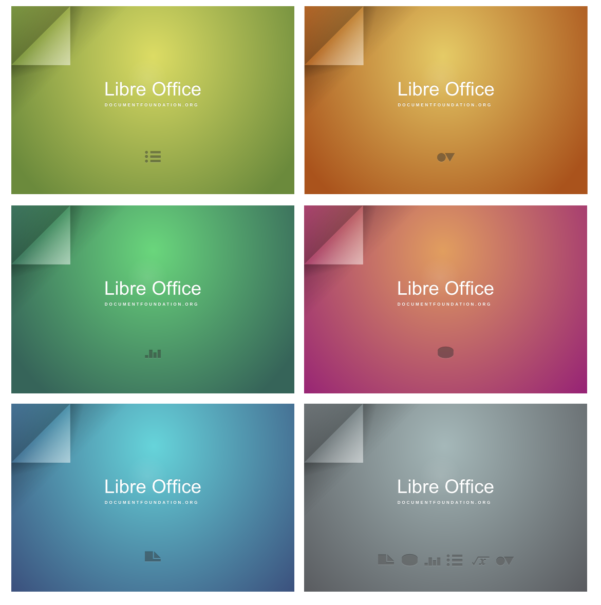
They look really nice, I absolutely like the minimalistic style. But the
logo must in that case be adapted and integrated in the color-scheme of
each splash-screen, I even wonder where to place it while not disturbing
the minimalistic layout...? The strength of this splash lies in it's
simplicity, so one should be careful not to add something that makes it
cluttered or is not fitting in. That's my opinion.
Cheers

Paul


On 12/01/13 23:08, Charles-H. Schulz wrote:
> Good idea, although we ought to include Libreoffice's actual logo.
>
> Best,
>
> Charles
>
>
> Alexander Wilms <[email protected]> a écrit :
>
>> Hi everyone,
>>
>> on the Deviantart page of Harvey Cabaguio someone mentioned an old
>> design submission for the original LibreOffice brand:
>> https://wiki.documentfoundation.org/images/5/5f/AndyFitzsimon_ArtworkProposal_splashes.png
>>
>> It also kind of fits the minimalist swiss style, maybe the gradients
>> should be a bit flatter. Would you mind if I ask the Designer (former
>> Novell, now Red Hat employer) if he would license it under LGPLv3/MPL
>> and use it as basis for a submission?
>>
>> Cheers
>>
>> Alex
>>
>>
>> --
>> Unsubscribe instructions: E-mail to [email protected]
>> Problems?
>> http://www.libreoffice.org/get-help/mailing-lists/how-to-unsubscribe/
>> Posting guidelines + more:
>> http://wiki.documentfoundation.org/Netiquette
>> List archive: http://listarchives.libreoffice.org/global/design/
>> All messages sent to this list will be publicly archived and cannot be
>> deleted


--
Unsubscribe instructions: E-mail to [email protected]
Problems? http://www.libreoffice.org/get-help/mailing-lists/how-to-unsubscribe/
Posting guidelines + more: http://wiki.documentfoundation.org/Netiquette
List archive: http://listarchives.libreoffice.org/global/design/
All messages sent to this list will be publicly archived and cannot be deleted