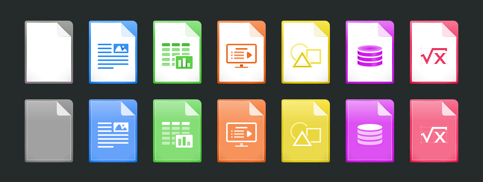
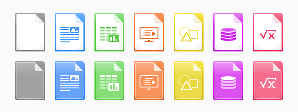
Hi everyone,

Some years ago (2011) I did help the redesign of the mime type icons, just
adding some effects to the original ones created mainly by Christoph Noack.
More in https://wiki.documentfoundation.org/User:Paulojose
Since then I've been away from the LibreOffice design team, but today I had
a feeling to resume my contribution work and to create a new version for
these icons that I love so much. I tried to keep them close to the old ones
in terms of shape and elements, just adapting some forms, colors, and the
overall style.

Above row are application icons, and below the template icons. Against a
dark and a light background:
https://wiki.documentfoundation.org/images/e/e4/Mime_Type_Icons_Redesign_Proposal_2015-11-06_v1_Dark_BG.png
https://wiki.documentfoundation.org/images/b/b0/Mime_Type_Icons_Redesign_Proposal_2015-11-06_v1_Light_BG.png

Sorry if it's not appropriate for the current development time, I just
wanna share it with you and put myself available to work again on the
design team if you want me to. ^_^

Best Regards!
--
Paulo José O. Amaro

--
To unsubscribe e-mail to: [email protected]
Problems? http://www.libreoffice.org/get-help/mailing-lists/how-to-unsubscribe/
Posting guidelines + more: http://wiki.documentfoundation.org/Netiquette
List archive: http://listarchives.libreoffice.org/global/design/
All messages sent to this list will be publicly archived and cannot be deleted