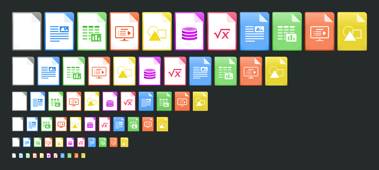
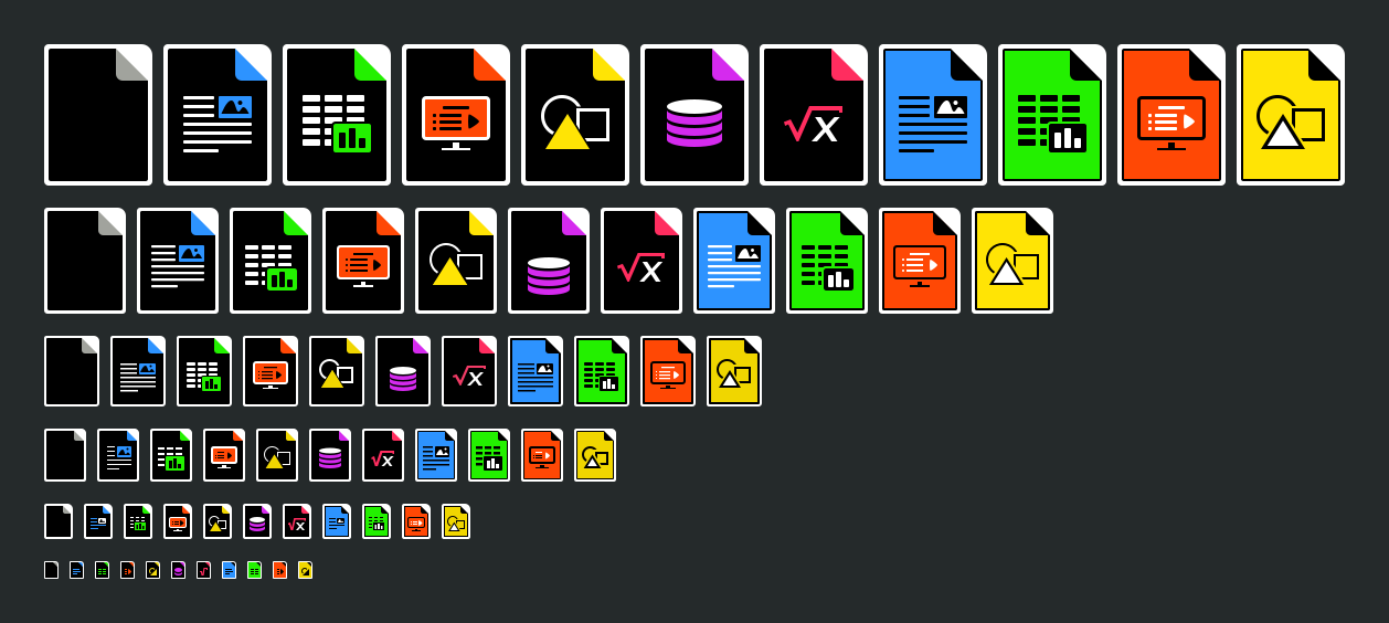
Just finished the 132 icons for the main applications and templates: 11
unique icons in 6 sizes (16, 32, 48, 64, 96, and 128 px) and 2 versions of
color (default and high contrast). I included the new sizes of 64px and
96px because they are common today in most OS's (i.e. default icon in
Nautilus are now 64, 96 and 128 px).
Default color:
https://wiki.documentfoundation.org/images/7/7d/Pj-icons-2015-11-6-v2-default-dark.png
High contrast:
https://wiki.documentfoundation.org/images/e/eb/Pj-icons-2015-11-6-v2-high-contrast-dark.png

Cheers

On Sat, Nov 7, 2015 at 4:25 PM, Bastián Díaz <[email protected]>
wrote:

>
> El 07-11-2015 14:08, Adolfo Jayme Barrientos escribió:
>
> A gripe that I always had
>> with the current LibreOffice icons is that document icons are not
>> visually different from the application icons.
>>
>> Parabéns!
>> Adolfo
>>
>
> I share with you their appreciation. In this regard I have two suggestions.
> - Commonly in GNU/Linux systems are previews of LibreOffice files.
> Therefore, it is not so significant.
> - I think the mime type icons must be handled by the icon theme used in
> the system. For themes icons Breeze and Adwaita, there are icons for mime
> type and "share design" with the icon theme included in LibreOffice. For
> other OS, they may include the mime type icons corresponding to the default
> theme in LO.
>
> The idea is that these will always be generic icon (For the ability to
> open legacy files in LO).
>
> Cheers
>
> ---
> Bastián Díaz
> https://telegram.me/diazbastian
>


--
Paulo José O. Amaro

--
To unsubscribe e-mail to: [email protected]
Problems? http://www.libreoffice.org/get-help/mailing-lists/how-to-unsubscribe/
Posting guidelines + more: http://wiki.documentfoundation.org/Netiquette
List archive: http://listarchives.libreoffice.org/global/design/
All messages sent to this list will be publicly archived and cannot be deleted