Oh, thanks for sharing this Nirzar. And I DO agree with Sean Dexter: it
looks like most of these task scenarios compared "weak signifiers" and
"strong signifiers", of which the 'flatness' of the design element was not
the most salient difference. Not by a long shot.
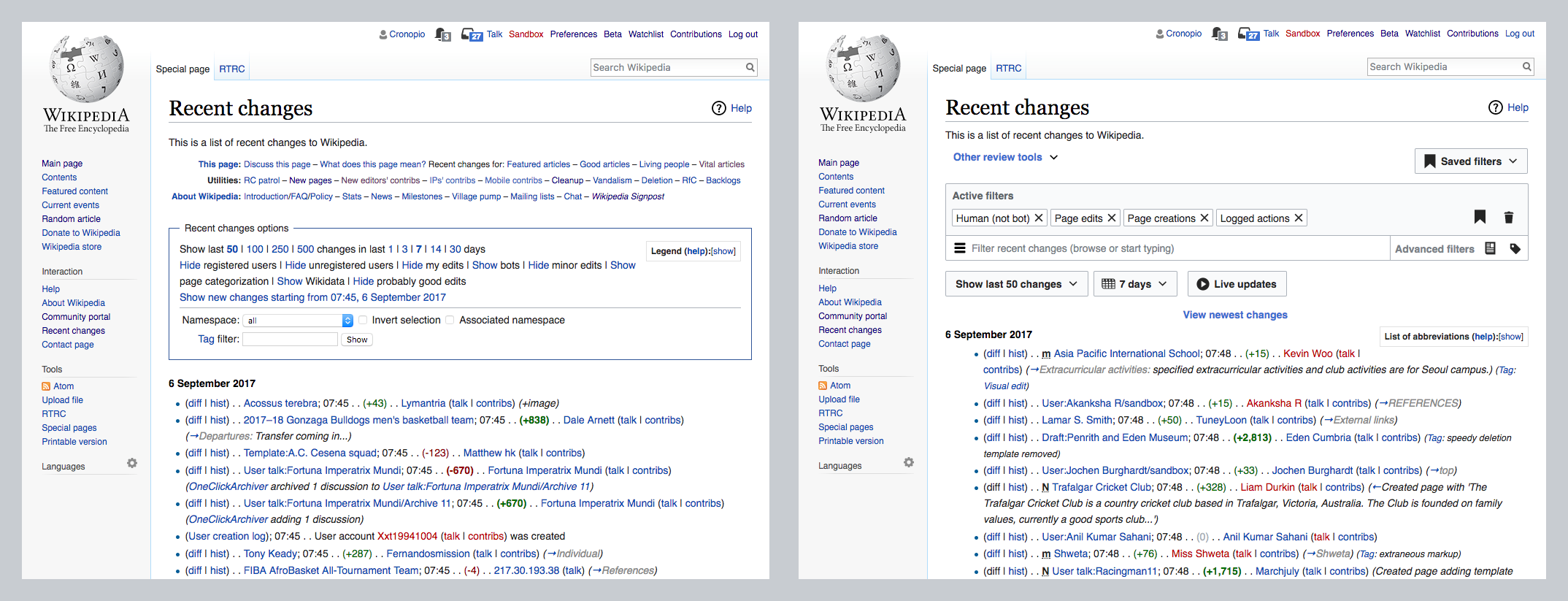
I used Windows phone for a number of years. And to be fair many of the
signifiers in Metro *were* quite weak---for example, lots of clickable
textual elements were the same color as display text, and only visually
differentiated by their placement, font, size, etc.

I can certainly see how this makes a UI less easily *learnable. *I'm not
sure it makes the UI less *usable* overall, at least not for people who are
already somewhat familiar with it. A lot of NN's user testing is performed
in an e-Commerce context, and the scenarios implicitly or explicitly assume
the user is interacting with a new webpage or UI for the first time. Strong
signifiers are obviously important in that case.

I'm not sure they are always *quite *as important for applications that see
repeated use--like a launcher, a music . Once I know that clicking on
widget X causes Y to happen, does widget X really need to look like a big
red 3D button?

But then, I loved flat design, and still do. :)

For better or worse, most of us are pretty use to weak/absent signifiers in
a mobile context by now--think about all the functionality on your phone
that is only accessible through multitouch gestures, which usually aren't
called out in the UI *at all.*

- J

On Mon, Sep 18, 2017 at 12:00 PM, nirza...@gmail.com <nirza...@gmail.com>
wrote:

> Not that I agree with either but just stumbled on a follow up post that
> might be relevant
>
> https://medium.com/@seandexter1/flat-design-why-
> you-should-question-nielsen-normans-research-on-the-trendy-design-style-
> 39a991517e02
>
>
>
>
>
>
> On Fri, Sep 8, 2017 at 10:28 AM, Peter Coombe <pcoo...@wikimedia.org>
> wrote:
>
>> For what it's worth, we've done quite a few tests with WMF fundraising
>> banners of skeuomorphic vs more flat designs, and didn't find any clear
>> differences in performance overall. We're now using OOUI styles which have
>> consistently performed well. I think they strike a nice balance between
>> "flatness/cleanness" and signifiers, plus it's nice to have consistency
>> with other parts of the site.
>>
>> On 7 September 2017 at 09:46, Pau Giner <pgi...@wikimedia.org> wrote:
>>
>>> Yet it shouldn't be too hard to notice a 20 % slowdown with small
>>>> usability tests/focus groups. It could be interesting to test a couple
>>>> existing skins and a couple big interface changes in the works (such as
>>>> Special:RecentChanges and Special:Search) to see if there is any such big
>>>> gap anywhere.
>>>
>>>
>>> For the case of Recent Changes a before/after comparison
>>> <https://phab.wmfusercontent.org/file/data/keh3ox7d7zowy776azjp/PHID-FILE-xyklxklkb6g7nyu3jmi2/RC-before-after.png>
>>>  does
>>> not seem to suggest that the changes involved going flat. In the previous
>>> state the filtering UI was a box with a flat lists of links and text, while
>>> the new UI uses contrast and grouping to help users identify the different
>>> elements.
>>>
>>> If there is any particular aspect related to flatness that anyone thinks
>>> we need to pay special attention to, feel free to share it and we can
>>> incorporate it in future research. We have been doing different rounds of
>>> research to test initial concepts
>>> <https://commons.wikimedia.org/wiki/File:Editing_-_Recent_Changes_Filters_Rd1_Findings_2016.09-10.pdf>
>>> , iterated ideas
>>> <https://commons.wikimedia.org/wiki/File:Editing_-_RC_Extended_Filters_Usability_Testing_Deck_2017.06.pdf>
>>>  and the version available on beta
>>> <https://commons.wikimedia.org/wiki/File:Contributors_-_RC_Filters_Integrated_%2B_Beta_Satisfaction_testing_deck_2017.07.pdf>.
>>> The results suggest that users are able to identify more clearly which is
>>> the current state of the filters and how to manipulate them with the new
>>> approach.
>>>
>>> In general, I think that labels such as "flat design" combine several
>>> different aspects that makes it hard to make broad statements like flat
>>> design being good or bad for all contexts. Talking about the impact on
>>> choices for the clarity of affordances, contrast of elements, layout
>>> approaches, etc. makes more sense to me. For example, the
>>> Nielsen/Norman article
>>> <https://www.nngroup.com/articles/flat-design/?lm=flat-design-best-practices&pt=article>
>>> criticizes both skeumorphism (for resulting in "clunky interfaces") and
>>> flat design (for the loss of clickability signifiers), but recommends what
>>> they call "flat design 2.0" for incorporating signifiers based on our
>>> intuition of phisics as Google's material does:
>>>
>>> Early pseudo-3D GUIs and Steve-Jobs-esque skeuomorphism often produced
>>>> heavy, clunky interfaces. Scaling back from those excesses is good for
>>>> usability. But removing visual distinctions to produce fully flat designs
>>>> with no signifiers can be an equally bad extreme. Flat 2.0 provides an
>>>> opportunity for compromise — visual simplicity without sacrificing
>>>> signifiers.
>>>
>>>
>>>
>>> On Wed, Sep 6, 2017 at 4:58 PM, Saint Johann <ole.y...@gmail.com> wrote:
>>>
>>>> In all fairness, I hope we wouldn’t. OOUI has so much more elements
>>>> that have no alternative in Apex theme, even accessible checkboxes are not
>>>> present in Apex (see https://phabricator.wikimedia.org/T162849).
>>>> Retiring Apex, not reinstating it, seems like the best solution at this
>>>> point, since Wikimedia developers and designers have a pretty average track
>>>> record when it comes to consistent development of alternative solutions (e.
>>>> g., current skins).
>>>>
>>>> The research itself is a bit misleading and sensationalising: it
>>>> doesn’t compare stylistic elements of flat design and skeuomorphism, it
>>>> essentially compares bad design practices (bad styling of CTA/primary
>>>> button, styling tabs like some kind of buttons, styling links like text)
>>>> and good practices. It should not be taken at word, although usually
>>>> Nielsen Norman Group have good points in their studies.
>>>>
>>>>
>>>> On 06/09/2017 13:22, Bartosz Dziewoński wrote:
>>>>
>>>>> OOUI was originally created with a classic design for buttons and
>>>>> other fields, and that theme (now called 'Apex') is still available and
>>>>> maintained. https://doc.wikimedia.org/oojs-ui/master/demos/?theme=apex
>>>>> We could switch to it at a moment's notice. Personally I wouldn't mind
>>>>> seeing it again ;)
>>>>>
>>>>> Still, buttons in the default theme are not entirely "flat", they have
>>>>> at least borders (or strong backgrounds) to distinguish them. The biggest
>>>>> problem is the existence of 'frameless' buttons (in both themes), which
>>>>> look just like normal text if they don't have an icon or something.
>>>>>
>>>>>
>>>>
>>>> _______________________________________________
>>>> Design mailing list
>>>> Design@lists.wikimedia.org
>>>> https://lists.wikimedia.org/mailman/listinfo/design
>>>>
>>>
>>>
>>>
>>> --
>>> Pau Giner
>>> Senior User Experience Designer
>>> Wikimedia Foundation
>>>
>>> _______________________________________________
>>> Design mailing list
>>> Design@lists.wikimedia.org
>>> https://lists.wikimedia.org/mailman/listinfo/design
>>>
>>>
>>
>> _______________________________________________
>> Design mailing list
>> Design@lists.wikimedia.org
>> https://lists.wikimedia.org/mailman/listinfo/design
>>
>>
>
> _______________________________________________
> Design mailing list
> Design@lists.wikimedia.org
> https://lists.wikimedia.org/mailman/listinfo/design
>
>


--
Jonathan T. Morgan
Senior Design Researcher
Wikimedia Foundation
User:Jmorgan (WMF) <https://meta.wikimedia.org/wiki/User:Jmorgan_(WMF)>
_______________________________________________
Design mailing list
Design@lists.wikimedia.org
https://lists.wikimedia.org/mailman/listinfo/design