On 14 April 2014 23:10, Nicholas Bollweg <[email protected]> wrote:
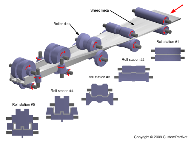
> updated, based on some designer feedback:
> http://imgur.com/7P2104K
>

I dont like that.The other had slim lines (simplicity) and strong colors
(vivid)

rgds
jan i

>
>
> On Mon, Apr 14, 2014 at 4:24 PM, Nicholas Bollweg <[email protected]
> >wrote:
>
> > sorry, it's some kind of gallery:
> > http://imgur.com/ITtyVG3,kA1rwlZ#1
> >
> > Here is the direct link:
> > http://imgur.com/kA1rwlZ#1
> >
> >
> > On Mon, Apr 14, 2014 at 4:22 PM, Rich Bowen <[email protected]> wrote:
> >
> >>
> >> On 04/14/2014 04:04 PM, Nicholas Bollweg wrote:
> >>
> >>> So much hammer and anvil... a bit 17th century, no?
> >>>
> >>> Several other more modern forging techniques are out there: drop,
> press,
> >>> upset, roll, net-shape, induction, etc (not doing the full wiki walk,
> but
> >>> some of them look cool). For example, roll forging is cool, as it
> >>> involves
> >>> a series of different tools that alter the metal moving through it
> before
> >>> it is finished:
> >>> http://www.custompartnet.com/wu/images/sheet-metal/roll-forming.png
> >>>
> >>> In regards to the feather: how about something that uses the
> foundation's
> >>> color scheme a bit more subtly, and pulls in some additional more
> modern
> >>> elements:
> >>>
> >>> http://imgur.com/ITtyVG3,kA1rwlZ
> >>> (just whipped it up, not super excited about)
> >>>
> >>
> >> Is this the right URL? I just see the word Allura, but later you refer
> to
> >> a chemical compound as being part of the logo, and I'm not seeing that
> yet.
> >>
> >> --Rich
> >>
> >>
> >>
> >>
> >>> the font is anonymous pro, which is coder-centric and open source
> (OFL):
> >>> http://www.marksimonson.com/fonts/view/anonymous-pro
> >>>
> >>> the chemical compound is Allura Red :)
> >>> http://en.wikipedia.org/wiki/File:Allura_Red_AC_ball-and-stick.png
> >>>
> >>> I kinda like the concept of a chemical compound as a metaphor, as it
> >>> suggests that it (i.e. a forge running allura) is made of smaller
> things
> >>> (atoms) (i.e. projects and neighborhoods) which are in turn made of
> even
> >>> smaller things (i.e. code, wikis, etc.). Also, the diagram is kinda
> like
> >>> the gitk diagrams (or whoever gitk appropriated it from), though if
> your
> >>> commit history looked like that, you'd probably be in for trouble :(
> >>>
> >>> I assume keeping clear away from the syndicated cartoon stuff is
> >>> probably a
> >>> good idea...
> >>>
> >>> Cheers!
> >>>
> >>>
> >>> On Mon, Apr 14, 2014 at 2:53 PM, Rich Bowen <[email protected]>
> wrote:
> >>>
> >>>  On 04/14/2014 12:20 PM, jan i wrote:
> >>>>
> >>>>  On 14 April 2014 18:11, Rich Bowen <[email protected]> wrote:
> >>>>>
> >>>>>   While it's not a requirement for us to have a logo, it would be
> very
> >>>>>
> >>>>>> nice.
> >>>>>> Anybody got any thoughts regarding what we might do for a logo, or
> the
> >>>>>> skills to make one?
> >>>>>>
> >>>>>> I was thinking that some imagery around the idea of a forge might
> >>>>>> work,
> >>>>>> although I know that SourceForge did that years ago.
> >>>>>>
> >>>>>>  It makes project/product identification a lot simpler when having a
> >>>>> logo.
> >>>>> Putting the logo on next to everything a project makes, ensures
> >>>>> end-users
> >>>>> asociate the logo with the project a lot better than the simple name.
> >>>>>
> >>>>> A simple forge, where our feather is forged/hammered. I am not good
> at
> >>>>> drawing, but I can see such an image.
> >>>>>
> >>>>>  FeatherForge (on Twitter, Facebook, Etsy, and featherforge.com) has
> >>>> such
> >>>> a logo.
> >>>>
> >>>>
> >>>>
> >>>>
> >>>> --
> >>>> Rich Bowen - [email protected] - @rbowen
> >>>> http://apachecon.com/ - @apachecon
> >>>>
> >>>>
> >>>>
> >> --
> >> Rich Bowen - [email protected] - @rbowen
> >> http://apachecon.com/ - @apachecon
> >>
> >>
> >
>