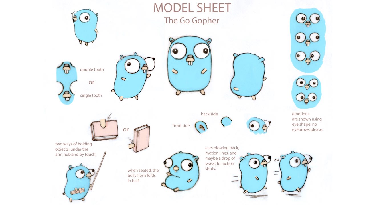
Nice!

1. Personally, I especially want it to be something easy for people to draw
and improvise in new poses / situations. Here is the sheet about the Go
Gopher that is about what I am thinking about, and amusing:
https://golang.org/doc/gopher/modelsheet.jpg. I think your slides do a
really good job of outlining similar things.
In order to encourage less talented artists to improvise using the
character, I favor simple & welcoming as the main depiction. I prefer the
side 3/4 view for the main depiction.

Color style - A - flat
Line style - A1 - heavy (I like heavy lines in all cases)
Color palette - works for me (I'm not sensitive to this)

Comments:

 - I really like the final slide and the one labeled "final outcome" which
have glowing wings. I wanted to note that A1 does not have the glowing
wings and it feels a bit flat with just one orange
 - I notice that in B1 the antennae are fully enclosed by lines, whereas A1
and C1 the end is left open to imply a connection to the head. I think B1
offers more playful possibilities for the antennae to be depicted in
different positions. There's the issue of being internally consistent with
how the arms are connected... looks good either way

Kenn

On Fri, Mar 13, 2020 at 12:33 PM Aizhamal Nurmamat kyzy <[email protected]>
wrote:

> Thank you Julian!
> Here is the link to the slides
> https://docs.google.com/presentation/d/1cEydTxQcsTJES_JCRvC_xgK7HMCIfnxmuawd7x2Bk_o/edit?usp=sharing
>
> On Fri, Mar 13, 2020 at 12:25 PM Julian Bruno <[email protected]>
> wrote:
>
>> Hello Apache Beam Community,
>>
>>
>> Together with Aizhamal and her team, we have been working on the design
>> of the Apache Beam mascot.
>>
>> We now need input from the community to continue moving forward with the
>> design. Please share your input no later than Wednesday, March 18, at noon
>> Pacific Time. Below you will find a link to the presentation of the work
>> process and we are eager to know what you think of the current design [1].
>>
>> Our questions to you:
>>
>> 1. Does the final outcome of the design process meet the community’s
>> expectations and represent Apache Beam? If not, what things should change?
>>
>> For printing, do you prefer sideways or front view for the character?
>>
>> 2. Which color style do you like? A. Flat Color  B. Gradient Colors C.
>> Shadows + Flat Colors (slide 13)
>>
>> 3. If you chose A, what line style do you like on the flat color style?
>> A1. Heavy Lines A2. Thin Lines A3.  No Lines (slide 15)
>>
>> If you chose B, what line style do you like on the gradient color style?
>> B1. Heavy Lines B2. Thin Lines B3.  No Lines (slide 17)
>>
>> If you chose C, what line style do you like on the shadows + flat color
>> style? C1. Heavy Lines C2. Thin Lines C3.  No Lines (slide 19)
>>
>> 4. What do you think about the color palette?
>>
>> Please reply inline, so it is clear what exactly you are referring to. The
>> vote and input phase will be open until Wednesday, March 18, at 12 pm
>> Pacific Time. And we will incorporate the feedback to the next design
>> iteration of the mascot.
>>
>> Thank you,
>>
>> Julian
>>
>>
>> --
>> Julian Bruno // Visual Artist & Graphic Designer
>>  (510) 367-0551 / SF Bay Area, CA
>> www.instagram.com/julbro.art
>>
>> ᐧ
>>
>