INTRO
=====
I invite everyone to take part in this short introductory course,
you won't regret it and I am sure you will pretty much enjoy it
[and maybe have a laugh, too].
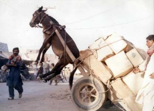
READING GUIDE
==============
Please follow the text order, as the presentation is dependent on
the proper flow of the content. Also, for best effect, you should view
the pictures exactly in the order as they appear. I deliberately omitted
the pictures in this presentation and included only external links,
so that you will be able to view them in the proper order.

BEGIN
=====
In order to get a better understanding of usability concepts, we will
first explore some errors and general misconceptions.

Humans have a tendency to make mistakes. I assume most have stumbled upon
a picture of this poor donkey:
http://www.swapmeetdave.com/Humor/Workshop/OL-Donkey-Cart.jpg

I had a laugh myself when I first saw that unhappy donkey. Indeed,
one is inclined to question the cleverness of those people who
overloaded the cart.

Many viewers may blame the poor socio-economic conditions in that country,
and the lack of education as the main causes for that mishap. But
what has UX to do with it?
Clearly, no UX-expert was involved in designing the cart. ;-)

The picture is shot in the developing world. A cart is a very primitive
technology and the chances are very dim for something similar happening
in the western world. Simply put, the West is technologically much too
advanced. Yet, these new technologies open fully unexpected avenues:
http://aviation-safety.net/photos/displayphoto.php?id=20020109-I-0&vnr=1&kind=I

For the full article, please see also:
http://www.drive.com.au/Editorial/ArticleDetail.aspx?ArticleID=3001&vf=1

Quite intriguing, isn't it? Who would have thought that such
mighty technology would fail so miserably in the 21st century?

What went wrong? Was it human error? Of course it was human error.
But I'll put the blame on the UX-designer.

So, the more intriguing question is: What has UX to do with it?

Well, as we will see, UX has a lot to do with it. Instead of blaming
the worker who unloaded the plane, blame foremost the designer
who failed to understand [in this particular case] mistake-proofing and
the UX-team who worked on the design of the plane.
[A number of true crashes with a lot of casualties did actually happen
 because of poor load-balancing.]

In the end, I would like to tell you a success story. Does anyone
remember the 1.44 MB floppy disk?

The older ones (including myself) had a lot of frustrations with
these diskettes. But I dare to ask something different:

Has anyone entered the 1.44 MB diskette wrongly into the disk drive?
How often did you enter it wrongly?

Lets remember the facts: this diskette is rectangular in shape and
has 2 surfaces, one upper and one lower:
http://www.starpixel.com/websites/oldleo/oidiskette.gif

So, basically you could insert it in 8 different ways.

The silly thing is, you can't insert it wrongly (unless you apply
a lot of force ;-) ).
http://facultyweb.berry.edu/jgrout/everyday.html
Whoever designed this diskette, he was a really brilliant UX designer.
He did not resort to teach users how to do it or to stick warnings
all over the diskette. He devised the system mistake-proof from
the beginning (and therefore made it user-friendly). This is real insight.

Lets ask a different question:
What did this latter designer do?

We will adopt an analytical approach to answer this question:
 state the problem, then try to solve it.
[Unlike Task-Centered System Designs, we will completely ignore
 the users. I will explain later.]

THE PROBLEM:
do NOT enter the diskette wrongly in the drive

OBJECTS/INTERACTIONS:
USER ----> DISKETTE
   \         /
    \       /
    DISK-DRIVE

SOLUTIONS:
1.) emphasis on user
   1.1.) teach user
   1.2.) special diskette warnings
   1.3.) special drive warnings
   1.4.) Plan B – mechanism to cope IF mishap still happened

2.) make system mistake-proof

Everyone will agree that option 2.) is way better and in the end
much less complex than option 1.

BUT what happened in option 2?
The designer basically changed the problem. He reshaped it in a way
that the user feels more comfortable to handle the new problem.
And the problem in option 2 is very different from that in option 1,
yet the users won't notice any drawbacks.

Also, the emphasis is not on the users, although they will benefit most
from it.

What can we learn from these stories?
Of course, the designers should have planned similarly for the aircraft.
Many things can go wrong in such complex systems. And foremost, humans
can err. They may not understand the system; they may just copy
someone else; they may simply fail.

What steps are necessary to balance loads within a plane?
1.) user has to acknowledge the problem
2.) has to track the balance-load: has to handle dynamically complex
    systems that describe the distribution of the load
3.) many other steps [e.g. that the balance is kept constant during
    various challenges, like unloading or takeoff]

The designer/UX-designer missed the opportunity to change/ to reshape
the problem. At least for unloading (a perfectly balanced plane),
he should have implemented such a mistake-proofing mechanism, instead of
resorting to a complex interaction between humans and machines.

LEARNING
========
What did we learn from these examples?

IF there is something that I wish you to learn from the previous examples,
than please remember that as a UX-expert, you can reshape the initial
problem and transform a complex one into a trivial one (trivial for
the user). It is your responsibility to make this happen, and not
the user's to solve the difficult problem.

Please note, we could devise the best solutions for teaching the users,
mark the diskettes with brightly coloured warnings and post warnings
all over the drive, yet we would have completely missed the best solution,
to block inserting the diskette the wrong way.
(Another example: there are computer cables that can be inserted only
 in one way, and others that can be inserted in the wrong way, too.
 What a shame.)

>From ongoing discussions on the UX-list, I fear that we spend most time
thinking about minor issues and miss completely the bigger picture.
I will emphasise this point later on, while using spreadsheets as
an example. We could devise the perfect solutions for all the small steps,
yet miss to provide any substantial help to the user, because we missed
the problem and the global issue.

USERS AND PROBLEMS
==================
Most importantly, UX-designers have to look at the broader picture and
tackle also more general problems. The user wants to solve the problem
he faces. He will look to solve it in a familiar fashion. But he will
overlook anything that is unfamiliar to him. Therefore, he usually misses
any other opportunities.
The UX-designer can actually shape the original problem and make
the unfamiliar seem instantly familiar. Instead of implementing
helping tools to solve a difficult problem – but retaining the complex
steps of the solution, a good program design changes the initial problem;
reshapes it in a way so that the user faces an easier problem and
still feels comfortable with the unfamiliar perspective.

It is the UX-designers responsibility to see this broader picture and
to reshape the problems the users face, ultimately allowing users
to adopt a new solving strategy.
Knowing the immediate problem is often not enough. Primarily you need
to understand the underlying problem that is required to be resolved /
/ the underlying task that the user wants to accomplish. The users might
sometimes miss the actual problem they try to solve:
 *they can't see the forest for the trees*

Sincerely,

Leonard

=============

END OF PART 1

The next post will deal with current technological changes and missed
opportunities. Part 3 will concentrate on spreadsheets, while part 4 will
describe GUI/HCI challenges. I will not deal with my particular GUI proposal
(or any specific GUI-implementation strategy), rather I will present a clear
picture of future GUI challenges based on technological advances and shifts in
current technology.

NB: the airplane example is largely based on an article published by the
American Institute of Architects (http://www.aia.org, although my recent search
for the page was unsuccesful).

For a good reading on more complex accident-models, see N.G. Leveson, System
Safety Engineering: Back To The Future. The book touches many fields relevant
to UX-design.
--
Psst! Geheimtipp: Online Games kostenlos spielen bei den GMX Free Games!
http://games.entertainment.gmx.net/de/entertainment/games/free

---------------------------------------------------------------------
To unsubscribe, e-mail: [EMAIL PROTECTED]
For additional commands, e-mail: [EMAIL PROTECTED]