Daniel Carrera wrote:
Ok, just for demonstration purposes, I made a page using that file:
http://www.math.umd.edu/~dcarrera/openoffice/website/HomePage3/
i asked because on the previous version
(http://www.math.umd.edu/~dcarrera/openoffice/website/HomePage2/) both
boxes were of the same size and 1.1.4 was more proeminent to me because
i read from left to right
I don't like how the box looks, but it sure scores high on usability.
Hence... I think there's probably a good idea hidden behind this table and
we just need to find it.
i see correct? the background of the box is a very light green? in this
case the border should be a darker green, to follow the style of the
other boxes.
i don't like the placement. how about using the download icon (the small
one, without text) next to the 'Free download' link and using a CDROM
icon (for example
http://clipart.nicubunu.ro/png/computers/compact_disc.svg.png [1]) next
to the "Buy CDs" link?
The right-side of the table looks empty, compared to the left. And the
"Free" looks redundant. On the other hand, I like the idea of a clear and
prominent image for download.
correct, *is* redundant and is contributing to an increased size
(download-wise) for the entire page. Matthew asked for such an icons.
a version of the icon without text is here:
http://ooo.nicubunu.ro/webicons/download.png
In any event, I'm putting it up, not as a suggestion, but as food for
thought.
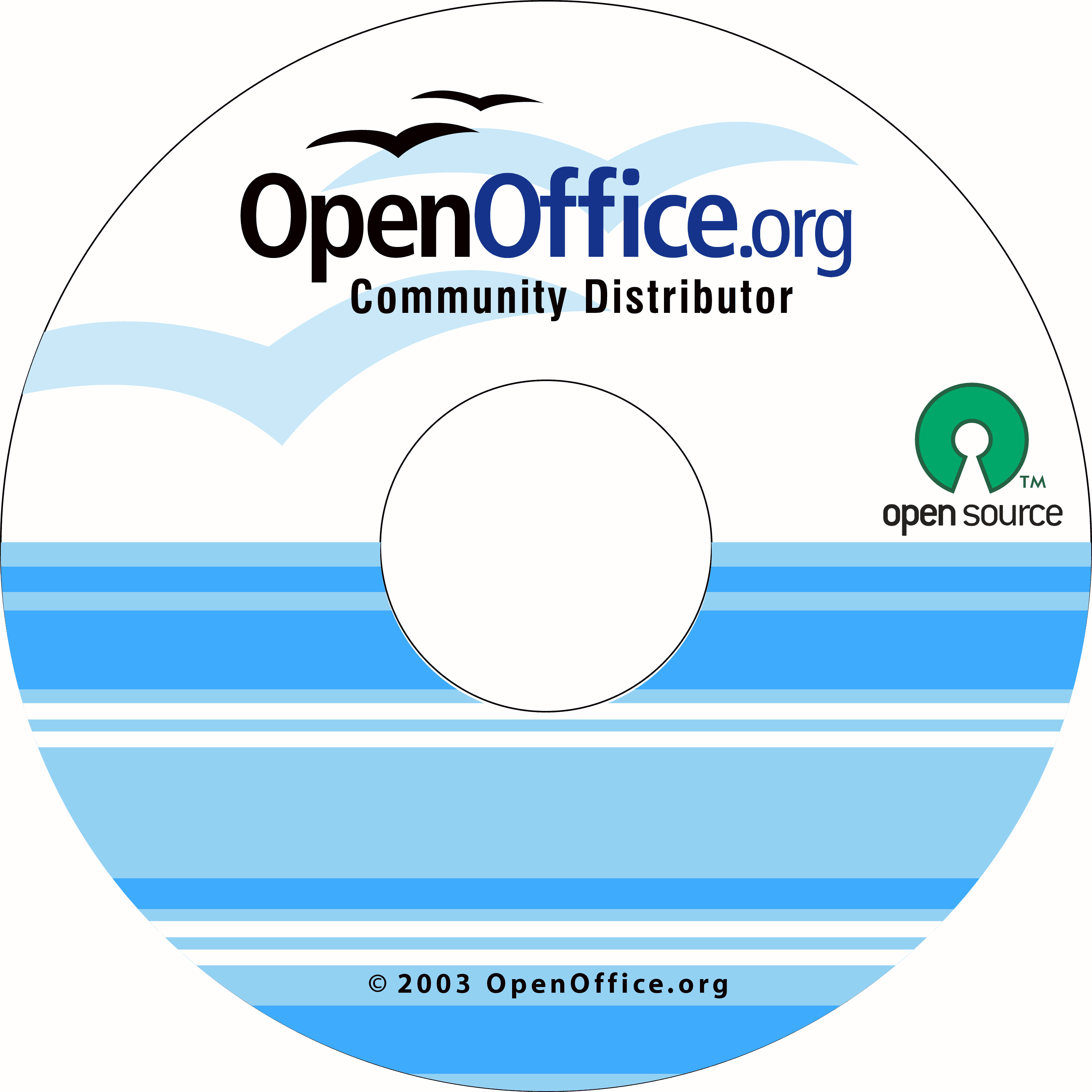
[1] the CDROM icon
(http://clipart.nicubunu.ro/png/computers/compact_disc.svg.png) can
contain the OOo logo and/or can be painted with the "official" CD label
(the 2.0 replacement of
http://marketing.openoffice.org/graphics/cd/ooo-cd-label-standard_osi.png)
--
nicu
my OpenOffice.org pages: http://ooo.nicubunu.ro
---------------------------------------------------------------------
To unsubscribe, e-mail: [EMAIL PROTECTED]
For additional commands, e-mail: [EMAIL PROTECTED]