Hi Ivan, André, Stella, and all others,

Context of this e-mail: The new website redesign. While we decided that it
should be a minimalistic design, we agreed upon including icons as well.
See for the latest version of the design:
http://patentpending.co.nz/openoffice/#
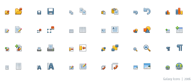
Recently, André suggested to use the Galaxy icons. Which I believe are
indeed very nice icons, and the more interesting to use in our publication
since they (but about this I'm not that certain), will become the default
iconset for OOo 3(?)

André wrote (at [email protected]):
>>  I'm still pledging to go with the Galaxy style.
>
> The galaxy icons are great! Is there an icon set that can be
> downloaded? All I could find is this:
> http://ui.openoffice.org/VisualDesign/gifs/Icons/example_galaxy_icons.png
> None of the icons in that image are really related to our action
> statements, but if there are more icons, and they are suitable to be
> paired with the action statements, their colors and clean design would
> work really well with the current design.

I was wondering if anyone could supply us with a little bit more
information on the use of the Galaxy icons. I like them quite so, though
there are also other icon sets I like... and would love to see this icon
set in place of the current default Win95 icon set before yesterday; the
sooner the better.

Since I am a big proponent of unifying design for OOo in general, yes that
implies reducing the freedom of independent artists, I would definitely
support the move to Galaxy icons for the homepage (if this is to become
the default iconset of OOo3 (but 2.4 would be even better ;) ), if not the
entire website.

g.,


Maarten

---------------------------------------------------------------------
To unsubscribe, e-mail: [EMAIL PROTECTED]
For additional commands, e-mail: [EMAIL PROTECTED]