On Fri, 15 Mar 2013 08:38:45 +0100
"alex" <[email protected]> wrote:
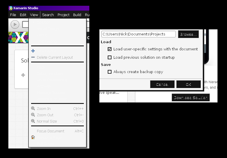
> On Friday, 15 March 2013 at 00:50:57 UTC, Nick Sabalausky wrote:
> > On Thu, 14 Mar 2013 23:42:04 +0100
> > "alex" <[email protected]> wrote:
> >
> >> On Thursday, 14 March 2013 at 22:33:38 UTC, Nick Sabalausky
> >> wrote:
> >> > On Thu, 14 Mar 2013 22:46:43 +0100
> >> > "alex" <[email protected]> wrote:
> >> >>
> >> >> Nope. You can switch it so some darker schemes. I also
> >> >> switched it to some darker background because it also was
> >> >> too bright for me.
> >> >
> >> > I couldn't find any settings for that. Where are they?
> >>
> >> On Windows, it's Tools -> Options -> Text Editor -> Syntax
> >> highlighting. Just select an other scheme, close the options
> >> dlg and you'll see it :)
> >
> > That's only affecting the text editor, not the rest of the UI.
> > Ironically, the text editor is one thing that does display just
> > fine
> > with the default settings (aside from being very bright).
>
> Oh noooees. Seriously, the only bright things in the main UI are
> only a menu bar and the solution pad, by default - Imho a
> circumstance which one can survive easily ;-D

I think you may be misunderstanding. See this image:

http://semitwist.com/download/img/shots/xamarin_screen.png

Even ignoring the "disregard my system settings" overdose of
white, the UI is still just generally very difficult to read due to what
appears to be a (more or less) buggy theme. Note in particular:

1. Invisible menu items.

2. "Very-light-grey on white" menu items.

3. Generally messed up text on buttons.

4. Overzealous anti-aliasing on the dialog text such as "C:\Users..."
and "Always create a backup copy". Not as bad as the first three, but
it'll still hurt a guy's eyes after a while.