Jesse Ross wrote:
If you want to get an idea for stylistically how my icons look, feel
free to check out the app icons I've built so far:
http://www.jesseross.com/clients/gnustep/icons/apps/
I love your icons and especially Ladder.app's which is my favorite.
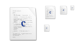
My point to share, I wish the small version of your icons are more
distinct. If I have to do a set of icons, I would focus my designs on that.
for example
http://www.jesseross.com/clients/gnustep/icons/apps/projectmanager/images/projectmanager_c_grid_01.png
The C character is too small. I know you already tried making the symbol
bigger on the smaller icons. But I don't think it is large enough. It should
be larger and understandable if it can be.
Best regards,
Banlu Kemiyatorn
Senior Janitor
Game Square Interactive Co., Ltd.
_______________________________________________
Discuss-gnustep mailing list
[email protected]
http://lists.gnu.org/mailman/listinfo/discuss-gnustep