#34036: Low text contrast over light blue backgrounds in admin light theme
-------------------------------------+-------------------------------------
     Reporter:  Thibaud Colas        |                    Owner:  nobody
         Type:  Bug                  |                   Status:  new
    Component:  contrib.admin        |                  Version:  4.0
     Severity:  Normal               |               Resolution:
     Keywords:  accessibility,       |             Triage Stage:
  color contrast, ux                 |  Unreviewed
    Has patch:  0                    |      Needs documentation:  0
  Needs tests:  0                    |  Patch needs improvement:  0
Easy pickings:  0                    |                    UI/UX:  1
-------------------------------------+-------------------------------------
Description changed by Thibaud Colas:
Old description:
> The Django admin’s light theme "primary" color is a very light shade of
> blue which doesn’t offer enough contrast when used with white text.
>
> Here is a [https://contrast-grid.eightshapes.com/?version=1.1.0
> &background-colors=%23fff%2C%20body-bg%0D%0A%23417690%2C%20header-
> bg%0D%0A%2379aec8%2C%20breadcrumbs-bg%0D%0A%23dfd%2C%20message-success-
> bg%0D%0A%23ffc%2C%20message-warning-bg%0D%0A%23ffefef%2C%20message-error-
> bg%0D%0A%23f8f8f8%2C%20darkened-bg%0D%0A%23e4e4e4%2C%20selected-
> bg%0D%0A%2379aec8%2C%20button-bg%0D%0A%23609ab6%2C%20button-hover-
> bg%0D%0A%23417690%2C%20default-button-bg%0D%0A%23205067%2C%20default-
> button-hover-bg%0D%0A%23888%2C%20close-button-bg%0D%0A%23747474%2C
> %20close-button-hover-bg%0D%0A%23ba2121%2C%20delete-button-
> bg%0D%0A%23a41515%2C%20delete-button-hover-bg&foreground-
> colors=%2379aec8%2C%20primary%0D%0A%23417690%2C%20secondary%0D%0A%23f5dd5d%2C%20accent%0D%0A%23fff%2C
> %20primary-fg%0D%0A%23333%2C%20body-fg%0D%0A%23666%2C%20body-quiet-
> color%0D%0A%23000%2C%20body-loud-color%0D%0A%23ffc%2C%20header-
> color%0D%0A%23f5dd5d%2C%20header-branding-color%0D%0A%23fff%2C%20header-
> link-color%0D%0A%23fff%2C%20breadcrumbs-link-fg%0D%0A%23c4dce8%2C
> %20breadcrumbs-fg%0D%0A%23447e9b%2C%20link-fg%0D%0A%23036%2C%20link-
> hover-color%0D%0A%235b80b2%2C%20link-selected-fg%0D%0A%23e8e8e8%2C
> %20hairline-color%0D%0A%23ccc%2C%20border-color%0D%0A%23ba2121%2C
> %20error-fg%0D%0A%23ffc%2C%20selected-row%0D%0A%23fff%2C%20button-fg&es-
> color-form__tile-size=compact&es-color-form__show-contrast=aaa&es-color-
> form__show-contrast=aa&es-color-form__show-contrast=aa18&es-color-
> form__show-contrast=dnp full contrast grid] of the light theme color
> palette for reference. The problematic "light blue" combos I have
> identified are:
>
> 1. Breadcrumbs text where the background --breadcrumbs-bg is light blue,
> and the text is either very light blue --breadcrumbs-fg, or white (both
> bad). We would need to either use a much darker shade of blue, or switch
> breadcrumbs text to a dark grey like --body-fg.
> 2. Table "caption" headers, with light blue bg and a text of either
> --header-color light yellow for current app, or white --header-link-
> color, both bad. Here we might be able to resolve this by switching those
> headers to using the --header-bg / --secondary shade of blue. Or use dark
> grey --body-fg text.
> 3. Fieldsets / modules h2 headers. Same as table caption headers.
> 4. Choosers’ "chosen" header. Same as table caption headers.
> 5. Non-"default" submit buttons. Here we won’t be able to use the
> secondary blue since it’s already used for default submit buttons. So
> we’d need to either change the primary color, or use a dark grey --body-
> fg text.
New description:
The Django admin’s light theme "primary" color is a very light shade of
blue which doesn’t offer enough contrast when used with white text.
Here is a [https://contrast-grid.eightshapes.com/?version=1.1.0
&background-colors=%23fff%2C%20body-bg%0D%0A%23417690%2C%20header-
bg%0D%0A%2379aec8%2C%20breadcrumbs-bg%0D%0A%23dfd%2C%20message-success-
bg%0D%0A%23ffc%2C%20message-warning-bg%0D%0A%23ffefef%2C%20message-error-
bg%0D%0A%23f8f8f8%2C%20darkened-bg%0D%0A%23e4e4e4%2C%20selected-
bg%0D%0A%2379aec8%2C%20button-bg%0D%0A%23609ab6%2C%20button-hover-
bg%0D%0A%23417690%2C%20default-button-bg%0D%0A%23205067%2C%20default-
button-hover-bg%0D%0A%23888%2C%20close-button-bg%0D%0A%23747474%2C
%20close-button-hover-bg%0D%0A%23ba2121%2C%20delete-button-
bg%0D%0A%23a41515%2C%20delete-button-hover-bg&foreground-
colors=%2379aec8%2C%20primary%0D%0A%23417690%2C%20secondary%0D%0A%23f5dd5d%2C%20accent%0D%0A%23fff%2C
%20primary-fg%0D%0A%23333%2C%20body-fg%0D%0A%23666%2C%20body-quiet-
color%0D%0A%23000%2C%20body-loud-color%0D%0A%23ffc%2C%20header-
color%0D%0A%23f5dd5d%2C%20header-branding-color%0D%0A%23fff%2C%20header-
link-color%0D%0A%23fff%2C%20breadcrumbs-link-fg%0D%0A%23c4dce8%2C
%20breadcrumbs-fg%0D%0A%23447e9b%2C%20link-fg%0D%0A%23036%2C%20link-hover-
color%0D%0A%235b80b2%2C%20link-selected-fg%0D%0A%23e8e8e8%2C%20hairline-
color%0D%0A%23ccc%2C%20border-color%0D%0A%23ba2121%2C%20error-
fg%0D%0A%23ffc%2C%20selected-row%0D%0A%23fff%2C%20button-fg&es-color-
form__tile-size=compact&es-color-form__show-contrast=aaa&es-color-
form__show-contrast=aa&es-color-form__show-contrast=aa18&es-color-
form__show-contrast=dnp full contrast grid] of the light theme color
palette for reference. The problematic "light blue" combos I have
identified are:
1. Breadcrumbs text where the background --breadcrumbs-bg is light blue,
and the text is either very light blue --breadcrumbs-fg, or white (both
bad). We would need to either use a much darker shade of blue, or switch
breadcrumbs text to a dark grey like --body-fg.
2. Table "caption" headers, with light blue bg and a text of either
--header-color light yellow for current app, or white --header-link-color,
both bad. Here we might be able to resolve this by switching those headers
to using the --header-bg / --secondary shade of blue. Or use dark grey
--body-fg text.
3. Fieldsets / modules h2 headers. Same as table caption headers.
4. Choosers’ "chosen" header. Same as table caption headers.
5. Non-"default" submit buttons. Here we won’t be able to use the
secondary blue since it’s already used for default submit buttons. So we’d
need to either change the primary color, or use a dark grey --body-fg
text.
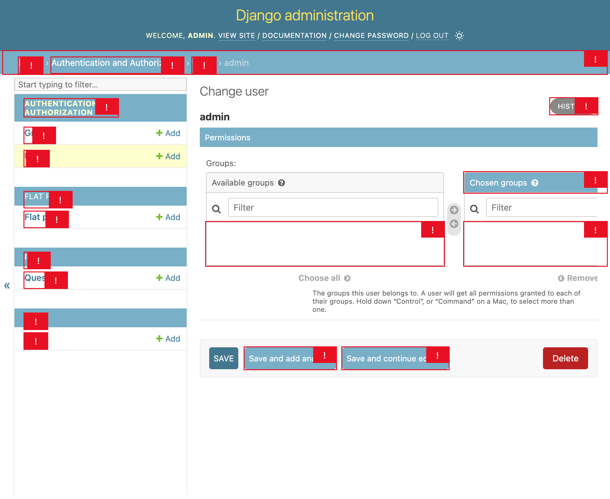
Here is a screenshot of a truncated form with those issues illustrated:
https://code.djangoproject.com/raw-attachment/ticket/34036/34036.png
--
--
Ticket URL: <https://code.djangoproject.com/ticket/34036#comment:1>
Django <https://code.djangoproject.com/>
The Web framework for perfectionists with deadlines.
--
You received this message because you are subscribed to the Google Groups
"Django updates" group.
To unsubscribe from this group and stop receiving emails from it, send an email
to django-updates+unsubscr...@googlegroups.com.
To view this discussion on the web visit
https://groups.google.com/d/msgid/django-updates/010701836e7ac39f-50d2f49c-3b03-478d-b52a-922bea5b70ff-000000%40eu-central-1.amazonses.com.