Hi everyone,

A couple of years ago the Engagement Team put together some mockups to
redesign the Friends of GNOME web pages. I'm really keen to pick this work
up again: the Friends of GNOME web pages are badly in need of an update.
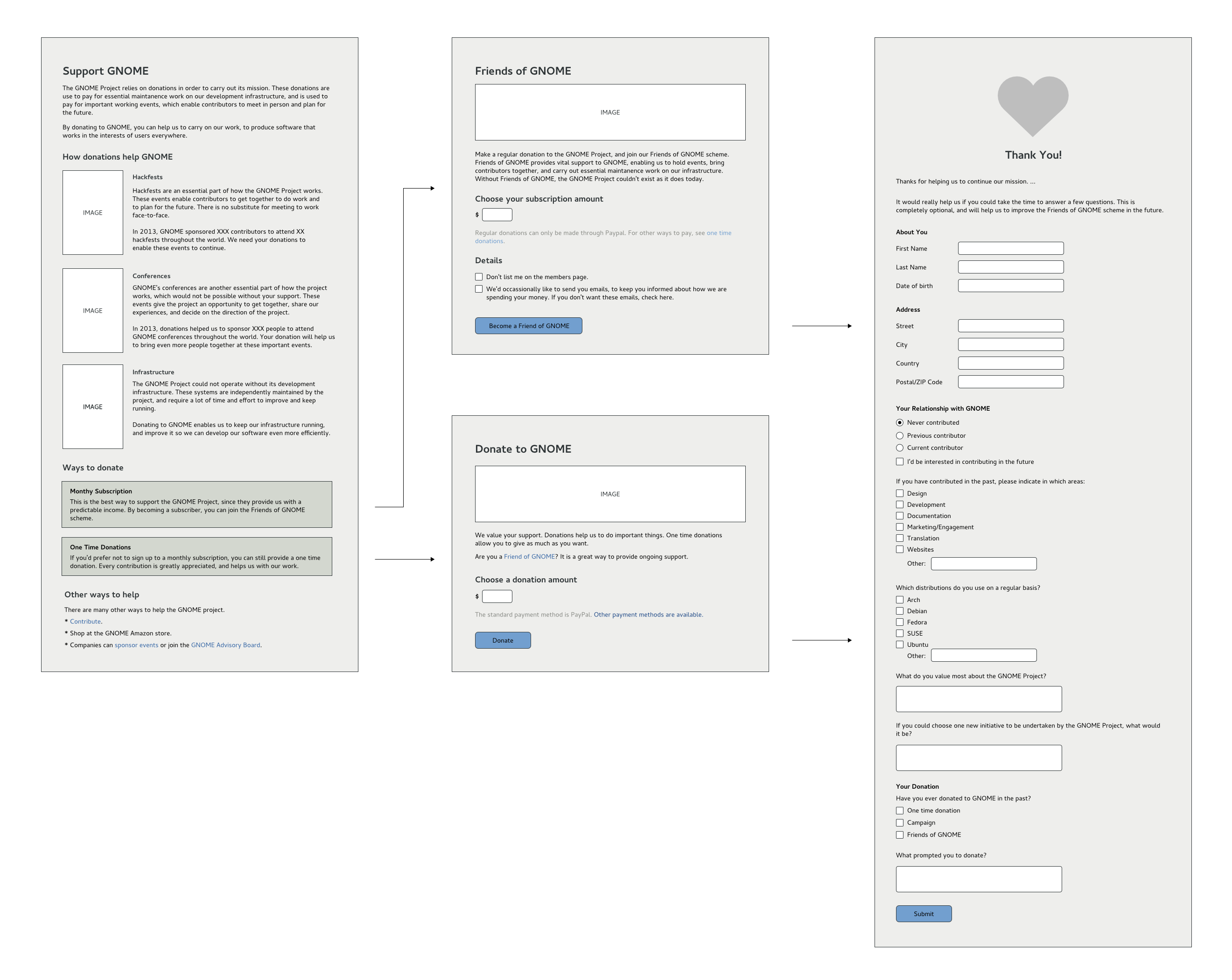
It seems like a good idea to revisit the previous designs to see if we are
still happy with them, or if anything needs to be changed. You can view
them here:

https://raw.githubusercontent.com/gnome-design-team/gnome-marketing/master/websites/friends-of-gnome/friends-of-gnome.png

Some key features of the designs, compared to what we have now:

   - The main page includes information on how donations are spent, and why
   they are important.
   - One time donations are more prominent, and are split out from monthly
   subscriptions.
   - No rewards for donors, like postcards or t-shirts.
   - Instead of predefined subscription levels, there's a box where the
   donor can specify the amount.
   - A questionnaire asks questions after someone has donated.

There is some background to these changes in the mailing list archives [1,
2, 3]. (You have to dig through the links to see the discussion,
unfortunately.)

My personal view is that the mockups themselves could be improved: they
have too much text at the moment, and could be more visual. Another thing
that occurs to me is that the designs don't cover what fixed goal fund
raising campaigns would look like on these pages.

Is there anything else we should change?

Allan

[1]
https://mail.gnome.org/archives/engagement-list/2014-August/msg00024.html
[2] https://mail.gnome.org/archives/engagement-list/2014-April/msg00052.html

[3]
https://mail.gnome.org/archives/marketing-list/2012-November/msg00112.html
_______________________________________________
engagement-list mailing list
[email protected]
https://mail.gnome.org/mailman/listinfo/engagement-list