On Mon, 19 Nov 2012 08:42:32 +0000 Rui Miguel Silva Seabra <[email protected]> said:
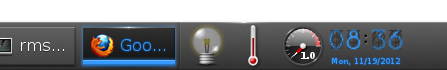
> You may be very right from an engineering point of view, but from an
> usability point of view you're quite wrong as the end result is quite
> dark and hard to read:
>
> http://files.1407.org/shot-dark-clock-on-dark-bg.png

i'm reading it incredibly easily. in fact not even reading - just glancing at
it and i can read the time just fine.

> Rui
>
> On Mon, 19 Nov 2012 09:55:29 +0900
> Carsten Haitzler (The Rasterman) <[email protected]> wrote:
>
> > On Sun, 18 Nov 2012 20:40:34 +0000 Rui Miguel Silva Seabra
> > <[email protected]> said:
> >
> > > As of today, some 10 hours ago old tree, the clock is almost
> > > unreadable, being dark blue on dark grey is not good...
> >
> > the day that it dark blue, is the day the sun is deep purple. this
> > isn;t a subjective thing - it's provable via rgb values (and lets say
> > you define dark blue as < 0x80 intensity of the maximum element).
> >
> > > Rui
> > >
> > >
> > > On Wed, 14 Nov 2012 22:24:19
> > > +0900 Carsten Haitzler (The Rasterman) <[email protected]> wrote:
> > >
> > > > On Wed, 14 Nov 2012 14:03:52 +0200 "Alex-P. Natsios"
> > > > <[email protected]> said:
> > > >
> > > > massively worse than whats there. in the same way its also blurry
> > > > and unreadable too (using that term the same way). in addition, a
> > > > serif font where everything else is sans-serif in the theme?
> > > > that's like walking around in a pink suit with green shoes and
> > > > expecting to be taken seriously in a business meeting. :)
> > > >
> > > > the clock is mimicing a blue version of a "tube clock":
> > > >
> > > > http://assets.ilounge.com/images/uploads/nixie-tube-clock-1.jpg
> > > > http://gadgets.boingboing.net/filesroot/nixie-tube-clock.jpg
> > > > http://i135.photobucket.com/albums/q146/atbglenn/Nixie%20Clock/MyNixieTubeClock.jpg
> > > >
> > > > as such it's a pretty good reproducion of such a thing as it was
> > > > done by hand, and its perfectly readable. people claiming it's not
> > > > readable are the kind of people who use that word to simply say "i
> > > > dont like it" - it has nothing to do with readability. you can
> > > > read is just fine without any problems.
> > > >
> > > > > Greetings,
> > > > >
> > > > > Many people came crying in #e about the new dark digital clock
> > > > > and those unreasonal scribbles in the numbers back.
> > > > >
> > > > > It looks cool and artistic but it is hard to read :( making it
> > > > > unusable as a module (at least in its digital form).
> > > > >
> > > > > After a brief discussion about it cipher (Haris Antonatos)
> > > > > decided to give it a try and create an alternative set.
> > > > >
> > > > > I think of it as pretty neat and matching with the overall feel
> > > > > please have a look at it as a possibly viable replacement of the
> > > > > current digital look.
> > > > >
> > > > > http://postimage.org/gallery/f4doc1s/
> > > > >
> > > > > --
> > > > > Best Regards,
> > > > >
> > > > > Alex-P. Natsios
> > > > > (a.k.a Drakevr)
>


--
------------- Codito, ergo sum - "I code, therefore I am" --------------
The Rasterman (Carsten Haitzler)    [email protected]


------------------------------------------------------------------------------
Monitor your physical, virtual and cloud infrastructure from a single
web console. Get in-depth insight into apps, servers, databases, vmware,
SAP, cloud infrastructure, etc. Download 30-day Free Trial.
Pricing starts from $795 for 25 servers or applications!
http://p.sf.net/sfu/zoho_dev2dev_nov
_______________________________________________
enlightenment-devel mailing list
[email protected]
https://lists.sourceforge.net/lists/listinfo/enlightenment-devel