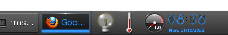
On Mon, Nov 19, 2012 at 10:50 AM, Carsten Haitzler <[email protected]> wrote:
> On Mon, 19 Nov 2012 17:35:01 +0800 P Purkayastha <[email protected]> said:
>
>> On 11/19/2012 04:59 PM, Carsten Haitzler (The Rasterman) wrote:
>> > On Mon, 19 Nov 2012 08:42:32 +0000 Rui Miguel Silva Seabra <[email protected]>
>> > said:
>> >
>> >> You may be very right from an engineering point of view, but from an
>> >> usability point of view you're quite wrong as the end result is quite
>> >> dark and hard to read:
>> >>
>> >> http://files.1407.org/shot-dark-clock-on-dark-bg.png
>> >
>> > i'm reading it incredibly easily. in fact not even reading - just glancing
>> > at it and i can read the time just fine.
>>
>> You got good eyes, siree. It is quite hard to read (especially because
>> of the underlying criss-cross grey pattern), unless you have a very dark
>> background.
>
> there is a very dark bg - the shelf... and i have the default wallpaper too.
>
> --
> ------------- Codito, ergo sum - "I code, therefore I am" --------------
> The Rasterman (Carsten Haitzler)    [email protected]
>
>
> ------------------------------------------------------------------------------
> Monitor your physical, virtual and cloud infrastructure from a single
> web console. Get in-depth insight into apps, servers, databases, vmware,
> SAP, cloud infrastructure, etc. Download 30-day Free Trial.
> Pricing starts from $795 for 25 servers or applications!
> http://p.sf.net/sfu/zoho_dev2dev_nov
> _______________________________________________
> enlightenment-devel mailing list
> [email protected]
> https://lists.sourceforge.net/lists/listinfo/enlightenment-devel
I do love Nixie Tubes and I still encounter them from time to time,
but they _are_ hard to read in general and so is the
Dark-Implementation.
Usually I can read it fine, but I can also see how the dark grey net
over the digits can make it very hard to read if the clock is a little
smaller and the lighting a little worse.

So I have a proposal: how about just having the lit-up digits always
on top and no "wiring" above it?
Yes, this is no correct analog Nixie Tube anymore, but we don't need
their disadvantages and can still keep the style.
If the wiring is still in the background, everyone gets the idea, it
looks just as good, and there is no more readability issue.

------------------------------------------------------------------------------
Monitor your physical, virtual and cloud infrastructure from a single
web console. Get in-depth insight into apps, servers, databases, vmware,
SAP, cloud infrastructure, etc. Download 30-day Free Trial.
Pricing starts from $795 for 25 servers or applications!
http://p.sf.net/sfu/zoho_dev2dev_nov
_______________________________________________
enlightenment-devel mailing list
[email protected]
https://lists.sourceforge.net/lists/listinfo/enlightenment-devel