I would remove the right-click at all from normal interaction and
leave it for
advanced users only.
While I'm not a big fan of the right-click either (try right-clicking
on a touchscreen or tablet!), it does give us another "word" while
using the language of the mouse. As long as it serves one, dedicated
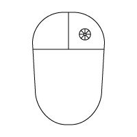
purpose, it doesn't bother me as much. Even better, label the right
mouse button with an actual icon, like so:
http://www.jesseross.com/clients/etoile/hardware/mouse_diagram.png
In this diagram I have assumed that the right click pulls up a circular
menu, and is thus labeled with a circular menu icon.
Considering mouse as our virtual hand, then the left click
should be "use the tool in hand/bare hand". From my point of view, the
right-click should be used for one of the following:
- bringing up a transient tool palette (circular/rectangular menu)
- bringing up a contextual menu (people are used to this from other
environments), everything in the menu should be accessible in other
means (not
like in many GTK/Gnome apps, where there are functions available only
through
contextual menu)
- switch between pointer and another tool (here I am recosidering my
thoughts
about his behaviour I have mentioned on the Wiki about pick&drop)
Rather than have a right click switch tools, I much prefer the display
format in your game screenshot, where the tools are always present.
Much like the Photoshop toolbar, having the tools present serves as an
additional indicator of which is currently selected and, thus, what
mode you are in.
Also, I think that the transient menu should serve as shortcut to the
main menu
or other more complex action/tool picker.
I had considered that myself -- having the vertical menu accessible
through the circular (transient) menu allows us to hide and show that
menu easily.
Here's my proposal:
Both types have their advantages, so we should use both. Circular
menus
should be used for items which don't change regularly and have few
top-level options, vertical menus should be use items which can change
regularly and have a lot of items. It makes the most sense for me to
use vertical menus to manage Component interaction with Objects (Text,
Table, Image, Audio, Person, Video, etc), and use circular menus to
manage interaction with the organizational items, such as Projects,
Documents, and Shelves and Applets.
I am confused here.
Sorry, I'll try to explain better. We have two "classes" of objects,
which I termed "Containers" and "Content" in a different email. A
container holds content: Projects (and Folders, if we have them),
Documents and the Shelf are all examples of containers. I would include
Applets (like OS X's Dashboard Widgets) in this group as well, since
they are more like utility applications and are closely tied into the
identity of the Shelf. Content includes the building blocks used to
create a document: Text Objects, Image Objects, Table Objects, Audio
Objects, People Objects, Video Objects, etc.
Containers are well defined by us regarding their use -- there are a
limited number of things we can do with a container: make a new one,
destroy it, add metadata to it, inspect its properties, etc. Content,
however, we want to be flexible -- we want developers to invent novel
ways of manipulating Object information via pluggable Components.
Remember, Components include most of the menu items you would now find
in GNUstep applications without the duplication of effort. For example,
you might have a Select All Component that selects all the information
in a document regardless of whether you're dealing with text or objects
or people. Or, you might have a Color Adjustment Component that that
can be used to change the color on an image or the color of text. We
have no idea how many Components might be installed by a user.
Since circular menus are best for things where you know the number of
items, and know that there will be not many items. Vertical menus are
best for when you have lots of items and need flexibility. Since the
number of menu items operating on containers are few, I would suggest
that circular menus are the primary method of menu interaction with
containers. Since we don't know how many installed Components a user
might have, vertical menus make the most sense for interacting with
Objects.
Here are my initial ideas for items in the circular menus (I'm sure
there are things I haven't thought of yet):

Project
-----------------------------
  - New
  -- Project
  -- Document
  -- Object
  -- Annotation
  - Duplicate
  - Hide/Show Annotations
  - Preferences
  -- Background
  -- Metadata
I would remove the "New" item. Creating new object in a project is
dragging a
prototype/template into the project container.
This might be a good way as well.
Hide/Show annotations is too specific. I want Hide/Show images or
hide/show
green text in Lucida font with size <12pt. Or why do you think it
should be
here?
I visualize Annotations as the scribbles you make over a Project to
comment on it or show the relationships between items. I see this
almost like a Shelf, that can be turned on or off. Maybe I'm wrong in
that assumption?
Instead of "Preferences" I would use "Inspect" and the inspector panel
will
pop-up. So my suggestion for default actions would be:

- duplicate
- destroy
- inspect
That would be fine too -- but I would prefer Destroy was Delete and it
was handled through the Delete key on the keyboard... or else we have
two different ways to do the exact same thing. The Delete key is
already there, lets use it ad a dedicated key.
Document
-----------------------------
  - New Object
  - Duplicate
  - Save Checkpoint
  - Publish
  - View Checkpoint History
  - Synchronize (for multi-user documents)
  - Preferences
  -- Size
  -- Margins
  -- Metadata
New object - not necessary.
What exactly means "Save chackpoint"? I have several interpretations
of that,
so
I would like to know yours.
See
http://dromasoftware.com/etoile/mediawiki/index.php?
title=Precognitive_FAQ where I talk about Versioning. A Checkpoint is a
term that was introduced in the Etoile presentation "Making Computers
Suck Less" by David and Nicolas. A checkpoint is simply a saved version
of a document at a specific point in time. Because we assume that
documents are always saved, if we want to create and track different
versions of a document, we press the Save Checkpoint menu item and the
document at that point in time is explicitly recorded. This is really
only important in memory-lacking systems. On a system with a lot of
memory, all points from the beginning of a document's life to the end
is saved -- on memory-lacking systems, the most recent version of a
document is preserved, as well as all checkpoints, while stages in
between may be dropped as memory gets reduced.
What is "Publish" in this cotnext?
Publish is like Export -- it saves the document to a specific format
for transfer to a non-Etoile system: PDF, Word Doc, Photoshop, etc. It
could also be used to strip out all of the checkpoints from a
document's history if you want to give a file to another Etoile user
but don't want them to see what you had in the document previously.
What is "View checkpoint history"?
It lets you see the different saved versions of a document.
My suggestions:
- duplicate
- destroy
- sync
- inspect
Again, all fine except for Destroy, which should be Delete and should
be handled by the Delete key.
Shelf
-----------------------------
  - New Applet
What is that?
We probably wouldn't need it, actually, since you could just download a
new Applet and move it from the downloaded location to the Shelf, we
wouldn't need it. Nevermind. :)
Applet
-----------------------------
  - Preferences
  -- Sticky
  -- (Additional Preferences as they relate to the specific Applet)
What is "Sticky"?
If you want an Applet to remain on screen when you hide the Shelf, you
make it sticky. This could either be a preference, or a certain button
that is toggled on.
All Objects would have two default items in their vertical menus:
Install New Component, and Link (to pipe data from one Object to
another). All others would be customizable.
What is "Install new component"?
I've changed my mind on this -- Components should just be downloaded
and dragged and dropped into a vertical menu list in order to install
them.
I agree with the "link", however, this is more complicated that it
seems to
be...
I believe it. Remember, I just come up with the ideas... :)
You may notice that some standard menu items are missing: Undo, Redo,
Delete, Pick, Drop (or Cut, Copy, Paste). I suggest that these be made
Dedicated Keys.
Undo/redo/pick/drop/cut/copy/paste... should be global tools in global
tool
shelf.
How is this better/easier than using dedicated keys?
Dedicated Keys
==============================

  - Zoom In
  - Zoom Out
Global magnifier tool - magnifier mouse cursor, accessible by a key.
- Search (Search Again would be Shift-Search)
Global search tool.
With a search, you're already typing, though, so it makes more sense to
have a Search key than a search tool you have to click on with the
mouse.
- Hide/Show Shelf
For advanced users + indicator of hidden shelf.
Yes -- the screen darkens when the Shelf is active.
- Scroll (for moving through a zoomed-in Project, I'll explain
below)
In old applications it was called "pan" and the tools was "panning
tool"
indicated by an open hand/palm cursor.
  - Pick (Pick a Copy would be Shift-Pick)
  - Drop (Drop a Copy would be Shift-Drop)
Tool with appropriate mouse cursor.
  - Undo
  - Redo
Global actions.
Note: You might notice that there are two kinds of things: Tools and
actions.
They all seem like actions to me... what is the difference?
Folders vs Projects
==============================
It has been said that we may use Folders as well as Projects. What is
the advantage to having both? Having two types of containers, when
Projects offer much more functionality over Folders, seems like it
would confuse the user.
What is the difference between project and folder? What are properties
of folder
and properties of a project?
Projects are Folders that when activated/opened expand to the entire
width and height of the screen. Thus, you can only view one project at
a time. When it fills the whole screen, the Project can be annotated --
marked up with drawings and text which act as metadata.
See http://jesseross.com/clients/etoile/ui/project_based/01/ for a demo
on how Projects would work.
Hot Corners
==============================
... for advanced users.
Yeah -- user customizable, like Expose.
The four corners are good hot spots for frequently used commands. I
would recommend that the corners be activated on click so as to
prevent
accidental activation. I have assigned commands to three of the four
corners:

Upper Left: Zoom Out
Upper Right: Zoom In to current selection
Too far away. I want to finetune the zoom, i have to move over a large
screen
from one corner to another. What about somehow activated slider where
one
corner means maximum zoom and the other means minimum zoom and i can
finetune
the zoom level?
Remember, I recommend that we have Zoom In and Zoom Out keys too. Maybe
we don't even need Zoom In and Zoom Out hotspots. The Zoom In and Zoom
Out keys should do a full jump from Project to Project or Project to
Document. Maybe Shift-Zoom In and Shift-Zoom Out zoom by a smaller
increment... maybe 10% of a regular Zoom In or Zoom Out.
Thanks for the good outline. Perhaps few images can help...
I intend to make some... drawings/mockups will definitely help... :)


J.