+1 on infra being unintuitive.
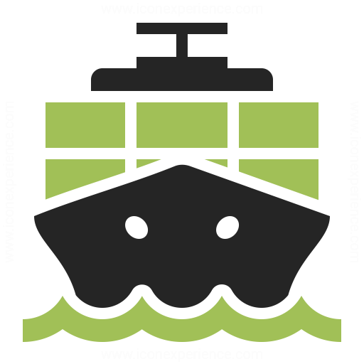
I'd also add that containers might not be obvious. I'd expect at least a
few because nobody runs just 1 container. Something like [1] or [2] is
more like what I'd expect, but at least 3 neatly stacked boxes IMHO.
Another this that overlaps a lot is Configure and Adminstrator. What's
the difference between configuring and adminstrating? I am aware that
this is currently also ambiguous but in the current design the left side
is operational and the right side more global. With a vertical design
you lose this difference so the labels need to be even more obvious. The
same can also be said for infrastructure. Even as an experienced Foreman
user I wouldn't know what to expect where.
Just a thought: is it possible to use Provisioning, Configuration,
Monitoring and Administration? Those are the core items we always
mention so can this be reflected in the menu and still be useful?
[1]:
https://www.iconexperience.com/_img/o_collection_png/green_dark_grey/512x512/plain/containership.png
[2]:
https://cdn0.iconfinder.com/data/icons/logistic-icons-rounded/110/Container-Ship-512.png

On Mon, Aug 14, 2017 at 10:06:05PM +0200, Timo Goebel wrote:
In my opinion, the infrastructure icon looks unintuitive. How about some kind
of treeview?
The rest looks good and straightforward to me.

Timo
On 14. Aug 2017, at 21:10, Roxanne Hoover <[email protected]> wrote:

Visual Design took a pass at the icons in vertical nav. Anyone have any
thoughts? They seem straightforward to me, some were unaltered from the
original chosen.
--
You received this message because you are subscribed to the Google Groups
"foreman-dev" group.
To unsubscribe from this group and stop receiving emails from it, send an email
to [email protected].
For more options, visit https://groups.google.com/d/optout.