Enron Corporation was an US based, world's leading electricity, natural
gas, communications and pulp and paper company, with claimed revenues of
nearly $101 billion in 2000. At the end of 2001 it was revealed that its
reported financial condition was sustained substantially by
institutionalized, systematic, and creatively planned accounting fraud,
known as the "Enron scandal". See < http://en.wikipedia.org/wiki/Enron >
and < http://www.enron.com/ >.
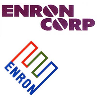
Enron used two logos, both also depicted on white company flags, the 1st
(Lippincott & Margulies’) replaced by the later (Paul Rand’s) somewhen in
the 1990ies. The later logo, and maybe also the flag with it, is still in
use by the Enron Creditors Recovery Corp. — whose «sole mission is to
reorganize and liquidate the remaining operations and assets of Enron
following one of the largest and most complex bankruptcies in U.S.
history.» (see < http://www.enron.com/images/logo.gif >).

(See however at < http://www.enron.com/images/favicon.ico > a different
logo in the favicon of enron.com. I have no idea how does it affect the
issue.)

The logo shows the outline of an upper case sans-serif "E" in red, green,
and blue, tilted on its lower back corner and the back side filled with
the word "Enron", in blue sans-serif capitals. Also used on a white flag:
< http://www.pbs.org/newshour/images/business/july-dec02/vouch2.jpg > (in
< http://www.pbs.org/newshour/bb/economy/july-dec02/veracity_8-14.html >,
with no vex content.) <us$enron.gif>

Being Enron what it was, its logo starred in countless parodies and
satyrical interpretations — you can see some of them here:
< http://politicalhumor.about.com/library/images/blenronlogo1.htm >.

This posthumous logo facelift replaced the "E" with three bulbs (?):
http://www.anvari.org/cols/Web_2.0_Logo_of_Famous_Companies/EnronLogo.html
I have no idea of its possible significance.

Archive footage on TV showed briefly sawn by me (sorry, I could not get
any detail about this “source”) showed a previous flag of Enron, with its
logo-lettering reading "Enron Corp" in purple bold wide sans-serif
capitals, the "o"s’ eyes replaced with a diagonal descending slash,
reminding slotted screw caps, aligned to match both slots, on a white
background. <us$enrn0.gif>

At < http://www.underconsideration.com/speakup/archives/002560.html >, a
comment says that «Paul Rand’s Enron Identity replaced the Identity that
was Developed and Designed by Lippincott & Margulies, 1990s.» and shows
image < http://www.underconsideration.com/random/maven_enron_logos.jpg >.

--
António MARTINS-Tuválkin                                            ____.
<[email protected]>                                          |  ()|
                                         Não me invejo de quem tem |####|
PT-1500-111 LISBOA                       carros, parelhas e montes      |
+351 934 821 700, +351 212 463 477       só me invejo de quem bebe      |
ICQ:193279138  http://tuvalkin.web.pt/   a água em todas as fontes      |
-------------------------------------------------------------------------
De sable uma fonte e bordadura escaqueada de jalde e goles, por timbre a
bandeira, por mote o 1º verso acima, e por grito de guerra "Mi rajtas!".
-------------------------------------------------------------------------

--
You received this message because you are subscribed to the Google Groups
"Flags of the world" group.
To post to this group, send email to [email protected].
To unsubscribe from this group, send email to [email protected].
For more options, visit this group at http://groups.google.com/group/fotw?hl=en.
<<attachment: us$enron.gif>>
<<attachment: us$enrn0.gif>>