> Yeah, that's a bit of a problem - how can we precisely define what is
> "correct", and if someone is doing something that differs from that
> spec, then aren't they (e.g., Apple or Microsoft) "wrong"?
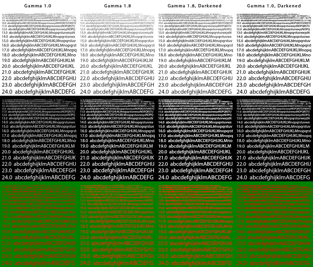
It's a technical definition with a bit of real world fudging thrown in.
The basic steps of correct text rendering in a world of > 2-bit visuals
are:

1) Create glyph bitmap from the font's vector data in linear gamma
space (gamma 1.0), where 50% coverage of a pixel by the outline
translates to a bitmap pixel value of 50% black[1]. This is what
FreeType spits out when you ask it do draw something. Hinting happens
before this step is completed. FreeType's control over the rendering
process ends here!

2) Blend the bitmap onto a surface in linear space. Here starts the
responsibility of the graphics library or GUI toolkit, because only the
lib knows the surface the glyph will be put on. No monitor out there
ever displayed stuff in linear gamma space afaik and most everything is
tuned to using sRGB (a gamma of about 2.2) or something else. The
graphics library therefore has to take the target pixels of the glyph
bitmap and convert the colors from whatever to linear space. Next, the
bitmap pixel and the target pixel have to be blended together (an
operation called "OVER" in composition speak).

3) Since we're in linear gamma mode now and no monitor displays this,
we have to "gamma correct" the final pixel before writing it back onto
the surface. For technical correctness, you need to gamma correct to
whatever gamma space you came from, usually sRGB.

Following these steps will get you rendered text that is smooth, keeps
the same weight on any background you put it on and has very little
color fringing if using LCD-optimized rendering.

The last step is where the fudging comes in. You face two problems:

a) The vast majority of screens out there are nowhere near calibrated.
With CRTs you always had a gamma curve of round about 2.1 to 2.3 or
something because that's how CRTs worked. With LCDs, there is no
technical reason why you couldn't have a gamma curve that looked like
[2]. This is a problem because...

b) ...gamma correction makes glyphs lighter because it makes grays
lighter (when going upwards of gamma 1.0). This is most obvious when
your glyph bitmaps consists mostly of grays: at small sizes, i.e.
everything on all LoDPI monitors ever[3].

Remember when people complained that text is too "light" when Microsoft
and Mozilla first introduced DirectWrite in their browsers? You have to
counter the lightness somehow or your users will complain about
unreadable text. Missing screen calibration means that you now have to
test and settle on an arbitrary gamma correction value or something
else to make text rendering less technically correct and more readable
for the majority of your users. On Windows, Microsoft opted to use a
gamma correction value of about 1.4 for legacy GDI-using apps and
tweaked the hinting of their flagship fonts a bit for DirectWrite,
Mozilla adjusted the ClearType parameters somewhat iirc. Adobe came up
with the stem darkening idea they also contributed to FreeType[3], my
personal favorite. It works well with CFF fonts, and less well with
explicitly hinted TTFs. Apple uses this concept, too, although I think
they really overdo it. They have no hinting to care about though. On
Android, Google recommends a gamma of 1.4 or something, but vendors are
free to do whatever they want to or simply ignore the issue. Thankfully
for them, problems a) and b) are MUCH less relevant on HiDPI screens
because glyphs contain more 100% black, which is same in gamma 1.0 and
23982392389.0.

Back to Infinality: The controls supplied by the Infinality patch set
only adjust things in 1) -- the result is incorrect if something is
done that *must* be done in 2) or 3)! No fudging at 1) will make text
look as good and harmonious across all fonts, sizes and backgrounds as
not fudging and properly doing 2) and 3).

[1]: Read http://www.kinematicsoup.com/news/2016/6/15/gamma-and-linear-
space-what-they-are-how-they-differ etc. Gamma pervades EVERYTHING you
do graphically on a computer.
[2]: http://www.prad.de/images/monitore/fujitsu_p27-8_te_pro/Bildmodus_
Benutzer.png
[3]: https://www.freetype.org/image/BlendingExamples.png -- Compare
Gamma 1.0 (what most graphics libs on X11 do today) with Gamma 1.8,
which is more correct.

> On the other hand, if we can't precisely define what is "correct"
> then that itself is a big argument for users to be able to tweak
> such settings.

You mean something like Microsoft's ClearType tuner? That will indeed
be nice to have... once 2) and 3) are done by all libs.

> Also, I don't know the extent (if any) variations in
> specific video drivers or physical screens play a role here (e.g.,
> what an ideal bitmap for a given rendering resolution should look
> like
> relative to what a user actually sees on their own particular
> screen).

Video drivers are irrelevant unless they mess with the bitmaps, screens
are more relevant due to a). The ideal bitmap does not exist I think.

> Yes, but at some point version 35 will go away, right? And the later
> versions of the interpreters do offer other improvements.

I don't think it will, the later versions are minor modifications of
v35 behavior that live in the same code as v35. v35 will stay as long
as the project wants to be compatible to various legacy fonts.

> OK, but I would like to ask *why* is this? Why can't, say, the
> GTK2/3+ folks, get this right after all this time?

Good question! FreeType doesn't solve b) across all font formats yet.
Also, performance in the olden days, inertia, nobody except five people
and me cares...

Qt can do 2) and 3) since 4.x or something, although it was disabled
because... people complained about light text ;)

_______________________________________________
Freetype-devel mailing list
[email protected]
https://lists.nongnu.org/mailman/listinfo/freetype-devel