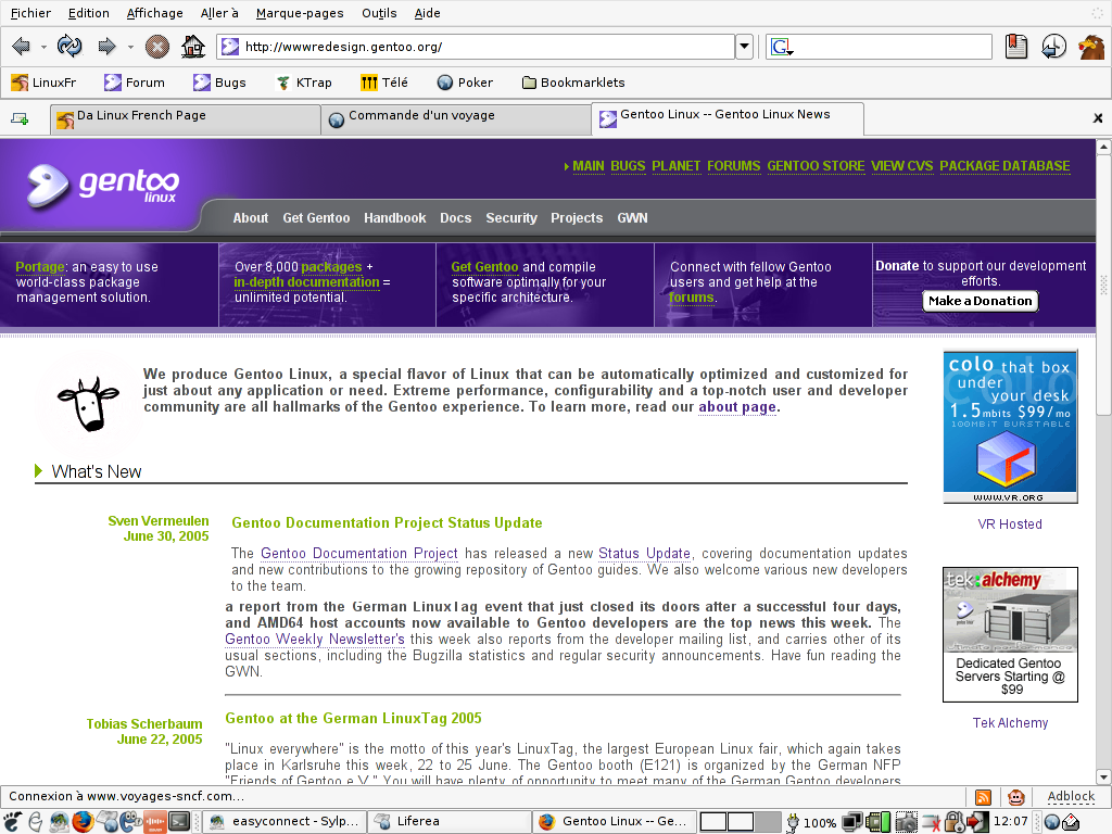
On Monday 21 November 2005 13:07, Thomas de Grenier de Latour wrote:
> On Mon, 21 Nov 2005 02:18:21 -0500
>
> Curtis Napier <[EMAIL PROTECTED]> wrote:
> > I'm asking for everyone (developers and users alike) to please
> > have a look at the updated site and send any feedback you may
> > have.
>
> Firefox-1.0.7 here, on a 1024x768 screen, and i think there is too
> much wasted space. Since i'm not new to Gentoo, when i go to the
> front page it's either to follow link to the doc or to read news.
> The former is fine, but the later is not (news are the last ~10% of
> what i see):
> http://tdegreni.free.fr/gentoo/redesign_gentoo_org.png
>
> I'm not good at HTML things so i can't send a patch, but I think the
> vertical size of the information boxes on top should be only what
> is needed for the text to fit, and not the background image size
> or whatever else it is at the moment. And also, there should be
> much less white space before the real contents starts.  Modified in
> Gimp, it would more looks like that:
> http://tdegreni.free.fr/gentoo/redesign_gentoo_org_fixed.png
>
On this respect, I agree, but also would like to be able to have the link
set at the bottom to be visible without scrolling. Perhaps they could be
moved to the side of the webpage. On 1280x1024 the text is too wide, and
in general the news font size seems to be a bit too big. Perhaps we could
also limit the amount of words in a news message and but the rest of the
message on a separate page.

In general I think that with the nice banner on gentoo we don't need the
cow saying "We produce ..." anymore. Perhaps a single line pointing to
the about page would be enough (yes I know it's also in the menu).

Paul

--
Paul de Vrieze
Gentoo Developer
Mail: [EMAIL PROTECTED]
Homepage: http://www.devrieze.net
![]() pgp6glbhgSeHO.pgp
pgp6glbhgSeHO.pgp
Description: PGP signature