gemmellr edited a comment on pull request #58:
URL: https://github.com/apache/activemq-website/pull/58#issuecomment-909407592
> > > Pushed a few more changes after chatting with @mattrpav. > > News feed on the front page with the 3 latest news items and a short description where you can include information about the number of changes, etc. The short description is pulled from the front matter of the release or news article so it should be pretty low impact to the release process: > I speak from a view of having pointed out on a frankly ridiculous number of occasions that people messed up making utterly trivial changes to update the website with a new release. You automated some bits originally to make it less effort, I thought that was great so I then made further improvements and did some others. Its obviously not hard, but from many prior showings people clearly dont want to go to the effort. Anything that makes it even slightly more 'difficult' like this is a bad idea. I wouldnt mind the extra step/detail being added here if I thought it actually added particularly useful info or made the site look nicer, but as I've said I personally dont think it does either. I still have to click to find out truly useful info, so the step and the space it takes up might as well not be there in my view. > > 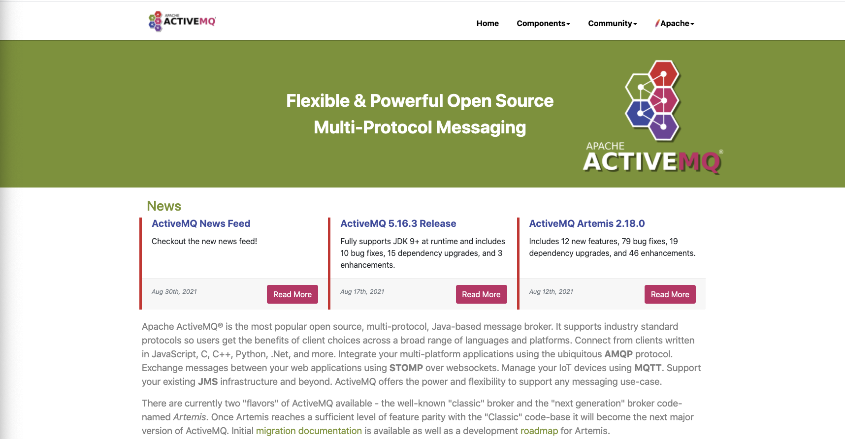 > Repeating prior comment that the banner and news feed take up way too much space. More so now the latter has about doubled in size. That the release happened and when is all I think it should show. It can then link to areas that have more information if desired. I guess from the description we are back to having multiple release entries for the same component, so I'll also repeat that I think that is a bad idea. Nothing so prominent as the front page should be linking to non-current non-mirrored releases. > Dedicated release pages for Artemis releases so I have some place to link to from the front page: > 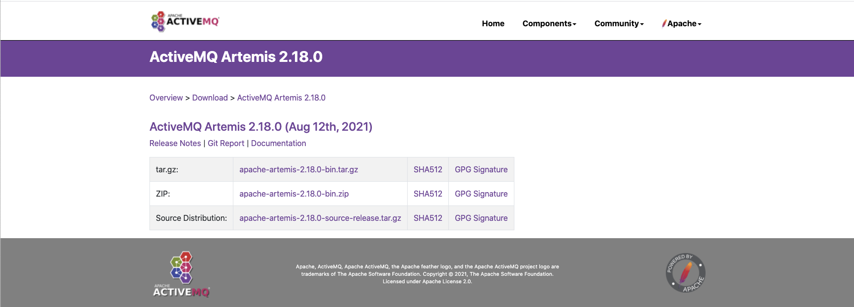 > I think it is better with a single download page being pointed to. People should always be directed to the latest release, particularly from any highly visible location such as the front page, as they are the only releases that are mirrored. If people want an old non-current release, there is already a simple page for those (which is linked to right from the top of the download page) or they can hit the archives directly. For the news page, it is easy enough to tell for older entries whether a release is 'current' or not and adapt the stale entry link to go to the past releases page instead of the download page. If we were to have prominent links pointing to individual release download pages then I think they should be set up to have a nice big warning emerge at the top noting if they are old releases and to go get the current release from the download page. (I also dislike that e.g existing 5.x release announcements go to a speciifc page rather than its download page, as that way people are always directed there when coming across old announcements rather than to the latest release. They should really have the same warnings added) -- This is an automated message from the Apache Git Service. To respond to the message, please log on to GitHub and use the URL above to go to the specific comment. To unsubscribe, e-mail: [email protected] For queries about this service, please contact Infrastructure at: [email protected]