I knew I used to get the Official Gmail Blog via e-mail!  I have them all
from the time I subscribed until they just stopped coming.  Here's one from
a couple of years ago.
*~Dodo*
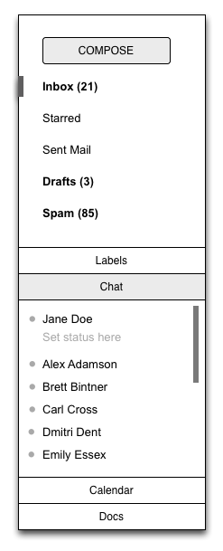
---------- Forwarded message ----------
From: The Gmail Team <[email protected]>
Date: Mon, Dec 5, 2011 at 9:00 AM
Subject: [Official Gmail Blog] Designing Gmail’s new left navigation
To: [email protected]


Posted by Jason Cornwell, User Experience Designer

One of our goals for the Gmail's new
look<http://gmailblog.blogspot.com/2011/11/gmails-new-look.html>was to
make Gmail feel more like a native application with independently
scrolling panels rather than a website that scrolls as a single page. This
design approach brings with it many advantages: the search box and primary
navigation are always in the same place, your inbox unread count is always
visible, etc. As with any design decision there were challenges with making
this change. People with lots of labels might have their chat contacts
pushed entirely off the screen and those with gadgets, like the Google Docs
or Calendar gadgets, might have to scroll the left panel past both the
labels and the chat contacts in order to see them.

We went through a number of different design revisions to try and address
these issues as elegantly as possible. We experimented with several
accordion designs, which stack sections on top of each other but only allow
one or two to be open at a time.

<http://4.bp.blogspot.com/-hlZ-x9kRGxc/Ttz2nDxFo8I/AAAAAAAAAeE/6-KFWxxee44/s1600/accordion.png>
We also experimented with designs that involved only one scrolling region,
but showed fewer entries per section.

<http://3.bp.blogspot.com/-nfApp0SRcUs/Ttz2nI1MBqI/AAAAAAAAAeM/gX9JegJyRkA/s1600/truncation.png>
The final design combines aspects of both approaches. It is a ducking
accordion design with only two sections. The bottom section has two tabs,
one for chat and one for gadgets, with room to add more tabs in the future.
The upper section, which contains labels, expands to show all of the
visible labels when you mouse over it. This allows you to see chat contacts
but still give quick access to the labels. Best of all, you can easily
adjust the balance between labels and chat to fit your own personal
preference by dragging the divider between the sections up and down.

<http://3.bp.blogspot.com/-bL4yvL7pcQY/Ttz2ncKfaEI/AAAAAAAAAec/SkaYDfScSj0/s1600/today.png>
This design went through a number of iterations as well. We carefully
adjusted the timing and triggering behavior of the expanding labels section
to minimize accidental triggering. We noticed in usability testing that
having the labels section expand when you are mousing over the Inbox label
delete didn't work for everyone. We tweaked the system only to expand if
you moved your mouse below the inbox label and keep it there for a moment.
We also tried to ensure that if you are moving your mouse to click on a
particular label or chat contact, that label or chat contact will never
move out from under you.

The end result is a system that is more flexible, more responsive, and
always keeps your chat contacts and unread count visible without adding a
lot of complexity or requiring too much clicking around.

--
Posted By The Gmail Team to Official Gmail
Blog<http://gmailblog.blogspot.com/2011/12/designing-gmails-new-left-navigation.html>at
12/05/2011 09:00:00 AM

--
You received this message because you subscribed to the Gmail Blog via
email.
To unsubscribe, email [email protected]. More
info at http://groups.google.com/group/gmail-blog-posts?hl=en

--
You received this message because you are subscribed to the Google Groups
"Gmail-Users" group.
To unsubscribe from this group and stop receiving emails from it, send an email
to [email protected].
To post to this group, send email to [email protected].
Visit this group at http://groups.google.com/group/gmail-users?hl=en.
For more options, visit https://groups.google.com/groups/opt_out.