Hello,

I have to admit: This is my 2nd attempt to send this e-mail so that you all can
read it. The 1st attempt 12 hours ago seemed to fail - still haven't received
my e-mail from the mailing list. I must have done mistakes in addressing, it
probably must be different, because it's a response e-mail to an e-mail of this
month... but I think and hope I got it now... whatever...
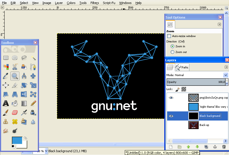
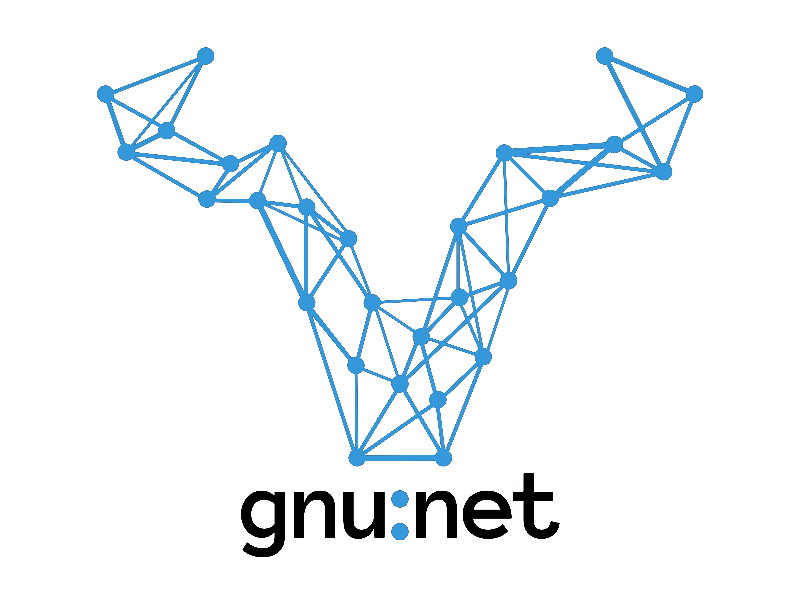
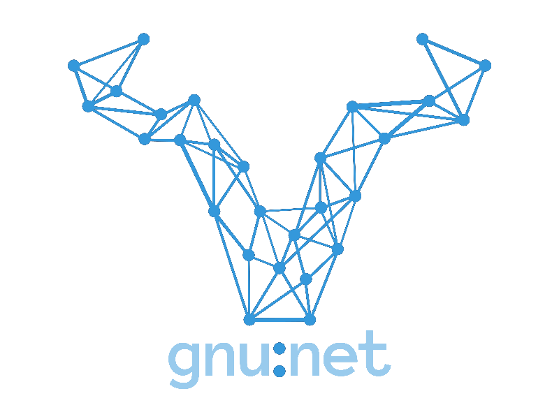
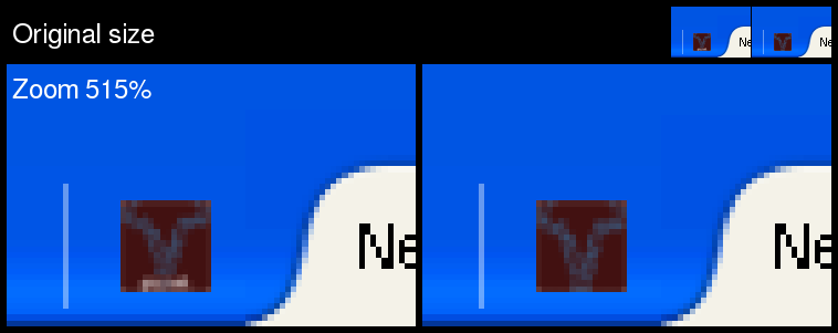
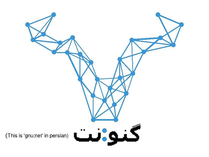
2 things: A basic evaluation & suggestions for improvement


1. - A basic evaluation:

The result of addressing the raised legal concerns by changing the shape of the
gnu away from a 'V' form worked out very well.

As such the 'network in shape of a gnu' logo including the text 'gnu:net' looks
good.

In comparison to the old logo - the comic gnu in the spider net - the 'network
in shape of a gnu' is a clear improvement.
New point:
The logo design approach of a 'network in shape of a gnu' as such can be
animated better by an 'appearance animation' than the old logo - the comic gnu
in the spider net. So, in case our community starts efforts to let the GNUnet
logo appear by an animation, the prospects of a good outcome as such are far
better with the 'network in shape of a gnu' than with the old logo - the comic
gnu in the spider net.
Old point:
The 'network in shape of a gnu' logo is refreshingly timeless, modern, and
slick, a look mirroring what the GNUnet is: Hot shit. So, it's pleasing and
just fits to the project.

I'm wondering a bit about the text not being 'GNUnet', but 'gnu:net'. Wasn't
consensus in case of text application, that it should be 'GNUnet'?

In case of a vote and if I had a say there, I would vote in favor of changing
the old logo - the comic gnu in the spider net - to this version of the
'network in shape of a gnu' posted by Lynx on 24th of june 2018 on this mailing
list.


2. - suggestions for improvement:

The network and the text look good, but the background doesn't fit so well: The
white border distracts and when you squinch your eyes half way shut, the brown
background turns into black.
So, let's go dark/no-brown right away: Here are 2 variations without the white
border and no brown background - a black background, and a 'night theme'-like
very dark blue background.
Both build up a brightness difference between the network and the background,
which lets the network appear to be glowing a bit - but just a bit, not too
flashy - which is good.

'night theme' version:  https://abload.de/img/logoonnightthemelikevo7jbt.png
- dev screenshot: https://abload.de/img/devscreenshot-logoonnkckqe.png
black background version:
https://abload.de/img/logoonblackbackgroundv5sud.png    - dev screenshot:
https://abload.de/img/devscreenshot-logoonbvmjsc.png


In general I think it's a good idea to just stick to 3 colors regarding this
design:
This bright blue,
black/'night theme' like very dark blue,
and white


The text has a different color than the image. And it's not just a different
alpha value making it the same color but just half way transparent instead of
solid.
As a result changing backgrounds becomes a hassle:
The image color always stays the same - this bright blue - so you avoid
backgrounds in bright blue.
When you have the bright blue image with text on the black background, but the
text hasn't the same color than the image, at all,
then you have to make sure, that the text color additionally works out well on
the background: So, with black background the text can't be black, too, but
rather has to be something else, like white, for example.
Same with white background. White text would vanish, so you need something
else, like black text, for example.

logo on black background: see the link above -
https://abload.de/img/logoonblackbackgroundv5sud.png
logo on white background: https://abload.de/img/logoonwhitebackgroundc6khx.png

One could avoid this hassle by making the text in the same color like the image
- this bright blue - but go half way down with the alpha value, so that the
text is half way transparent, and so always works out well no matter what the
background is.
3 nice side effects of this approach:
This way text is not competing so much with image for attention. The image gets
primary priority, the text second priority.
Additionally this way text and image melt more together. They also do so in
spacing by the 2 network like dots between the text, that's one interaction in
space.
The half transparency approach adds a second interaction between both, an
interaction in color. And that all around forms image and text to a pretty well
harmonized team.
3rdly, shaped like this the text always will integrate between the image and
the background. This way in general the logo fits better into all different
kinds of backgrounds.

logo + half transparent text on 'night theme' like very dark blue background:
https://abload.de/img/logohalftransparenttel2jn5.png
logo + half transparent text on black background:
https://abload.de/img/logohalftransparentte2okgs.png
logo + half transparent text on white background:
https://abload.de/img/logohalftransparenttexrkr2.png


So, if the logo shall be built by image + text, I would suggest going for half
transparent text in color of the image.
But I rather suggest leaving away the text, adding 3 new reasons for it next to
the old ones:

The new ones:

Good logo design also means, that a logo is clearly and easily recognizable in
a small size, like for example as a web browser tab icon.
And this is an aspect, which gets more and more important. Think of social
media avatars and the transformation of our computer experiences rather towards
small mobile phone screens, away from big screens.
Reason no. 1.: A logo with text will always be less clearly and easily
recognizable than a pure image logo version.
Additionally - reason no. 2 - often small size versions of a logo are so small,
that you can't read the text in it, anyway, in case the logo contains text.

Comparison picture:     https://abload.de/img/smallsizeevaluationdokb9.png

Comparison picture of the logo with text and the logo without text in context
of web browser tab icons - this transforms
every picture in a 16x16 px square, no matter how the proportions and size were
before


Reason no. 3: Having image with text as a logo or just a pure image decides
wether a logo is universal,
or if adjustments within the logo itself are necessary from language to
language:

Example picture:
https://abload.de/img/logotextindifferentlaldsnu.png

The old ones:

Just using the image, and that's it, leaving the writing under it away, is the
best solution to the problem of too big competition for attention between the
logo and the writing.

Let it speak for itself, because it can.
Firstly, the logo as such is self-explanatory,
and secondly, the logo already is surrounded by the writing 'GNU' or 'GNUnet',
because of it's environment:
We're seeing the logo in logical connection and close to something, which
contains the writing 'GNU' or 'GNUnet'.
Maybe it's the URL in the address bar, or the hashtag of a social media message.

So, to sum it up:
In case of a vote and choice of versions incorporating said suggestions for
improvement and if I had a say there, I would vote...
1st priority: in favor of changing the old logo - the comic gnu in the spider
net - to this version of the 'network in shape of a gnu' posted by Lynx on 24th
of june 2018 on this mailing list, but without the text under the image, and
with suggested color & background scheme (bright blue, black/'night theme' like
very dark blue, and white)
2nd priority: in favor of changing the old logo - the comic gnu in the spider
net - to this version of the 'network in shape of a gnu' posted by Lynx on 24th
of june 2018 on this mailing list, but with the text under the image being
half-transparent and in image color, and with suggested color & background
scheme (bright blue, black/'night theme' like very dark blue, and white)

Otherwise - 3rd priority - I'd just go with the basic version, voting in favor
of changing the old logo - the comic gnu in the spider net - to this version of
the 'network in shape of a gnu' posted by Lynx on 24th of june 2018 on this
mailing list.


Greetings,
Bastian Schmidt

--- Ursprüngliche Nachricht ---
Von: carlo von lynX <[email protected]>
Datum: 24.06.2018 21:01:01
An: [email protected]
Betreff: [GNUnet-developers] logo rework

> I picked one of amirouche's most promosing
> designs (thanks for the svg!), changed the
> horns and head to look a bit more like a
> gnu and less like a 'V', changed some vertices
> that were too near to each other, changed
> vertices that were too thin for printing and
> generally zoomed into every part of the logo
> to position the points and vertices in a more
> structured way.. also worked on the symmetries
> and intentional asymmetries to make things
> line up where they should. I tried some fonts
> but ultimately Martin's suggestion to try
> 'Anonymous Pro' proved the best looking - and
> quite ironic to be called that way. I did
> change the kerning however.
>
> So here's something we could go for as a new logo to go
> with the new website.


_______________________________________________
GNUnet-developers mailing list
[email protected]
https://lists.gnu.org/mailman/listinfo/gnunet-developers