Just some quick remarks, a real comment has to wait a few days I guess
because of my schedule:
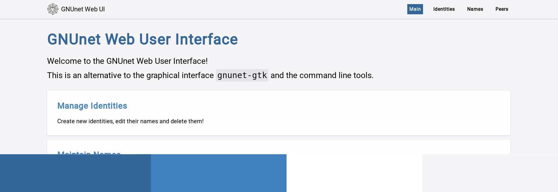
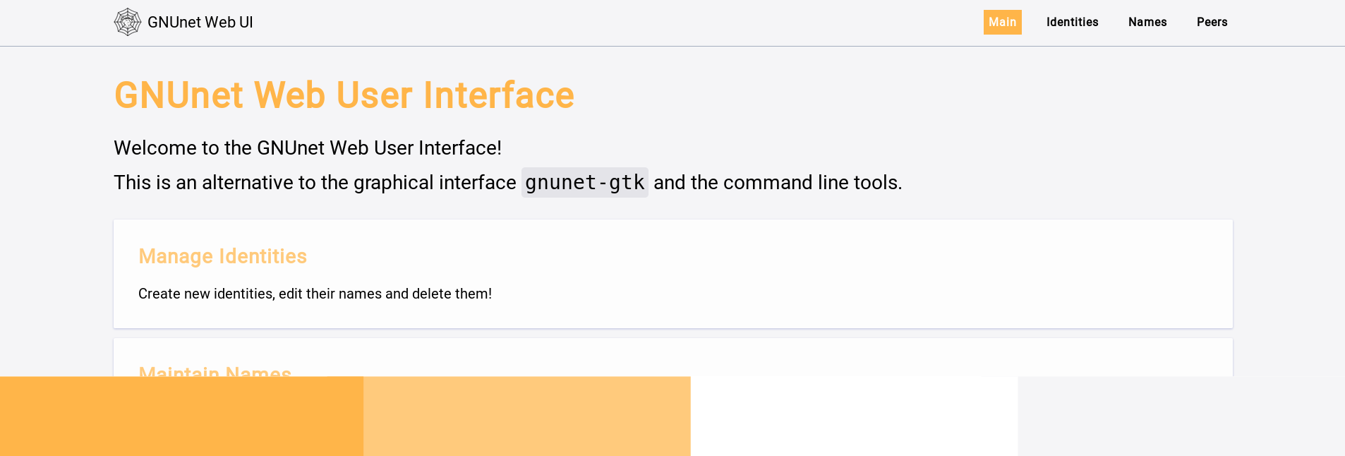
once there is a branding/corporate identity guide (which goes in the
direction of what you are proposing to start) We should have variants
for the static generated website. Beyond a default we somehow however
agreed upon, we need values for people who have problems with certain
color ranges (and optional:) as well as for people like myself who
prefer to read dark on bright background during the day, and dark colors
in the morning and night.

Christian Grothoff transcribed 4.8K bytes:
> Dear Phil,
>
> There is no "official" color scheme (at least not yet), and work on this
> is very much appreciated.  However, you should check out the 'www.git',
> and possibly modify the CSS there: we're _today_ hacking in a larger
> group on www.git for the content, so work on the colors would be nicely
> complementary.
>
> The instructions for generating the HTML in the README work at best
> 'sometimes' right now, but we'll try to put up a staging page generated
> automatically from the Git via CI 'soon'.
>
> (Oh, and I won't comment on the colors you proposed, as I am not at all
> qualified to comment on colors.)
>
> Happy hacking!
>
> Christian
>
> On 06/26/2018 07:55 PM, Phil Buschmann wrote:
> > Hi,
> >
> > the last mails on this mailing list discussed design of the logo and the
> > website but I was thinking of another important design question:
> > As it is kind of my work to design a website for the rest API of GNUnet
> > (GSoC), I want to be consistent with the current or future design of the
> > GNUnet web page. However, I could not find any officially defined color
> > scheme. Therefore, I'd like to propose some examples (of the current
> > Main Page for the API website [https://gnunet.org/git/gnunet-webui.git/]).
> >
> > Every image will have a bottom line with a four color color scheme.
> > White is currently used for background of cards and light grey is used
> > as general background. I didn't define a bright secondary color,
> > otherwise my design became too overloaded. Big headers and buttons use
> > the first, primary color, "subheader" use the second, lighter primary
> > color.
> >
> >
> > 1: https://abload.de/img/gnunet_website_colors12k69.png - This would
> > resemble the color scheme of the current GNUnet website.
> >
> > 2: https://abload.de/img/purple_colors3aj7d.png - This is the same
> > design in another color variation, which is currently used by myself on
> > the website.
> >
> > 3. https://abload.de/img/amber_colorsigj9b.png - I changed these colors
> > just to show, that we do not have to use a blue-like color, but the
> > readability is not quite perfect in this example.
> >
> >
> > If I missed the official scheme, please point me into the right direction.
> > Otherwise, I'll be also happy to try out new combinations, just respond
> > with color codes / ideas.
> >
> > BR,
> > Phil
> >
> >
> >
> > _______________________________________________
> > GNUnet-developers mailing list
> > [email protected]
> > https://lists.gnu.org/mailman/listinfo/gnunet-developers
> >
>


> _______________________________________________
> GNUnet-developers mailing list
> [email protected]
> https://lists.gnu.org/mailman/listinfo/gnunet-developers


_______________________________________________
GNUnet-developers mailing list
[email protected]
https://lists.gnu.org/mailman/listinfo/gnunet-developers