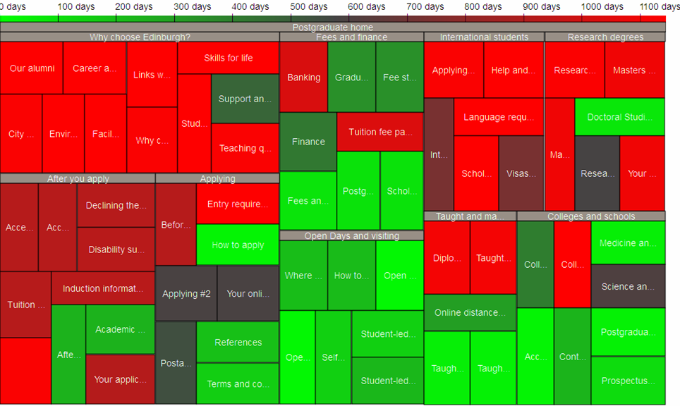
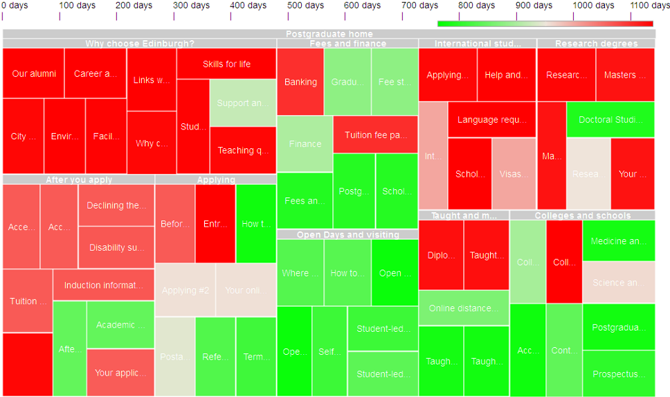
The default colors have changed (and in particular the middle color). You
can set them to the previous values that looked nicer for you if you prefer.
As for the scale, indeed having it use only part of the space does not match
your added scale marks. We are considering adding more information on our
legend which might be helpful in that case.
  Viz Kid

On Thu, May 19, 2011 at 3:13 PM, mmorrey <[email protected]> wrote:

> Hi again.
>
> You can see what I mean clearly in the following screengrabs of an
> example page (before and after the change happened)
>
> The labels and markings on the scale at the top of the chart are my
> own addition.
>
>
> http://www.docs.is.ed.ac.uk/docs/uws/maintenance/2011-05-01/2011-05-01_treemap-grab_before.png
>
>
> http://www.docs.is.ed.ac.uk/docs/uws/maintenance/2011-05-01/2011-05-01_treemap-grab_after.png
>
> I didn't change a thing about this.  One day it looked like the
> "before" image (1st May).  When I looked a few days later, it looked
> like the "after" image.
>
> Martin
>
> On May 14, 8:00 am, Viz Kid <[email protected]> wrote:
> > Hi
> >
> > The default colors of the treemap has changed in the last release, with
> some
> > other cosmetic changes.
> > You can set the colors to what they were before as someone already
> mentioned
> > here, so I'm not sure what exactly you consider as the issue.
> >
> >   Viz Kid
> >
> >
> >
> >
> >
> >
> >
> > On Fri, May 13, 2011 at 3:04 PM, Valani <[email protected]> wrote:
> > > I have experienced the same issue.  Something changed.  I already
> > > reported this as a bug, so please comment on it so we can raise it
> > > higher
> >
> > >http://code.google.com/p/google-visualization-api-issues/issues/detai.
> ..
> >
> > > On May 10, 9:32 am, mmorrey <[email protected]> wrote:
> > > > Has anyone else experienced a change to the visualization API, at
> > > > least to thetreemapvisualization, in May 2011?
> >
> > > > The colors in my treemaps seem to have suddenly got lighter,
> affecting
> > > > the readability of my white labels.
> >
> > > > The color scale indicator has also got much narrower - it used to be
> > > > the full width of the diagram, and now its about about a third of
> > > > width and aligned to the right, wrecking my carefully positioned
> value
> > > > markers.
> >
> > > > According to the release notes, the last release was pushed in March
> > > > 2011, but my examples have definitely changed since I did some
> > > > screengrabs of them in late April.
> >
> > > > Thanks,
> >
> > > > Martin
> >
> > > --
> > > You received this message because you are subscribed to the Google
> Groups
> > > "Google Visualization API" group.
> > > To post to this group, send email to
> > > [email protected].
> > > To unsubscribe from this group, send email to
> > > [email protected].
> > > For more options, visit this group at
> > >http://groups.google.com/group/google-visualization-api?hl=en.
>
> --
> You received this message because you are subscribed to the Google Groups
> "Google Visualization API" group.
> To post to this group, send email to
> [email protected].
> To unsubscribe from this group, send email to
> [email protected].
> For more options, visit this group at
> http://groups.google.com/group/google-visualization-api?hl=en.
>
>

--
You received this message because you are subscribed to the Google Groups
"Google Visualization API" group.
To post to this group, send email to [email protected].
To unsubscribe from this group, send email to
[email protected].
For more options, visit this group at
http://groups.google.com/group/google-visualization-api?hl=en.