I'm not sure if the image and the description are connected. But, for your
example, you can have a bar chart showing this year's sales and have a line
chart represent the information of last year on the same chart (using
ComboChart<http://code.google.com/apis/chart/interactive/docs/gallery/combochart.html>
).
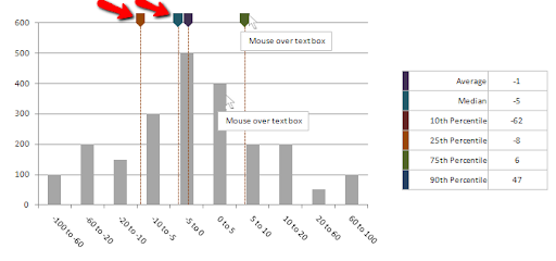
Hope this helps,
  Viz Kid

On Fri, Sep 2, 2011 at 12:25 AM, Li-Ming Lu <[email protected]> wrote:

> Trend lines are horizontal/vertical lines spanning the chart canvas which
> aid in interpretation of data with respect to some pre-determined value. For
> example, if you are plotting sales data of current year, you might want to
> add previous year's average monthly sales as trend indicator for ease of
> comparison.
>
> How to add image to the end of trend line?
>
>
> <https://lh5.googleusercontent.com/-WbDPiPCWDTo/Tl_4D--6d1I/AAAAAAAAABM/LjsQuxDBT3w/p4p_histogram.png>
>
>  --
> You received this message because you are subscribed to the Google Groups
> "Google Visualization API" group.
> To view this discussion on the web visit
> https://groups.google.com/d/msg/google-visualization-api/-/ayW9sjozqhgJ.
> To post to this group, send email to
> [email protected].
> To unsubscribe from this group, send email to
> [email protected].
> For more options, visit this group at
> http://groups.google.com/group/google-visualization-api?hl=en.
>

--
You received this message because you are subscribed to the Google Groups
"Google Visualization API" group.
To post to this group, send email to [email protected].
To unsubscribe from this group, send email to
[email protected].
For more options, visit this group at
http://groups.google.com/group/google-visualization-api?hl=en.