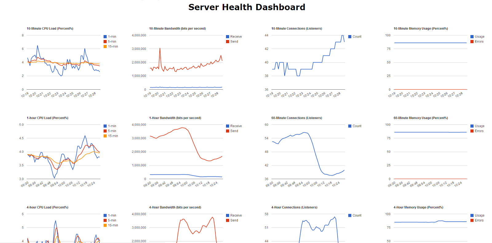
Hi Group, I'm new.  I created a script that polls server performance
statistics (CPU, Memory, Bandwidth) ... every 10 seconds and logs to a
MySQL Database.  Every so often the recent results are averaged and stored
in separate tables to be able to display long term statistics without
saving all the 10 second records.   In my first attempt at Google charts I
have managed to make all sorts of basic easy graphs already (see picture
below)
I'm seeking suggestions for a chart type that I can use to get away from
drawing 20 different charts.  Preferably a single chart that shows all the
statistics in one with the ability for variable zoom anywhere from 10
minutes to 31 days or more.

I know how to join all the SQL records into a single dataset easy enough.
 Every record has a unix timestamp.  The H axis would need to be formatted
as date/time.

What does the group think would be the best fit for this application?


<https://lh3.googleusercontent.com/-sKqvU0R2f0k/UlGeUQ88mTI/AAAAAAAAACE/JtkdZ9jLte8/s1600/dashboard.PNG>

--
You received this message because you are subscribed to the Google Groups
"Google Visualization API" group.
To unsubscribe from this group and stop receiving emails from it, send an email
to [email protected].
To post to this group, send email to [email protected].
Visit this group at http://groups.google.com/group/google-visualization-api.
For more options, visit https://groups.google.com/groups/opt_out.