Bonjour,

voici mon problème. J'aimerais un peu uniformisé le look de mon graphique
qu'il ai 1 ou 80 entrées.
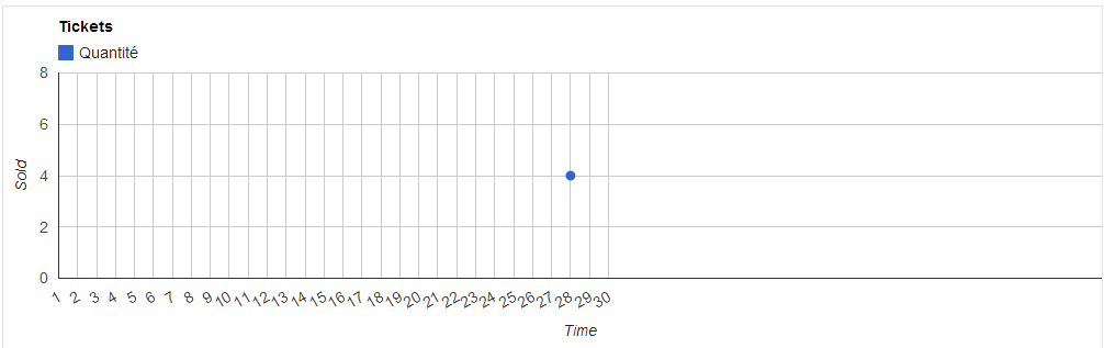
Le voici avec 1 seule entré et les options suivantes:
{
title: 'Ticket sales',
lineWidth: 0,
pointSize:7,
interpolateNulls:true,
vAxis:{title: 'Sold',Color:{color: '#333'},format:"####"},
hAxis:{title:
'Time',format:'##',ticks:this.range(1,30,1),maxTextLines:0,showTextEvery:1,minTextSpacing:500},
legend:{position:"top"},
chartArea:{left:50,top:60,width:"100%",height:"60%"}
};
<https://lh5.googleusercontent.com/-RZ7N8icJFmc/Uuf-S6VO4jI/AAAAAAAAAGM/fn-CFFBFmd8/s1600/Capture.PNG>
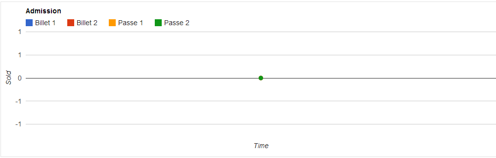
Et pourtant, avec les mêmes options, il peut avoir l'air de cela (Cependant
il n'a aucune donné):
<https://lh5.googleusercontent.com/-HzzU7PI5Q0o/Uuf-tckEiyI/AAAAAAAAAGU/Z_ul78KmzpQ/s1600/Capture2.PNG>
Ou ceci (qui n'a aucune donné lui non plus):
<https://lh6.googleusercontent.com/-hbgVQlelTVM/Uuf-0EHuTjI/AAAAAAAAAGc/TecXu0MqYrc/s1600/Capture3.PNG>
Je ne comprend vraiment pas comment sa peut rendre de façon aussi
différente avec les mêmes options.
--
You received this message because you are subscribed to the Google Groups
"Google Visualization API" group.
To unsubscribe from this group and stop receiving emails from it, send an email
to [email protected].
To post to this group, send email to [email protected].
Visit this group at http://groups.google.com/group/google-visualization-api.
For more options, visit https://groups.google.com/groups/opt_out.