Hi,
if I plot the same data on a LineChart using Date on the x-axis I get a
different result when using an "index" on the x-axis.
For example if I plot
["2015-04-26T15:00:00", 46.20]
["2015-04-26T17:00:00", 43.23]
["2015-04-26T19:00:00", 52.25]
["2015-04-27T09:00:00", 96.19]
["2015-04-27T10:00:00", 41.65]
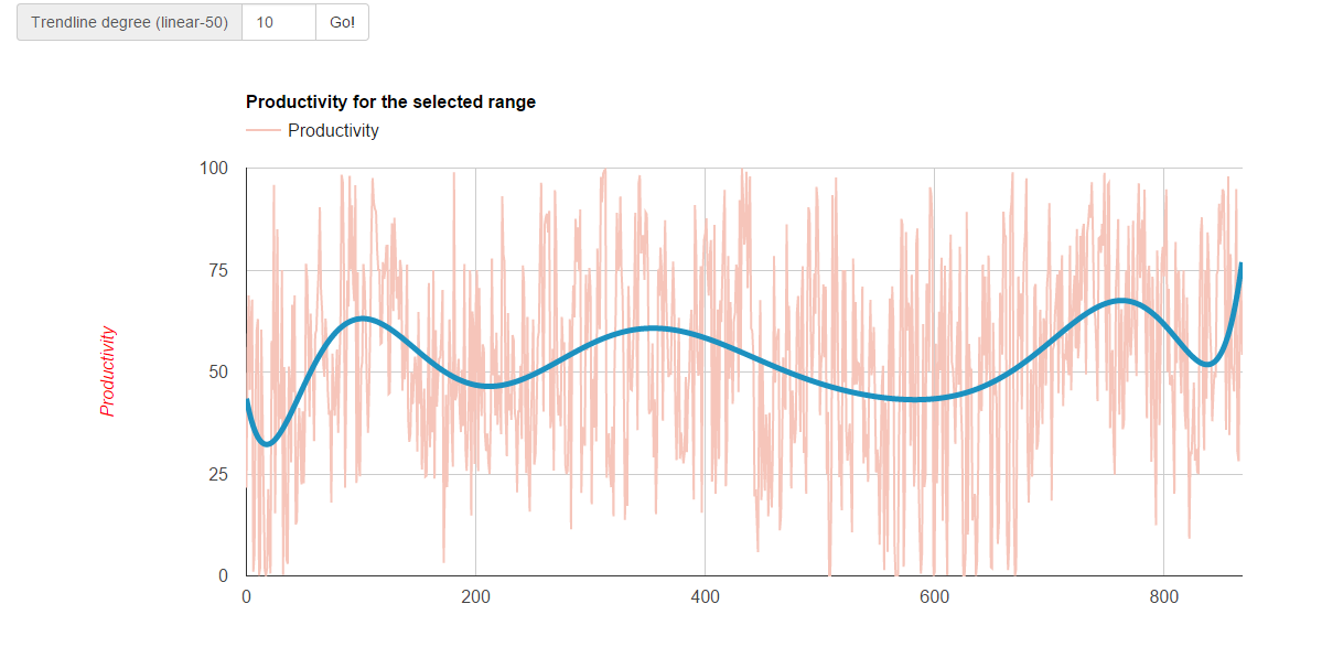
I get a different result when plotting

[0, 46.20]
[1, 43.23]
[2, 52.25]
[3, 96.19]
[4, 41.65]

It seems that some data are removed when using date.
Also: when using date the trendline does not work properly

Here is my code: http://pastebin.com/pMKNZUSM
What's wrong?

In the following pictures the dataset used is the same. Note that the
trendline in both graph is polynomial with 10 degree

<https://lh3.googleusercontent.com/-ymafsIis550/Vlgm1WiiSZI/AAAAAAAAAsc/LPhDCCk0HTU/s1600/ok%2B-%2BCopia.PNG>

<https://lh3.googleusercontent.com/-qoZuAo8aS98/Vlgm5rw6LJI/AAAAAAAAAsk/UW7AP2hBeJI/s1600/nok%2B-%2BCopia.PNG>


PS: sorry for my english: is not my native language :)

--
You received this message because you are subscribed to the Google Groups
"Google Visualization API" group.
To unsubscribe from this group and stop receiving emails from it, send an email
to [email protected].
To post to this group, send email to [email protected].
Visit this group at http://groups.google.com/group/google-visualization-api.
To view this discussion on the web visit
https://groups.google.com/d/msgid/google-visualization-api/cce0cb2d-488f-4cad-9280-5ae1d54a62fb%40googlegroups.com.
For more options, visit https://groups.google.com/d/optout.