On the Tor Project ux list we're working on design guidelines for Tor
projects, such as software and web sites. FYI, I posted the Orbot
graphics as food for thought.
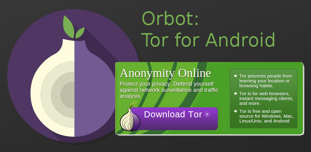
https://lists.torproject.org/pipermail/ux/2016-March/000089.html

----- Forwarded message from David Fifield <[email protected]> -----

Date: Thu, 17 Mar 2016 10:39:03 -0700
From: David Fifield <[email protected]>
To: [email protected]
Subject: [ux] Orbot design

With the talk about design guidelines I wanted to call attention to what
things look like in Orbot, the Tor distribution for Android. Whereas Tor
Browser has the hand-drawn-looking onion icon, Orbot uses a more
circular, abstract onion graphic in the same colors. It seems like they
must have put some thought into the design.

https://guardianproject.info/apps/orbot
https://guardianproject.info/wp-content/uploads/2010/02/featuregraphic.png
https://guardianproject.info/wp-content/uploads/2010/02/device-2016-01-04-021058-169x300.png
_______________________________________________
UX mailing list
[email protected]
https://lists.torproject.org/cgi-bin/mailman/listinfo/ux

----- End forwarded message -----
_______________________________________________
List info: https://lists.mayfirst.org/mailman/listinfo/guardian-dev
To unsubscribe, email:  [email protected]