Maaf panjang, kalau mau baca di web silakan ke sini:
http://www.androidpolice.com/2014/05/09/rumor-google-exploring-home-screen-overhaul-with-revamped-notification-shade-recents-menu-and-more/
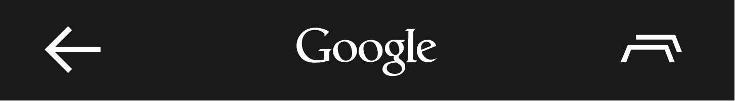
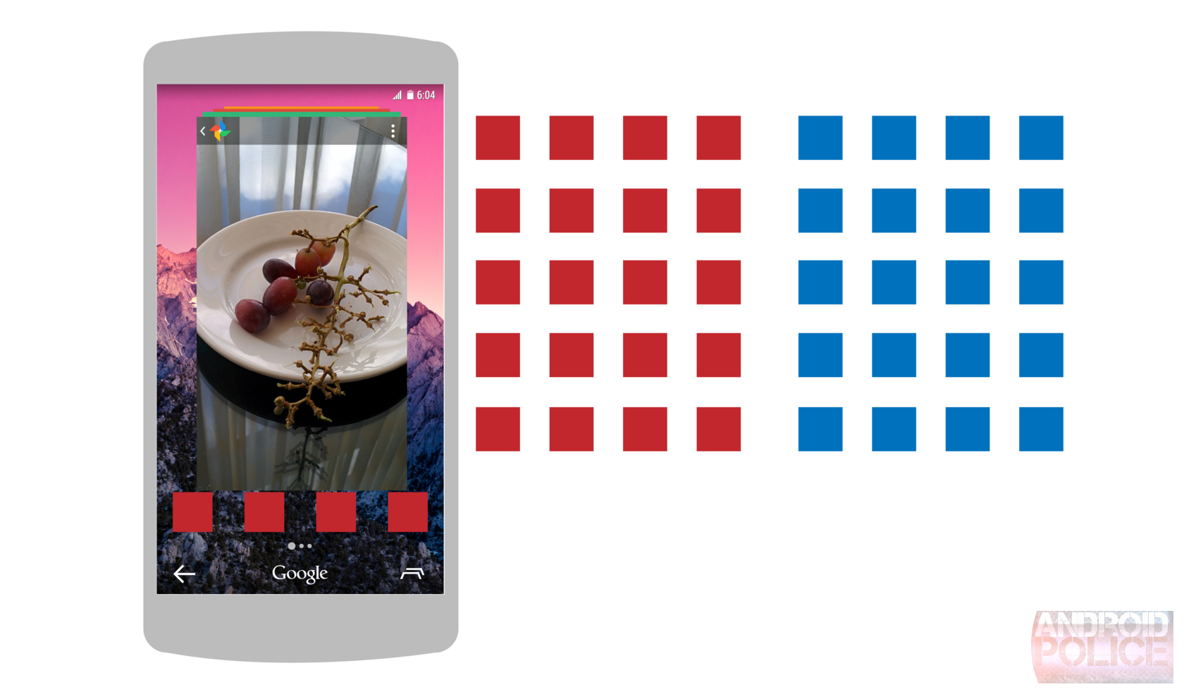
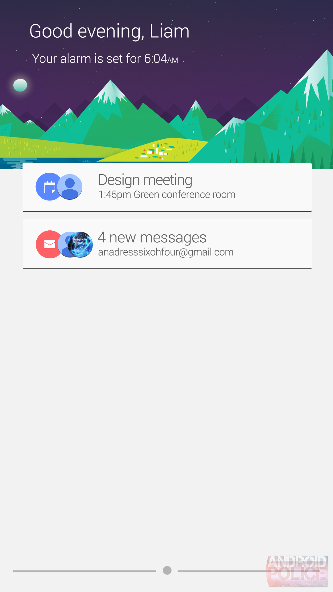
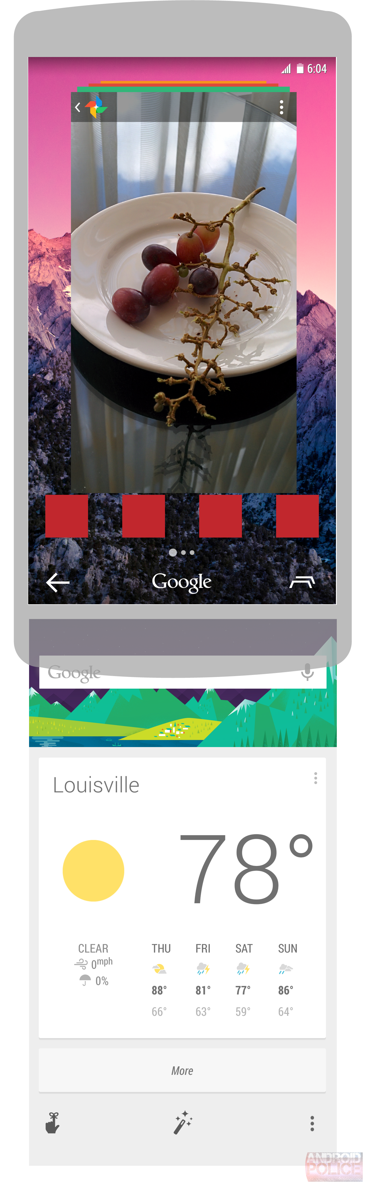
TL;DR: Google lagi-lagi mau mengubah desain home screen Android, dan kali
ini cukup drastis. Notification dicampur dengan Google Now, tombol Google
pengganti home button, desain baru untuk Recent Apps, dan masih banyak lagi.


Google Exploring Home Screen Overhaul With Revamped Notification Shade,
Recents Menu, And More
<http://www.androidpolice.com/2014/05/09/rumor-google-exploring-home-screen-overhaul-with-revamped-notification-shade-recents-menu-and-more/>
Last Updated: May 10th, 2014

<http://www.androidpolice.com/2014/05/09/rumor-google-exploring-home-screen-overhaul-with-revamped-notification-shade-recents-menu-and-more/>
In our recent post about Google's plans to break its Search sauce out of
the dedicated app and bring it to the rest of
Android<http://www.androidpolice.com/2014/04/25/rumor-ok-google-everywhere-modular-actions-new-navigation-buttons-coming-to-android/>,
I alluded to the fact that we'd have more to talk about later. Specifically
left un-discussed were the implications of new navigation buttons for the
Android home screen. As readers will remember, our information leads us to
believe that the navigation bar will be getting a shakeup, with the new
layout including the typical back and multitask buttons, plus a "Google"
button, which appears - for now - to be an actual Google logo.

<http://cdn.androidpolice.com/wp-content/uploads/2014/05/nexusae0_image1.png>
[image:
image]<http://cdn.androidpolice.com/wp-content/uploads/2014/05/nexusae0_image1.png>

Pressing the "Google" button appears to trigger Search, which would help
users perform general searches or app-specific actions. The back button
seems to work as you'd expect, and the multitask button appears to bring up
the multitasking view we saw a glimpse of when looking at Google's
potential plan to unify Chrome and Search on
Android<http://www.androidpolice.com/2014/04/06/rumor-googles-plan-to-bridge-chrome-android-and-search-to-do-everything-on-your-device/>.
So where's the home screen? Today's post will take a look at what Google
seems to be experimenting with - a new launcher system, a new look for
notifications, and a new quick settings shade. Let's dig in.
 *Disclaimer*: No matter the confidence level, there's always a chance
product updates, features, and some or all details will be changed or
cancelled altogether. As with all rumors, nothing is 100% until it's
officially announced.

We do not have possession of any APKs or unreleased devices, so please
don't ask for them.
Confidence Level

This rumor gets a confidence rating of 7 out of 10. We are confident that a
change *like* this is probably coming, but the changes seen in the
information available to us are so far-reaching that it's hard to be sure
to what extent those changes will be implemented. It is clear Google is
experimenting with the home screen and notification system, and in fact
things like Android Wear give good hints that some of these changes
actually may survive into a public Android release, but it's best to
approach things like this with caution. The launcher we now know as the
Google Now Launcher went through several revisions before reaching release
with the Nexus 5, but the core principles of the launcher remained the
same. It is probably safe to say the same pattern will hold true with these
changes.
The Rumor

I'll try to get through the actual rumor in as concise a manner as
possible, since the "Evidence" section is what will really tell the story
here. Basically, it appears that Google is experimenting with drastically
altering the launcher experience. To do this, it will require users to rely
more heavily on the multitasking screen, accessed from its usual right-most
navigation button. From here, users can launch an app from their hot seat
or swipe to the right to see more apps.

Notifications will apparently be split into two parts - the shade will
still pull down from the top, but "high priority" notifications will appear
first, and a swipe up will reveal low priority or ongoing notifications.
Quick settings will also be present in a secondary shade (as it is now),
though we do not have firm information indicating what exactly that
interface will look like.

Before we continue, it should be noted that - should they come to fruition
in some form - these changes could be limited to Google's eponymous Now
Launcher as part of the overall "Google" experience, though changes to
multitasking and the navigation buttons could point to a wider sweep. It's
always worth stressing that with unreleased software features, our
information is rarely 100% complete, and anything can change.
The Evidence

For this rumor, it may be helpful to take a broad view and then discuss the
elements individually. As usual, we won't post source images of unreleased
software, opting instead to recreate the interfaces based on the images or
information available to us. Rest assured we replicate the interface as
faithfully as possible.

Below is a quick animation sketch of the overall functionality. Note that
launcher icons in the mockups below have been replaced with simple squares
to keep the focus on the interface.
  Multitasking

Multitasking, it appears, will be the user's primary point of entry to the
launcher. What's interesting, besides its overall design (showing a stack
of app interfaces as cards rather than a lineup of thumbnails), is that it
looks like the user could swipe down on the action bar of an app to enter
multitasking, if for whatever reason they don't feel like pressing the
dedicated button. It isn't clear if this functionality will be available
for all apps, but it is being experimented with at least in some of
Google's apps. Apps would be dismissed from multitasking by swiping down.

<http://cdn.androidpolice.com/wp-content/uploads/2014/05/nexusae0_wm_Recents.png>
[image:
wm_Recents]<http://cdn.androidpolice.com/wp-content/uploads/2014/05/nexusae0_wm_Recents.png>

App Grid

>From the information available to us, it looks like Google is experimenting
with eliminating the app drawer in favor of an iOS-style app grid. This is
one of the farther-reaching changes, with as yet unknown implications for
widget placement.

What is apparent, though, is that the hot seat would remain, sans app
drawer button. As we always note with unreleased software, anything can
happen.

<http://cdn.androidpolice.com/wp-content/uploads/2014/05/nexusae0_wm_appgrid.png>
[image:
wm_appgrid]<http://cdn.androidpolice.com/wp-content/uploads/2014/05/nexusae0_wm_appgrid.png>

*Update:* As commenter Zargh notes
below<http://www.androidpolice.com/2014/05/09/rumor-google-exploring-home-screen-overhaul-with-revamped-notification-shade-recents-menu-and-more/#comment-1377120292>,
Android 4.4.3's change
log<http://www.androidpolice.com/2014/05/09/android-4-4-3-changelog-turns-up-in-aosp-with-every-modification-since-kitkat-4-4/>
has
a few curious lines that sound like they could be related to the app grid.

 dff0bfe Do not allow duplicate shortcuts when ALL_APPS is disabled.
da41ea6 Allow 5 hotseat icons in DISABLE_ALL_APPS mode.
306c1cf Show widgets when ALL_APPS is disabled.

What this sounds like is that there may be an option to either use or not
use the app grid, with widgets showing up based on that selection. Time
will tell.
What About Widgets?

Presumably, the addition of the grid could rule out widgets - they don't
fit into any obvious place in the overall picture (except perhaps between
recents and the grid itself), but traditional, customizable home screens
are likely still an area that's under consideration with these changes.

The app grid itself could just be an exploratory element, or there could be
more to the placement of traditional home screens than our information
suggests. As always, remember that any pre-release functionality, no matter
how convincing the evidence, could change.
Notifications

>From what we've seen, Google appears to be experimenting with a
notification shade that - while familiar - sees a significant stylistic
overhaul. It still pulls down from the top, but notifications are now
presented in the same style as Google Now cards (these notifications are
internally referred to as "nowtifications," get it?). Some high priority
Now cards may also appear in the notification shade (for instance, if it's
time to leave for an appointment), and would be placed in the top "half" of
the shade, with low priority or ongoing notifications just a
fluidly-animated swipe away. Assuming our information is correct, this
revised notification shade would give richer meaning to notifications'
priority levels, and greater separation for users tired of a cluttered
shade.

It also seems that the notification shade will greet you with a
time-appropriate phrase and your next alarm, or the current weather.

<http://cdn.androidpolice.com/wp-content/uploads/2014/05/nexusae0_wm_Notifshade1.png>
[image:
wm_Notifshade1]<http://cdn.androidpolice.com/wp-content/uploads/2014/05/nexusae0_wm_Notifshade1.png>

[image: nowitfgif]
<http://cdn.androidpolice.com/wp-content/uploads/2014/05/nexusae0_nowitfgif.gif>

[image: wm_notifshade3]
<http://cdn.androidpolice.com/wp-content/uploads/2014/05/nexusae0_wm_notifshade3.png>

Google Now

Google Now has moved around a lot since its initial introduction. At
present, it lives to the left of the leftmost home screen. In the new
launcher, it would be below the screen, accessible from any home screen
with a quick swipe. This is where most of your predictive cards would live,
and for now it appears the same as the current Now interface, though we've
seen evidence that the "Ok Google" hotword is destined to work almost
everywhere.

<http://cdn.androidpolice.com/wp-content/uploads/2014/05/nexusae0_wm_Nowswipe.png>
[image:
wm_Nowswipe]<http://cdn.androidpolice.com/wp-content/uploads/2014/05/nexusae0_wm_Nowswipe.png>

Final Thoughts

This is probably the most wide-sweeping rumor we've recently encountered,
so it's worth approaching with some caution. It's clear to us that Google
is exploring these changes, but not that they are finished, or that they
will appear in an upcoming Android release. Taken with other rumors we've
seen, it seems likely that some of these features will appear, though their
final implementation remains to be seen.

Changes like the move to an app grid seem far fetched for Android, which
prides itself on the ability to customize home screens with widgets and
other changes. It's possible that the app grid is only an exploration, or
that traditional home screens could appear between recents and the grid -
again, anything can happen.


http://www.androidpolice.com/2014/05/09/rumor-google-exploring-home-screen-overhaul-with-revamped-notification-shade-recents-menu-and-more/

Andri Agassi
http://andriagassi.com

--
==========
Berubah menjadi lebih terkendali bersama @kartuHalo Halo Fit Hybrid
Info Lengkap >> tsel.me/halohybrid   #KendalikanHidup
-------------------
Gunakan layanan Hosting Indonesia yang stabil, terjangkau dan aman
Kunjungi  >> http://www.Qwords.com
--------------------
ID-Android on YouTube
https://www.youtube.com/watch?v=0u81L8Qpy5A
--------------------
Kontak Admin, twitter @agushamonangan

Aturan Umum  ID-ANDROID >> http://goo.gl/NfzSGB

Join Forum   ID-ANDROID >> http://forum.android.or.id
==========
---
Anda menerima pesan ini karena Anda berlangganan grup "[id-android] Indonesian
Android Community " dari Google Grup.
Untuk berhenti berlangganan dan berhenti menerima email dari grup ini, kirim
email ke [email protected].
Kunjungi grup ini di http://groups.google.com/group/id-android.