    [
https://issues.apache.org/jira/browse/CAMEL-15140?page=com.atlassian.jira.plugin.system.issuetabpanels:comment-tabpanel&focusedCommentId=17120320#comment-17120320
 ]
Aashna Jena commented on CAMEL-15140:
-------------------------------------
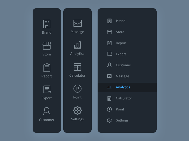
Or we could have a single-column menu, making sure we don't hide too much of
the screen (left example). If we want our menu to have more text than icons, we
can take the right side approach - have icons, text, and perhaps differentiate
two items by difference in color/some boundary.
!https://cdn.dribbble.com/users/135150/screenshots/2580823/sidebar.png!
> Improve Main Menu for Mobile Screens
> ------------------------------------
>
> Key: CAMEL-15140
> URL: https://issues.apache.org/jira/browse/CAMEL-15140
> Project: Camel
> Issue Type: Improvement
> Components: website
> Reporter: Aashna Jena
> Priority: Major
> Labels: outreachy2020
> Attachments: screenshot-1.png
>
>
> Our current menu for mobile screens is a list of text items with a small
> drop-down arrow, which don't really make for a good touch target. I like how
> the facebook app displays menu items - they take up the full screen and each
> menu item has an icon and text enclosed in a box-like structure. I also like
> Amazon app's menu, where sub-menus replace the menu space instead of opening
> up as drop-downs. I can post some mock-ups if we are open to changing the
> design of the menu on mobile screens
--
This message was sent by Atlassian Jira
(v8.3.4#803005)