Aman-Mittal opened a new issue, #489:
URL: https://github.com/apache/fineract-backoffice-ui/issues/489
## What happens
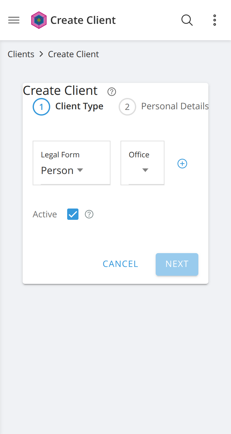
At a phone viewport, the Create Client stepper lays its three steps out in a
single non-wrapping row that is wider than the space it is given. Step 3
renders past the right edge and is then clipped by an ancestor — so it is
neither visible nor reachable by scrolling. A user filling in the form has no
way to know a third step exists.
Measured at **368×691** on `/clients/create`, step 1 active:
```
<ol class="stepper"> scrollWidth: 442 clientWidth: 264
display: flex flex-wrap: nowrap overflow-x:
visible
step labels (viewport width 368):
"Client Type" left 88 right 165 visible
"Personal Details" left 225 right 333 visible, but clipped by the
card at ~332
"Contact Details" left 393 right 494 entirely outside the viewport
```
## Why it is clipped rather than scrollable
Walking the ancestor chain for `overflow-x`:
```
OL.stepper visible
APP-STEPPER visible
FORM.client-form visible
ION-CARD-CONTENT visible
ION-CARD hidden ← clips here
DIV.form-container visible
MAIN.content-area auto ← would have scrolled, but the card already
cut the content off
```
`MAIN.content-area` does allow horizontal scrolling, but `ion-card`'s
`overflow-x: hidden` clips the overflow before it ever reaches that scroll
container. The result is content that is neither shown nor scrollable to.
## Cause
`src/app/shared/components/stepper/stepper.component.ts` has no responsive
handling at all:
```css
.stepper { display: flex; ... } /* no flex-wrap */
.step-label { white-space: nowrap; ... }
```
```console
$ grep -c "@media" src/app/shared/components/stepper/stepper.component.ts
0
```
Not a single media query in the file. The layout is desktop-only by
construction, and `DOCS/MOBILE.md` makes clear that phone support is an
intended target rather than an edge case.
## Suggested fix
Give `.stepper` a mobile behaviour below a breakpoint. Any of these works:
- `flex-wrap: wrap` so the steps stack onto two rows;
- make the strip horizontally scrollable (`overflow-x: auto` on `.stepper`
**and** relaxing the `ion-card` clip) with a visible scroll affordance;
- a compact variant that shows numbered circles only, expanding the text
label for the active step.
The third degrades best — three small circles fit comfortably in 264px and
still communicate "3 steps, you are on 1".
## Environment
Reproduced against a clean checkout of `main` (`a24a06ba`) served with `ng
serve`, Chrome at 368×691 with mobile emulation and touch.
--
This is an automated message from the Apache Git Service.
To respond to the message, please log on to GitHub and use the
URL above to go to the specific comment.
To unsubscribe, e-mail: [email protected]
For queries about this service, please contact Infrastructure at:
[email protected]

