Aman-Mittal opened a new issue, #585:
URL: https://github.com/apache/fineract-backoffice-ui/issues/585
Across every create and action form I checked, required fields carry the constraint in code but nothing on screen says so, and the only feedback is a permanently disabled submit button. 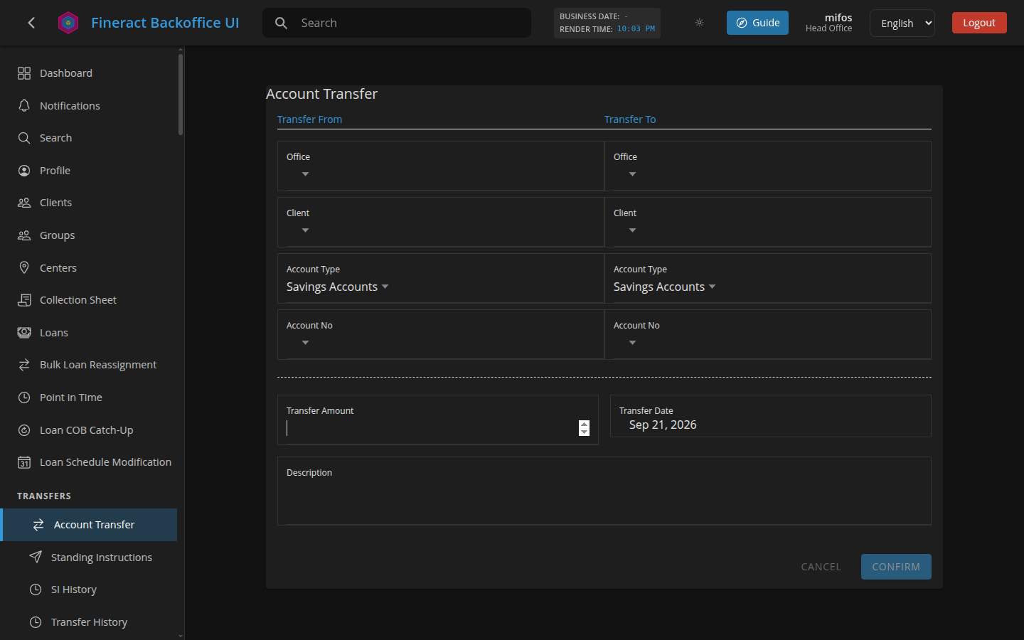 ## Measured across eight forms | Form | Fields | Required | Visible required markers | Submit | Disabled on arrival | |---|---|---|---|---|---| | Transfers → Account Transfer | 10 | **9** | **0** | Confirm | yes | | Savings deposit | 3 | 1 | **0** | Save | yes | | Clients → Create | 8 | 4 | **0** | Next | yes | | Security → Create user | 8 | 8 | **0** | Save | yes | | Accounting → Create journal entry | 8 | 6 | **0** | Save | yes | | Organization → Create office | 3 | 2 | **0** | Save | yes | | Organization → Create staff | 6 | 3 | **0** | Save | yes | | System → Create code | 1 | 1 | **0** | Save | yes | **34 required fields, zero markers.** The `required` attribute is correctly set on the inputs, so the information exists — it simply never reaches the screen. ## What the user experiences On **Account Transfer** — a screen that moves money — there are nine required fields across two columns and nothing distinguishes them from the optional `Description`. `Confirm` is greyed out from the moment the page loads, with no text saying why or what is still needed. Filling some fields does not tell you how many remain. Blurring a required field while empty produces no message either: the control picks up `ng-invalid ng-touched`, but no error text renders anywhere on the form. So a user who cannot work out why `Confirm` is dead has nothing to go on but trial and error. ## Suggested fix - Mark required fields visibly — the conventional `*` on the label, or mark the optional ones if most are required. - Render the validation message the control already knows about, on blur and on submit attempt. - Reconsider the disabled-submit pattern. Letting the user press `Confirm` and then showing which fields need attention (and moving focus to the first one) is more usable than a dead button, and it is what tells a screen-reader user that anything is wrong at all. - If the button stays disabled, give it an adjacent hint — "Complete the required fields to continue". ## Related #287 covers the other half of this — the visible label not being programmatically associated with its input. That shows up in the same sweep: Account Transfer has **8 of 10** fields with no `label[for]`, `aria-label` or wrapping label; journal entries has 4; create-client and create-user have 2 each. A shared form-field component would be the natural place to fix both the association and the required marker at once. ## Reproduction 1. Sign in, open **Transfers → Account Transfer**. 2. Nothing on the form indicates which of the nine fields are required. 3. `Confirm` is disabled with no explanation. 4. Focus `Transfer Amount`, leave it empty, blur — no message appears. ## Tested against Deployed build of `main`, Chrome, 1440x900. -- This is an automated message from the Apache Git Service. To respond to the message, please log on to GitHub and use the URL above to go to the specific comment. To unsubscribe, e-mail: [email protected] For queries about this service, please contact Infrastructure at: [email protected]

