zentol commented on pull request #14903:
URL: https://github.com/apache/flink/pull/14903#issuecomment-775484371
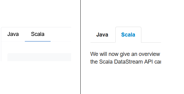
I think the code tabs have lost a bit of clarity; it's not immediately obvious that you can click them in the first place.  In a similar vein, the REST API request/response drop-down elements are also not rendered in a way that indicates them to be interactive. The previous approach was admittedly crude. A down-arrow after the text would likely do the trick already. This will remove some excessive whitespace, and ensure that the url font size isn't smaller than usual text: ``` .rest-api h5 { margin-top: .5em; margin-bottom: .5em; font-size: 1em; } ``` ---------------------------------------------------------------- This is an automated message from the Apache Git Service. To respond to the message, please log on to GitHub and use the URL above to go to the specific comment. For queries about this service, please contact Infrastructure at: [email protected]
