There wasn't a way to do this, so I just added one:
http://dcjones.github.io/Gadfly.jl/geom_ribbon.html
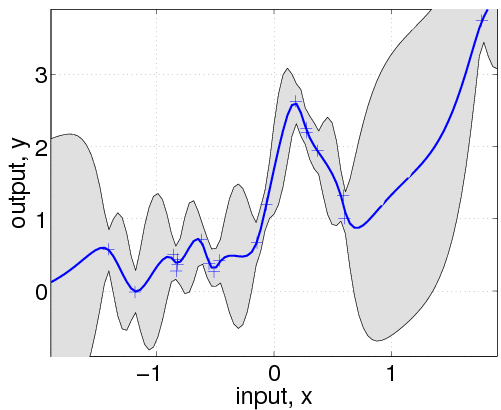
On Monday, February 17, 2014 5:06:54 AM UTC-8, Tom Nickson wrote:
>
>
> When regressing, I quite like to plot my variance as a filled region
> behind the mean - as in this example from the GPML website.
> <http://www.gaussianprocess.org/gpml/code/matlab/doc/f2.gif>
> assuming I had data:
>
> x, mean, std_dev
>
> and I wanted to plot mean against x and (mean +/- std_dev) against x as a
> filled regions, how would I set up my dataframe and call plot?
>
> Double points if everything comes up nicely on the plot legend!
>
> Tom
>
>