https://bugs.kde.org/show_bug.cgi?id=459708
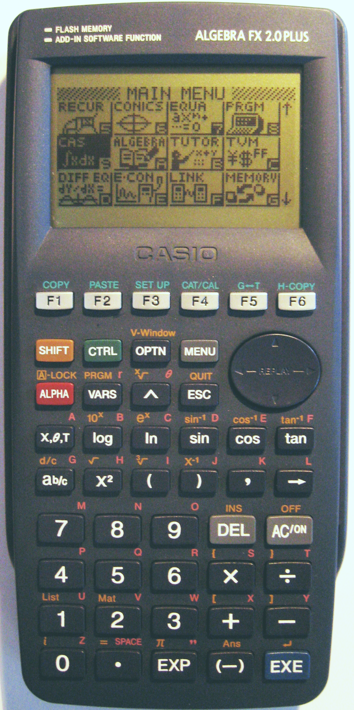
--- Comment #4 from Mike H <myst...@gmail.com> ---
First of all, I'm not certain why my bug was closed as a duplicate of a much
less detailed bug one year later. I believe that one should have been closed
instead.

Second, the resolution to promote square root still does not address the UX
issue of not understanding what 'shift' implies.

The shift button should have some special text styling or button background
color that is different from every other button. Perhaps Italicized and a
different color for example. At the very least a different color.

Then, every single button that is affected by the shift should have superscript
text, perhaps italicized, But definitely the same color as chosen for the shift
button, that displays what the secondary feature of the button is.

I linked a descriptive picture of a TI-36 calculator previously in this bug
that denotes how its second function key has the different color and the text
on the buttons denotes both features, one being the italicized feature.

It does however appear that Casio calls their second function button the shift
key like K-Calc. I have never owned a Casio calculator and only today decided
to start looking at Texas instruments's competition.

https://upload.wikimedia.org/wikipedia/commons/f/fc/Casio_algebra_fx_2.0_plus.PNG
shows how Casio has a shift button that is orange and superscript text above
every shiftable function button that shows its secondary function.

Instead of hiding behind an opaque layer change for the button, or entire text
replacement, I don't know how it is done, both values somehow need to be
displayed on the button.

Concurrently.

While it does currently mimic casio's naming, I also still think that the
naming of shift is ambiguous even with UX contextual clue improvements, so
renaming to 'second function' '2nd func' something like that, might also be
very helpful.

--
You are receiving this mail because:
You are watching all bug changes.